Category: Tips

  • A few notes on the Timeline: model-driven Power Apps form tweaks

    A few notes on the Timeline: model-driven Power Apps form tweaks

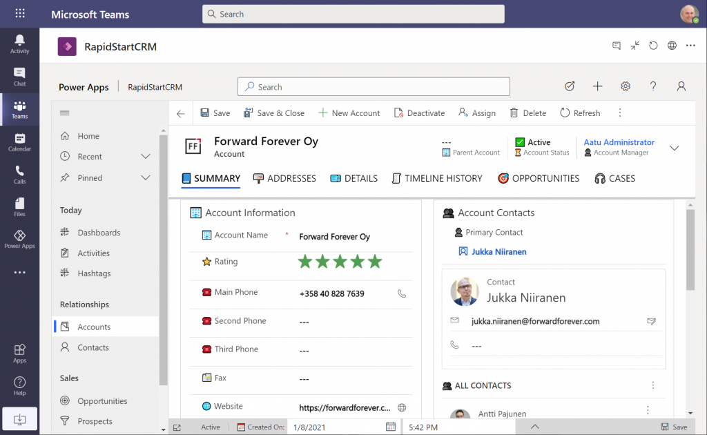
    In the default form components arrangement for tables in model-driven Power Apps or Dynamics 365 CE apps, the Timeline is usually front and center. This makes perfecet sense. Scenarios that revolve around accounts and contacts typically include the need to show activities and notes related to these records.

    Compared to how things used to be just a few years ago, meaning mostly hard coded, we now have an amazing amount of configuration options for the Timeline control. This is reflected in the MS Learn article “set up the Timeline control” which has an estimated reading time of 32 minutes! And that’s just the “how” part of official documentation, not the “why” that you’ll learn as the settings are applied in real world business application context.

    This blog post is my attempt to highlight the recent, most useful features that the modern Timeline form component enables for improving the user experience of your model-driven apps.

    Rolling up the notes

    The one huge feature that 2022 Release Wave 2 has delivered for model-driven Power Apps has been buried deep into the release plan. It seems almost like an intentional “let’s hope no one notices this” move since the feature is listed under Dynamics 365 Customer Service and called “Improve agent productivity with timeline enhancements”:

    Notes that work like other activities and roll up on contact, account, and opportunity form timelines.

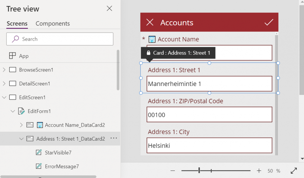
    Woohoo! We’ve been waiting for this feature close to 2 decades already! If you haven’t experienced the Dynamics CRM era, then the significance of the rollup capability in the platform may not be immediately obvious. I won’t go deep into it now, instead I’ll dig up an illustration that I created 11 years ago for a blog post I wrote about the native activities associated views vs. form subgrids:

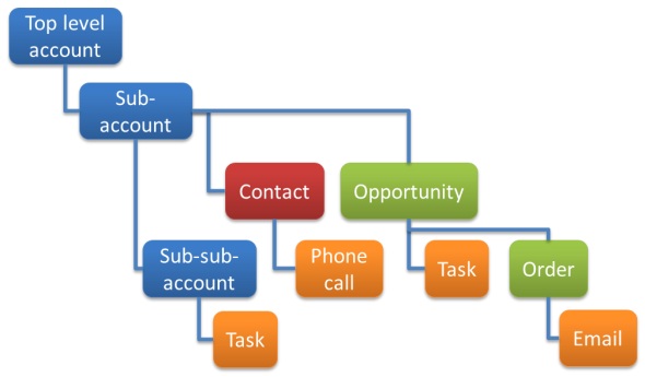
    Unlike other standard or custom tables in Dataverse, activities have one superpower: they can be shown not just from the directly related child records but also rolled up from deeper in the hierarchy across many different record types (tables, entities, you pick the terminology). This means that in the account Timeline you’re able to see tasks, phone calls, emails, appointments that are set regarding a child record, like an opportunity where that account is the potential customer.

    While the same form component has been used to display both activities and notes (and activity feed posts, in case someone’s still using them), the rollup functionality has been exclusive to activity data. This has lead to a classic CRM functional gap where a note record added onto a lead will not be carried over once the lead is qualified and becomes an account/contact/opportunity. Notes have been “sticky” in the sense that you slap them on a specific record and that’s where they’ll forever stay.

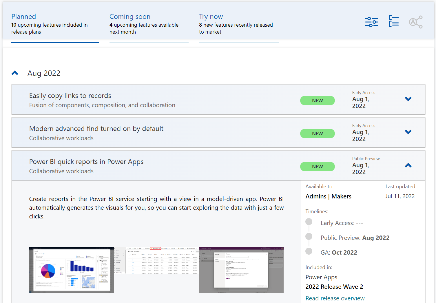
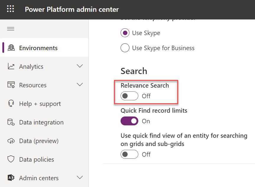
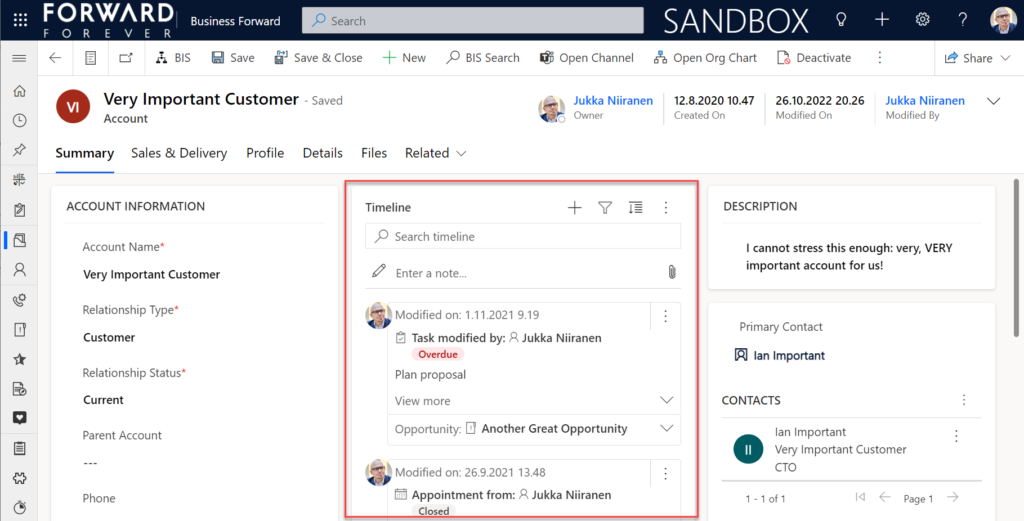
    Well not anymore! While the official docs on Learn are still pending to be updated to describe the feature in more detail, the “Notes rollup type” setting already appears on the Timeline component properties:

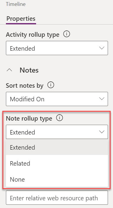
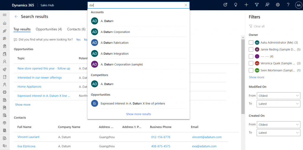
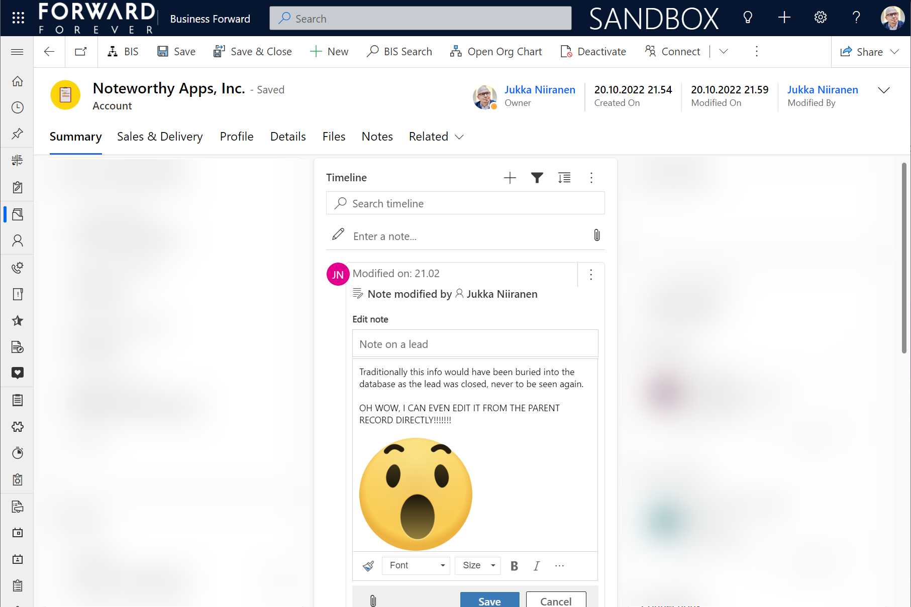
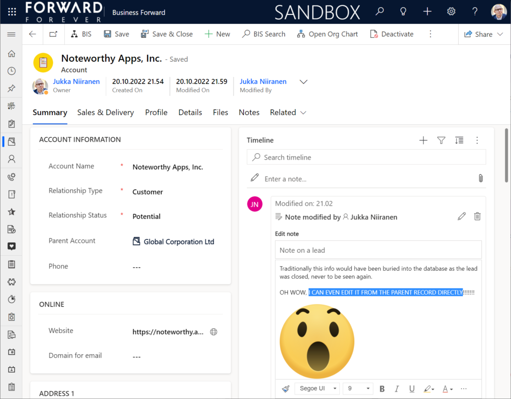
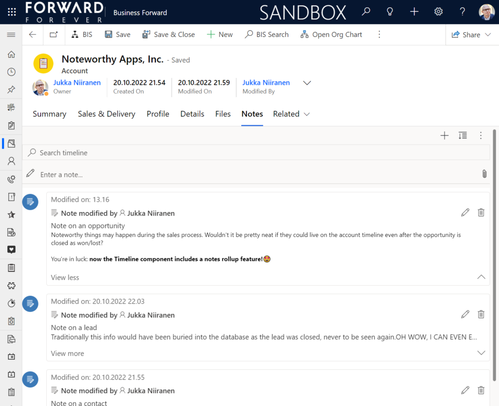
    Setting this to “Extended” for the Timeline control on the account means that we’ll now see notes that have been added to the originating lead, any of the account’s contacts or opportunities. Here’s an example where there are zero notes on the account itself, yet we can see 3 notes on the Timeline:

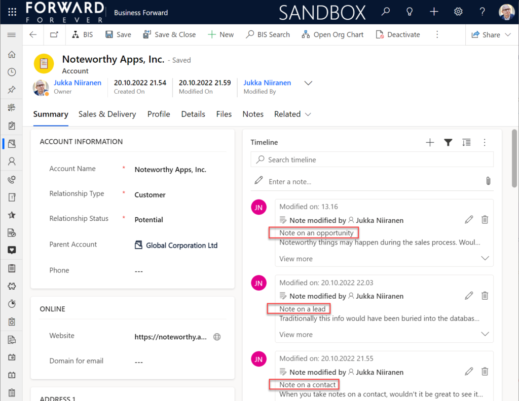
    All the notes from these child records appear just as like they were the traditional notes on the account record itself. In fact, you can simply click the pen icon to start editing a note on the account form Timeline, even if it has originally been added via a different record:

    This can be a bit confusing for the user, since there’s no visual indication on the Timeline card on which exactly is the original hosting record of that note. Which probably is due to the Dataverse data model that doesn’t treat the notes (annotation) table as something where the users could freely set the Regarding record information. With such a non-standard implementation it might be tricky even for the team developing the Timeline to surface this information in the UI.

    You need to keep in mind that this notes rollup isn’t applicable to custom tables, nor across all system tables either. Just like the activity rollup, this is feature of showing relational data from beyond a single relationship “hop” is not a generic platform capability in Dataverse. It works in these basic CRM style scenarios using predefined record types. And when it does, it can be hugely beneficial to end users.

    Alternative Timelines

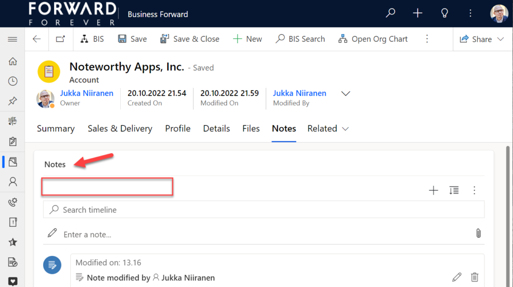
    There are more goodies in 2022 Release Wave 2 under the release item “Try enhancements to timeline maker experience”. One of them is the support for having multiple Timelines on a single form. This means you could add a dedicated “Notes” tab on the account form and configure it to include only notes data, not activities or posts. The benefit from this would be to tailor the display settings in the main Timeline differently than in the Timeline dedicated for notes only.

    In the example above I’ve ticked the box “expand first component to full tab” in the tab settings. This removes all the whitespace and labels around the Timeline, giving it maximum space. Yeah, it’s not the prettiest tab in the world when applying this technique to the Timeline. Yet from a purely functional perspective it’s an option worth trying out.

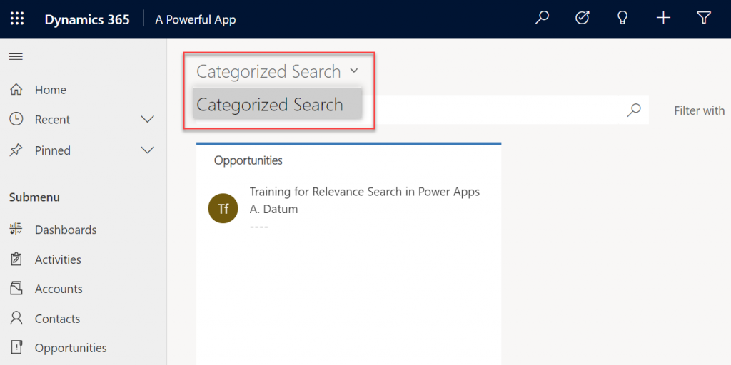
    One common question from customers who want to customize their CRM system’s terminology has been “can we rename the Timeline to something else”? The answer is still: no. However, now that you can have multiple Timelines on a form, the workaround you can apply is this: 1) under Timeline – Properties – Advanced – Additional Settings, check the box “Hide Timeline label”, 2) set your form column label to show the string you want.

    Now the custom text will appear and the place where it used to read “Timeline” is blank:

    Native controls like search or options menu will still use the timeline terminology, though. It’s always worth asking a few times whether it’s absolutely necessary to try and change such native features of a SaaS product like Dynamics 365. (The argument “because we had it like that in our previous system” is always the wrong answer.)

    Timeline forms and actions

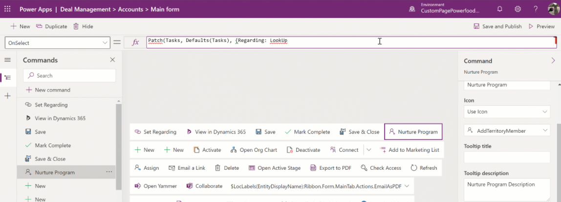
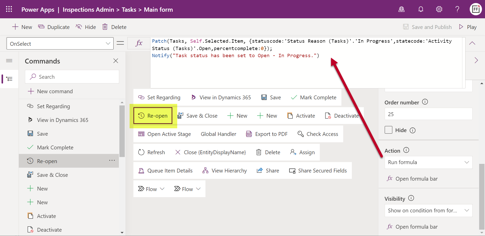
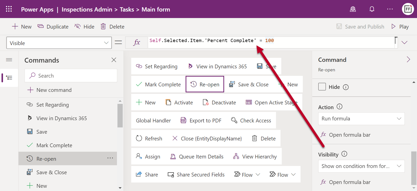
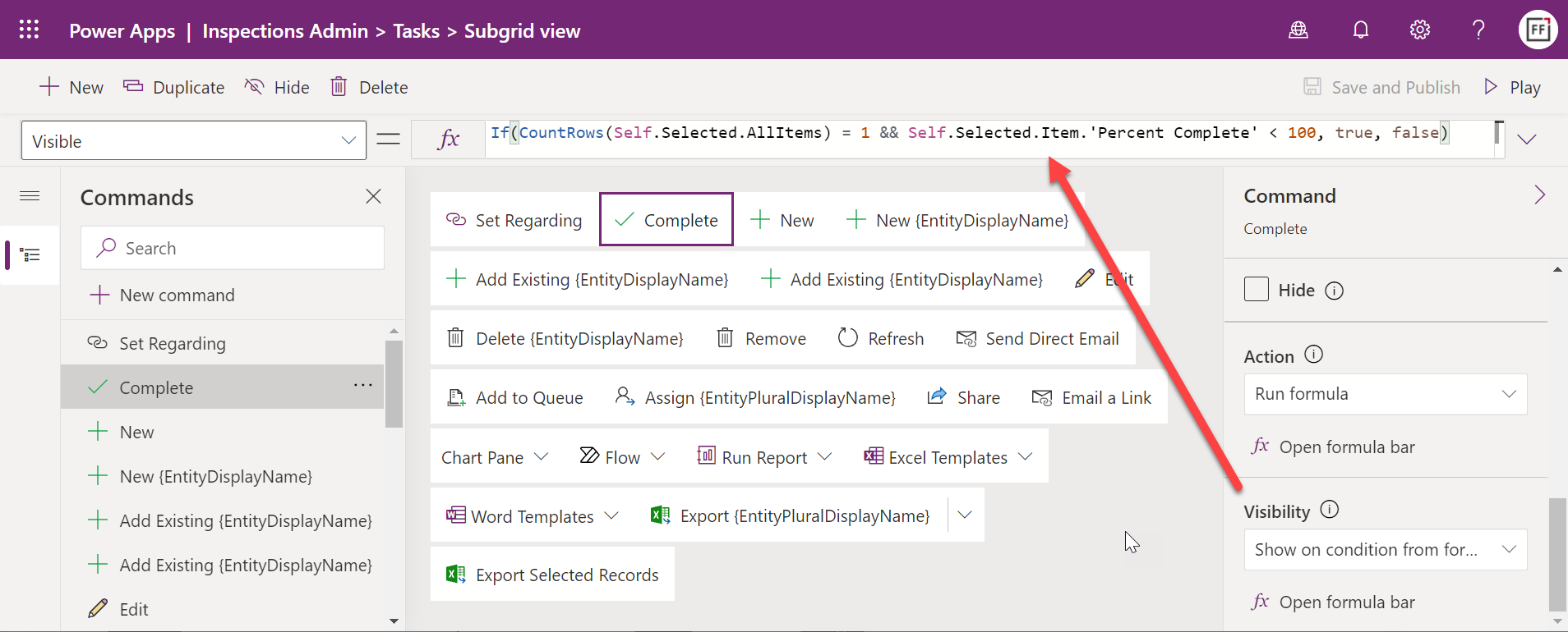
    An area of the Timeline that has really exploded in terms of configuration options is the forms used for interacting with records shown on or created from the Timeline. Let’s look at one example of how the default functionality for tasks could be optimized on the opportunity form Timeline. Without any customizations, it looks like this:

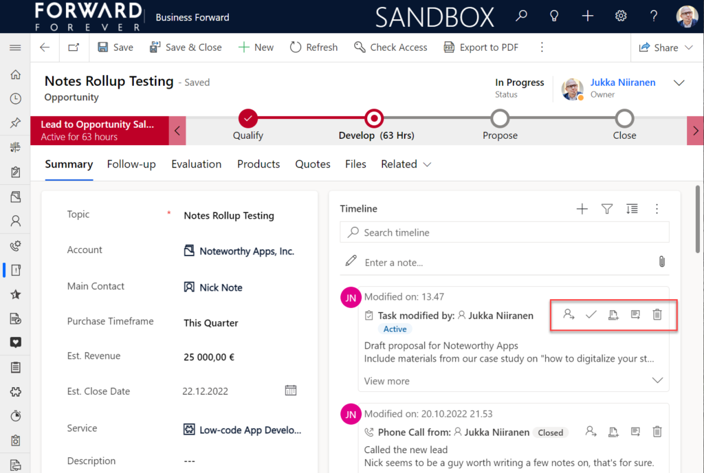
    Looking at the standard Timeline, there’s a bunch of command buttons available for every activity. Problem 1 is: it’s not easy to spot which icon opens the task’s detail form (at least I’ve never learned to immediately pick the right one). Problem 2: when we open the task, it takes us to a whole different web page, thus we lose the context of the original business record (opportunity).

    The Timeline allows us to fix both these problems by changing the settings just a bit. By going to Record settings – Activities and clicking on Task, we get a flyout pane with options specific to that activity type in this specific Timeline instance. Problem 1 can be fixed by disabling rarely needed actions like “Assign”, “Add to queue” (who uses queues anyway?) and “Delete” (deletion of data in CRM does not need to be easy!).

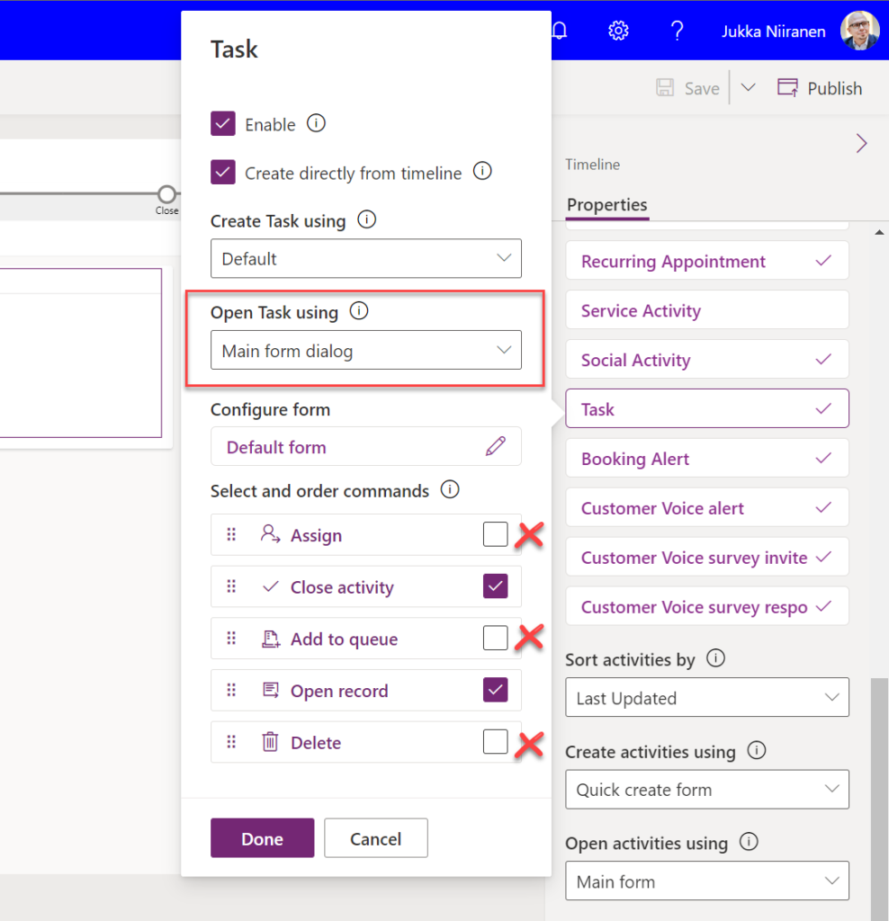
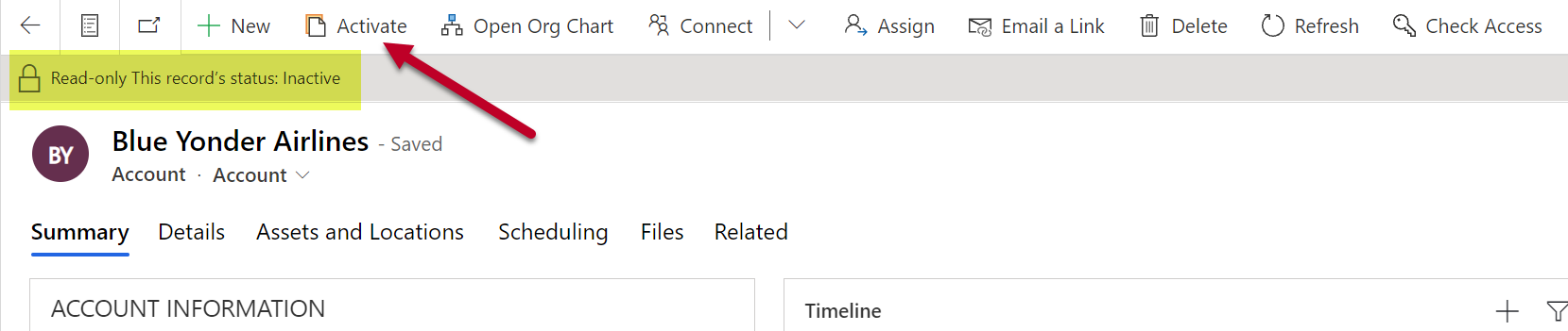
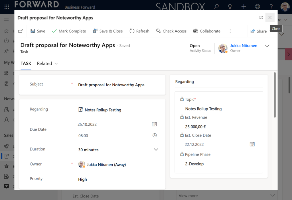
    Problem 2 is resolved by changing the “Open Task using” setting to “Main form dialog”. What does that do exactly? It gives you a modal window on top of the current record, which is a much less jarring experience than bouncing between full forms. Closing it from the X icon will allow you to keep working on the opportunity without forcing any page refresh.

    Want to learn about the Power Apps main form dialog? Read my earlier blog post on how to leverage MFDs for making it easier to work with relational data.

    Timeline configuration sprawl

    The one caveat of all this configurability that we’ve received via the modern Timeline control is that we now have a huge number of different settings we must remember to change. Performing any of the above mentioned changes is relatively easy as an isolated task, but we need to do it for all the tables and their forms where the Timeline control is used. There is no global system setting or “apply to all” option to help us. With any larger business application you’ll quickly need your own Excel sheet just to keep track of all the N settings and N forms that you must manually harmonize.

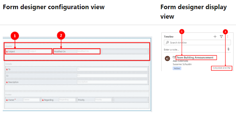
    Where things can potentially get really laborious is modifications to the card forms used for displaying activity and note data on the Timeline. If the standard date fields aren’t what we want to show, for example (created on vs. modified on vs. due date etc.), there’s a way to change most of them. However, as you can quickly see after browsing through the documentation, the card form editor from the CRM 2011 era and the modern Timeline control have nothing in common when it comes to rendering the visible UI:

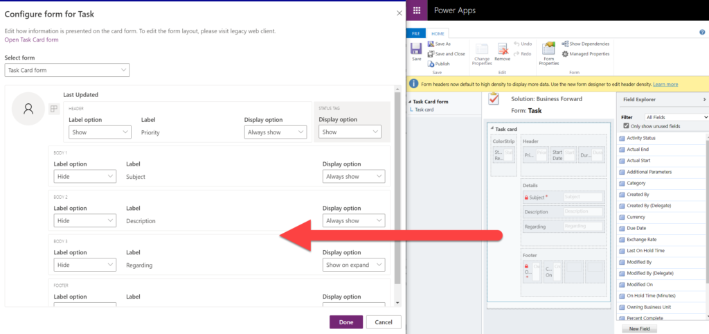
    If you want to include some custom columns from your activity tables into the Timeline cards, the good news is that it’s supported. The bad news is, you’ll likely need to keep the documentation on one screen as a reference, the form editor one the second screen, and the card form legacy editor on the third one. Good luck doing these tweaks from only your laptop screen while working away from the office!

    These configuration tasks start to quickly add up. Let’s say we need to change one date field on the task card and configure its display options and label options. Perhaps our application has 20 tables where the Timeline is used for showing this activity type. Maybe we’ve also created role based forms and targeted them via different model-driven app modules, like “Sales” and “Admin”. That single requirement could mean updating the settings on maybe 30 different forms. With all the loading, saving and navigating in the Maker portal – it could easily take more than an hour to complete.

    Now, let’s say that in a Dynamics 365 project you’ve been assigned the responsibility to take care of all the details for activity and notes management features on every Timeline in the system. Sorting, filtering, control display options, supported activity types, form types per activity, actions per activity… Planning, configuring and validating all these changes will quickly consume many days, even in an SMB level CRM system. And because it’s so easy to miss a few clicks in performing this repetitive work over & over again, you’ll also need to reserve time for fixing the things that were missed.

    Achieving a consistent user experience requires plenty of work – this simple truth has not changed from the early days of Dynamics CRM projects. As Microsoft invests money in modernizing their client controls and introducing more no-code configuration options, the customers must also do their part in ensuring the changes and new possibilities in the evergreen cloud platform are taken into use in a controlled manner. Striking a balance between what can be customized and what should be customized – this remains the eternal question.

  • Forget static plans, use the Release Planner for Power Platform roadmap info

    Forget static plans, use the Release Planner for Power Platform roadmap info

    It’s that time of the year again when Microsoft have published their plans for the upcoming 2022 Release Wave 2 for Power Platform and Dynamics 365. “How exciting! New PDF documents with hundreds of pages to read!”

    I’m sure many of you have learned to skip the static PDF files by now and instead add bookmarks to quickly get to the online version of these plans. Like these:

    That’s much better, but it isn’t really optimal either. I don’t know about you, but personally I’ve had a hard time getting very excited about the new Release Plan drops for a couple of years now. There’s just something not quite right with this “wave” model.

    Everything changes, always

    Don’t get me wrong. It’s great that the Power Platform community members are curating their own top lists from these Release Plans twice a year. There’s plenty of value in seeing what items people are actually excited about, not just reading MS corporate style “excitement” on everything included in the Plan.

    Yet the reality is this: the contents of these Releases Plans is likely to reflect less than 50% of what will actually be delivered into the products over the course of the wave. If you need proof, then check out the most important page of the online Release Plans: change history.

    At any given time, Microsoft product teams are working on several new features and enhancements that they are not yet ready to disclose. They’ll get added to release plan later (or sometimes launched without it). As a very recent example, Managed Environments was announced as a preview feature on the same day as the 2022 wave 2 plans came out. The feature is not yet in either wave 1 or wave 2 documentation. It’s very natural that the product marketing’s need for making feature specific big announcements is a higher priority. After all, diligently maintaining the long list of similar release items won’t bring that much attention to any single feature.

    Then there’s the inevitable reality of planning / estimating in software development. Things can get delayed due to too optimistic estimates, dependencies to other items/products, changes in MS product strategy, acquisitions, and so on. Ultimately the Release Plans are just a publicly visible backlog of what the team is working to deliver. It’s better not to get too excited about any specific feature on the list – often those will be the ones that get eventually postponed / removed…

    While it’s kinda nice that we have a steady rhythm of 2 release waves per year that can be easily communicated to customers, the reality is more messy. These waves are forcing an artificial structure onto the ongoing product development work. Remember: the “wave” is not any actual release in itself. October 2022 will deliver a tiny fraction of the items listed in the 2022 wave 2 plan, as the wave lasts for 6 months.

    While the waves themselves are sequential, Microsoft’s communication model has overlap for the waves. The fact that the wave 2 plans are first announced when there’s still 3 months worth of wave 1 to go (until end of September) can make it complex to keep track of items. You can’t tell whether a feature is in the product roadmap just by looking at the latest plan since it might be in the previous pipeline still. Here’s one example:

    If only we had a more dynamic view into the Power Platform and Dynamics 365 product backlog, without these artificial “waves” to confuse us…

    Say hello to the Release Planner website!

    Although it’s still a preview in itself, the Dynamics 365 and Microsoft Power Platform release planner is already a very worthy rival to the familiar Release Plans. If you’re familiar with the Microsoft 365 roadmap, then this a similar website that provides the current state of what features are being planned, rolling out or recently delivered.

    The data on release items is largely identical to what the official release plans already offer. However, it’s not wrapped within the wave concept, meaning everything can be found under a single site.

    There have been recent enhancements made to the Release Planner (listed here). Searching the release plan items with keywords is now possible. There’s a change history to reflect updates made to delivery milestones (i.e. delays in early access / preview / GA dates). Finally, filters and sorting options have been introduced, so you can view only the latest additions (7/30 days) or updated items across Dynamics 365 and Power Platform.

    Since the Release Planner is a Power Apps Portal Power Pages website instead of a Microsoft Docs site, it is much easier to implement such features that are intended for working with a list of records. Docs is great for documentation of course, as well as version control through its GitHub back end.

    One really neat feature in Release Planner is the personalization option. When I log into the site, I have the ability to pick items into “my release plan”. Essentially its a way to create a list of favorite items to follow. Because let’s face it: we all focus on some corner of Power Platform or Dynamics 365, not the entire MS BizApps cloud. Creating a personal release plan also provides an option to copy a public share link for it:

    Using a short URL service, I can now create an easy to remember link that will always take me to the list of Power Platform release plan items I’ve flagged for myself to follow. You can of course have a look at it, too:

    https://ff.tips/releaseplan

    With this link, I can now spend less energy on A) remembering if an item has been in wave 1 or 2, and B) stop hunting through the change history page for status updates. Oh, and it also works fairly well on a mobile device, whereas trying to navigate the legacy release plans on MS Docs seems to be impossible (at the moment at least, on Android/Chrome).

    Of course any dynamic website is only as good as the underlying data that is used for rendering it. At the time of viewing, there seem to be tens of release plan items from 2022 wave 1 that have not yet been updated to reflect the current status. The Release Planner site says they should be available/GA when in reality they’ve been delayed, postponed or even cancelled. This is something that technology in itself won’t fix. I hope as Microsoft’s release planning process matures beyond thinking about “waves” we’ll see more up to date information in the Release Planner site, too.

    Did you know?

    This Release Planner isn’t the first step for Microsoft to use the Power Platform to manage the product development of the very same platform. Already back in 2019 the process and tools used by the BizApps team for release planning was published in a blog post. There’s a sample app on GitHub that contains a solution with the tables, forms, plugins, PCF controls, cloud flows etc. for deploying your own copy of the release management tools.

    This process was designed to dynamically produce outputs from the release items data managed in Dataverse. Both the release plan document as a Word output as well as the Docs pages as markdown files on GitHub were generated with Power Automate cloud flows:

    Since the solution was built on top of a solid platform designed for managing business process data, there were of course other opportunities to leverage it. As was pointed out in the comments section of the 2019 blog post, by a certain ex-MVP (now at MSFT) with a long history on Portals in the form of Adxstudio:

    Which brings me back to an even more ancient blog post of mine, from 2015, called XRM Strikes Back. Inspired by Microsoft’s acquisition of Adxstudio, I argued why in the long term it would be a more successful strategy for MS to bet on the platform, rather than trying to integrate SaaS products from outside the ecosystem into the Business Applications portfolio.

    Success doesn’t happen overnight either way. Looking at the XRM based acquisitions, Adxstudio is now the 5th product in the Power Platform family, with the new name Power Pages. FieldOne Sky turned into Dynamics 365 Field Service that has quite a solid position in the market (from what I know). Mojo Surveys evolved into Dynamics 365 Customer Voice, which may not have an extensive roadmap right now, yet it’s still widely used by the customers we are working with at least.

    Back in 2011 when Dynamics CRM Online itself was used for managing the Dynamics CRM Online launch website, backed by (Windows) Azure, so might have considered that a crazy thing to do with a business application platform like XRM. Well, who’s laughing now?!?😁

    The journey up to this point has been long, but that’s exactly what such low-code application platform journeys are for customers, too. Microsoft is now in the process of also migrating their third party Ideas sites for product feedback into the Dynamics 365 Customer Service Community portal template (meaning Power Pages). The Power Automate Ideas site is moving there next week. Dynamics 365 Ideas already lives on this platform, so I’d imagine other products will soon follow. Another piece of the digital feedback loop coming together, through the power of the platform.

  • Sharing Dataverse for Teams apps outside the team

    Sharing Dataverse for Teams apps outside the team

    When you’re building Power Apps within a Microsoft Teams based Dataverse environment, the most common target group of app users is obviously people who belong to that team. This is very logical when the purpose of the app is to collaborate as a team on something that might have otherwise been an Excel sheet shared with all team members.

    The simplified table security model of Dataverse for Teams with Owner/Member/Guest (“OMG”) levels instead of custom security roles makes things easy to manage when everyone is equal. But what about when you’d need to have more granularity on who gets to do what? What if in addition to the owners (app admins) and members (managers) you also need a level further down this hierarchy: the “normal” users?

    Colleagues with access

    This is where the concept of a “broad distribution app” comes in handy. It allows you to grant access to the app for users who are not part of the team that’s hosting the Dataverse for Teams environment. Here’s how the Docs on Dataverse for Teams table permissions describe this:

    “With Power Apps for Teams, you can share an app with Azure AD security group whose members need not be part of the Teams team where the app was built. This enables you to add users to the application without having to add them to the specific team, and opens up “Broad Distribution” scenarios. For example, you may want to build an app that is enabled for every accountant in the organization, or even every employee in that organization.”

    The ability to share an app with one Azure AD security group makes Dataverse for Teams quite an attractive platform for low-code apps that have a high number of potential users. Not many organizations have yet committed to covering all their employees with a Power Apps Per User license that unlocks premium features like Dataverse. Since every user who’s licensed for Teams via Office 365 / Microsoft 365 is allowed to use apps running on Dataverse for Teams, this option significantly lowers the barrier to start building apps on top of a true relational database designed for business applications – as opposed to running your complex processes on top of several SharePoint / Microsoft Lists.

    Sharing with colleagues in practice

    Let’s say you’ve built an app within a Dataverse for Teams environment and are ready to publish it to the whole organization. In this demo scenario we are using the Bulletins sample app for Teams. We’ve created an Azure AD security group called “Access All Apps”. The first thing we need to do is go an add the necessary access rights to each table used by the app. For example, when it comes to the Bulletin table, users should be able to read all records but not create/modify/delete them, so we grant the “Reference” level to this group:

    You’ll need to do a lot of clicking for an app like Bulletins that has 11 tables, so be sure you’re selecting the “colleagues with access” section before assigning the permission level on each page.

    Next, let’s share the Power Apps canvas app itself with this group. Again, you’ll need to be careful with where to click in the navigation maze that is the Power Apps for Teams app. Go to the Apps list of the Dataverse for Teams environment but don’t select the app. Otherwise you won’t see the “share with colleagues” toolbar button.

    In the modal dialog window, choose which apps from this Dataverse for Teams environment you wish to make accessible with the chosen security group. This is where you’ll notice that while you could have tens of different apps within on environment, there’s no ability to choose which Azure AD security group gets to see which apps – since there can only be one.

    Adding apps to Teams channels

    If we were to now go to our target team and add a new Power Apps tab to the channel, we would not find our Bulletins app there. Nope, not even under that “sample apps” filter, since that actually shows a list of Power Apps sample apps like Asset Checkout that are part of all Power Apps environments. Dataverse for Teams sample apps like Bulletins are a completely separate thing, of course.

    The logic is different when it comes to Power Apps that have been built within Dataverse for Teams. You need to go back to the Power Apps for Teams app, i.e. the Maker experience. Click on the Build tab, choose your environment, find your app, select it for real this time, then choose “Add to Teams”.

    You don’t get to choose a team or a channel, though. That’s because this process actually publishes your app into the Teams app store. It will become available under the “Built with Power Platform” section:

    OK, fair enough. It’s an app built within Teams, so it makes sense to use the same distribution mechanism as apps developed with custom code. The other Power Apps in your tenant are “external content” that you can freely pin to channel tabs. Dataverse for Teams apps are same but different.

    Blocked by Teams permissions

    This is actually the reason why I started writing this blog post in the first place. Ever since the broad distribution apps were announced in January 2021, adding them to a team from the app store worked without any additional hoops to jump through. Recently that has changed in a way that is not yet reflected in any MS documentation.

    In a new tenant with the default settings for Microsoft Teams, you may be blocked from installing the Dataverse for Teams based apps after doing the “Add to Teams” dance. Instead the app store may present you with the following error message:

    Permissions needed. Ask your IT admin to add [app name] to this team/chat/meeting.

    You will get this message even if you are the Global Administrator of the tenant, so it’s not about the user permissions. It is rather the Teams policies that are blocking the deployment of Power Apps created within Teams.

    To solve this issue, you’ll need to contact the Teams administrator of your tenant and ask them to verify that the following setting is turned on:

    Teams apps – Setup policies – Global (Org-wide default) – Upload custom apps – On

    After this change, you’ll be able to open the Bulletins app in the Teams app store, select “add to team” and create a channel tab in any team that you are a member of.

    I can tell for a fact that the requirement for the “upload custom apps” policy didn’t always used to be required (or it was enabled by default). In one of our demo tenants I had previously used the “share with colleagues” feature to add Dataverse for Teams apps outside the hosting team. The existing tabs worked just fine, but adding new apps became blocked until the apps policy in the Microsoft Teams Admin Center was modified.

    It’s a bit unfortunate if this will indeed become a permanent requirement for IT admins to grant the permission for “upload custom apps”, just to share the Dataverse for Teams app into a different team. Compared to normal Power Apps, there are a number of quirks like this that the app makers need to be aware of. Be sure to also check out my earlier blog post where I explore what it’s like to work with solutions in Dataverse for Teams.

    Update 2022-06-17: In case you’re wondering how the general approval process would actually work for Teams store apps where the approval request prompt is shown, check out this great blog post from Tony Redmond: “Users Can Request Access to Teams Store Apps”.

    Update 2022-08-11: there’s a new feature rolling out, called “Microsoft Teams user request configuration to external systems (URL redirect)”, allowing Teams admins to configure a custom URL + message for the app requests in the Teams app store. Read more here.

  • Dataverse environment administration mode and storage consumption

    Dataverse environment administration mode and storage consumption

    In November we had a situation where our production environment had records unintentionally deleted. This required us to restore a backup copy of production into a new environment and retrieve the missing records from it.

    Why didn’t we restore the environment backup directly over the production environment? There are many reasons which I’ve documented in the Forward Forever team blog. In short, if you’ve got any Power Apps canvas apps or Power Automate cloud flows in your environment, things can get seriously messed up if you restore the backup into the same environment. My recommendation is to avoid doing this in production if you have any workarounds at your disposal.

    After we had manually copied & imported the data back, we left that restore environment in place for a while. In this case, “a while” actually meant 6 months. We were in no rush to free up the capacity, so I decided to wait and see if there were any further lessons to be learned from this incident.

    What happens to the storage space of a restored environment that no one is using? You might expect it to remain roughly in the same size as the original backup. In our case, the restore environment grew to be over 2x the size of the original environment. Below is an illustration of the restore vs. production environment storage usage from Power Platform Admin Center reports:

    Our production today is at around 7 GB total Dataverse storage consumed, whereas the production restore environment had ballooned to 17 GB. What was consuming all that space? The AsyncOperation table:

    This is where all the Dataverse system jobs are stored. These jobs will keep running, even if no live users (nor outside integrations) touch the environment.

    Looking at the number of rows in that table (via XrmToolBox plugin Fast Record Counter), I saw that while our production environment had 8.4k rows, the restore environment had 51k rows in that table.

    Why are there more jobs in the dormant environment? This is because normally the completed system jobs are deleted by another scheduled job, known as bulk delete jobs. Only in this restore environment the jobs just kept piling up. I checked that the bulk delete jobs weren’t reporting any errors. However, the actual system jobs offered the explanation to the storage space growth:

    Switching to the suspended system jobs view revealed that there were 3.5k system events stuck. New batches seemed to be generated on a daily basis. With titles like “Microsoft.Dynamics.CDD.AuthorizationCorePlugins.RoleAutoExpanderPlugin”, it wasn’t immediately obvious what these jobs were related with.

    Upon inspecting the system jobs records, the column “message name” revealed that these are related to solution imports and updates. Yes, just because you stop using a Dataverse environment, that doesn’t mean Microsoft would stop from servicing it with the latest solution versions and new features.

    Why did the jobs get suspended then? The answer is in what happens after restoring tje environment from a backup. It gets put into administration mode by default. The intention here is quite sensible, since you wouldn’t want any integrations from the newly restored environment to be talking with the outside world. This could cause issues when you’d have multiple Dataverse environments connecting to the same target systems, potentially causing duplicate data and messages to be created.

    The challenge here is that in today’s Dataverse / Dynamics 365 environments there are first-party integrations that also rely on features that the admin mode by default disables. These will keep running as system jobs inside the environment, yet they can’t complete their tasks and are therefore put in the queue as suspended jobs.

    In a small CRM style environment like we have, this caused 10 GB worth of additional data to get accumulated into the Dataverse tables within 6 months. While system jobs are now stored in the cheaper file capacity rather than the expensive database capacity, it’s still quite a lot of unwanted storage consumption from built-in features.

    Obviously the administration mode is not designed to be a permanent state for any Power Apps or Dynamics 365 solution’s hosting environment. This does highlight the fact that it’s not possible to simply “freeze” a Dataverse environment and keep a snapshot of your data and configuration for a longer duration in the MS cloud. All live environments will get updates to system solutions sooner rather than later, thus altering the state of the database. While the business data in the Dataverse tables will be preserved as-is, the metadata and its surrounding maintenance processes will keep on living their lives.

  • Canvas app source code editing with VS Code in your browser

    Canvas app source code editing with VS Code in your browser

    The experimental feature for connecting Power Apps Canvas apps with Git version control is pretty amazing. You can read this blog post from my FF colleague Timo Pertilä to see how it looks like for app makers: Power Apps and Git version control.

    What doesn’t feel quite as amazing for a low-code guy like me is the steps needed for configuring the local Visual Studio Code client to connect with a GitHub repo. Timo has also blogged about these steps.

    I’m not sure how many people are yet aware of the really magical feature that GitHub offers: the github.dev web-based editor. In short, what this allows you to do is skip all of the local configuration steps and launch an instance of VS Code directly from a GitHub repo – in your browser. Here it is in action:

    (Grab this MP4 video if the GIF animation doesn’t show up properly.)

    What are the steps needed? First, we completely everything in Timo’s first blog post. Create a GitHub repo, then enable the experimental feature in Canvas app settings. Note: you will now have irreversibly linked your app to GitHub, so don’t do this for any “real” app just yet.

    After linking the repo Power Apps will automatically copy all of the app source code there. Open up GitHub.com and browse to the /Src folder to find YAML source code files for your Canvas app screens.

    Open a YAML file you want to edit. Then, it’s time for MAGIC! Press the period key (.) on your keyboard and watch VS Code load up in the current browser window, with the file you were looking at over on github.com.

    You’ve now got immediate access to the wide variety of editing features of VS Code, to perform updates on any file in that repo you’re in. How does github.dev do this? Here’s the answer:

    The web-based editor runs entirely in your browser’s sandbox. The editor doesn’t clone the repository, but instead uses the GitHub Repositories extension to carry out most of the functionality that you will use. Your work is saved in the browser’s local storage until you commit it. You should commit your changes regularly to ensure that they’re always accessible.

    A simple example of the benefits is that we can visually track all the changes performed on our YAML file. Then, as we’re ready to commit it, just add a commit message and everything will be synced to the repo.

    Whenv we’re back in the Power Apps studio, clicking on the sync button will retrieve the latest updates from GitHub:

    And there we have it! A new value for the “app name” label that we edited in VS Code, with nothing but GitHub.com and a single “.” keypress.

    Could we one day do all of this directly from within the Power Apps Maker portal / studio? Well, as you can see, Microsoft has a lot of the infrastructure already in place to make the online browsing and editing of Canvas app source code technically possible.

  • How to control the lookup view columns for a customer field

    How to control the lookup view columns for a customer field

    It’s the little things in a user interface that can drive me nuts – at least when I keep running into them repeatedly.

    One such detail in Dynamics 365 CE apps / Model-driven Power Apps is the scenario where you’re creating a new contact record and linking it to a parent account. Filling in the lookup field gives a nice little preview of the matching records. Like this:

    Now, look at the first two results: aren’t they actually saying the same thing, but in different order?

    At least I have a hard time distinquishing which record I should pick when I want to link this new contact under the account Forward Forever Oy. So, why is row nr. 1 the right answer and row nr. 2 the absolutely wrong choice to pick here?

    The underlying dilemma is that this lookup field is a customer field (column). It can reference either an account or a contact record (row). It’s one of those non-simple types of lookups that Dataverse has contained since forever, thanks to it being originally designed for the purpose of being a CRM database.

    Now, in a B2B CRM scenario you would almost never want anyone to link child contacts under other contacts. Unfortunately, even after 2 decades of shipping a mighty fine CRM product, Microsoft still hasn’t considered it worthwhile to offer customer organizations a configuration option to force contacts to be linked only to parent accounts.

    Being an extensible enterprise business application platform, you can of course get a developer to write some JavaScript to change the default behaviour of the lookups that bother you. As for me personally, I always like to explore if there are no-code ways that would allow me to achieve a similar result without adding even a few lines of script into the environment for the future me / someone else to manage.

    In this case what I want to do is this: don’t show the Primary Contact field in the lookup view of an account. As we’ve seen, it can be highly confusing, since this very same contact itself can also show up in the list of results. For a contact, it’s very logical that the parent account should be shown in the lookup preview results. (and used as a search field). For accounts, the Primary Contact value would likely be irrelevant in 99% cases when looking up records.

    To give Microsoft some credit on the UX front, they have invested in developing a new Advanced Lookup feature that gives the end-users more filtering options to find the right record to link to. Opening up this modal dialog also gives us a way to examine why the previews behave the way they do.

    Initially this lead me to scratch my bald head even more. Based on what the documentation says about lookup field behavior, I shouldn’t see the Primary Contact field value in the dropdown preview of the lookup, as there are columns like Account Number before it in the view.

    “For system lookups that allow for multiple table types, the first two columns of the table lookup view are shown.”

    It turns out this is not true anymore. To demonsrate the real behavior, l added an Account Number “111” for Forward Forever Oy account record. This is what happens with the lookup preview:

    Ah. The current lookup in the modern Unified Interface is so darn clever that it shows the first non-empty column from the lookup view.

    The solution is simple then. You can just add columns at the beginning of the table’s lookup view that are always going to have data. These will then push further left the lookup fields that aren’t relevant in the dropdown preview. This means you can still keep the other fields visible by default when opening the Advanced Lookup dialog. Even that confusing Primary Contact field can be left there, just in case we need it.

  • Reopen tasks with Power Fx & custom command bar button

    Reopen tasks with Power Fx & custom command bar button

    The preview feature for customizing command bars in Model-driven Power Apps is one of the most exciting examples of how the converging app types allow doing more with less code. Instead of having to learn how to write JavaScript, the low-code app maker can now leverage the Power Fx language familiar from Canvas apps development (and of course Excel formulas) to add custom business logic for command bar buttons.

    This preview was launched late July, but up until now I hadn’t come across a need to use it in an actual Power App. Today I encountered a familiar platform limitation that I though would be a great opportunity to try the new Power Fx based commanding in practice.

    The missing feature in Power Apps activity management

    The scenario is this: for any “normal” table in Dataverse, there’s usually the possibility for the user to change the status not just from active to inactive but also from inactive back to active. For example, re-activating an inactive account is a feature available natively in the command bar:

    The story is different when working with activity tables. Let’s say we have a task record that we’ve closed as completed but would want to append with further information. Hmm, where’s the “activate” button on this form’s command bar…?

    It’s not there. Activities like tasks, phone calls, appointments aren’t something you can easily reopen. This has been the situation for as long as we’ve had Dataverse / Common Data Service / XRM / Dynamics 365 / Dynamics CRM. It’s not that the user wouldn’t technically be allowed to perform the reactivation. There just isn’t a feature that would allow you to click on a button and start editing an activity that has already been closed.

    The traditional no-code way for making this available to the user would have been to create an on-demand XRM workflow for them to run. A more advanced option would have been to create a JavaScript web resource and use the Ribbon Workbench to add a custom button for the user to click on.

    Yeah, the Ribbon was cool in 2011, but let’s see if we would have a better way to achieve this with Power Apps functionality now in the year 2021.

    Adding a command

    The first thing we need to do is to locate the new command designer. Currently this lives inside another preview feature, the modern app designer. We can launch this designer when looking at the options for editing a Model-driven app module inside a solution:

    In this new world the command bar is a component found from under a page in the app module. So, let’s look at the page for the task table and choose “edit command bar”:

    We need to keep in mind that we’ve got 4 different command bar locations to choose from. All of them are potentially relevant for such a generic feature, but to keep things simple we’ll focus on the main form command bar. This means that when we open a task record into a full window (or Main Form Dialog modal window), we want to see our new custom button there. It’s better to start from a command specific to a single record rather than any of the views where a command might need to apply to a number of different records from the same table at once.

    In the command designer window we can add a new custom button. The simple no-code parts are the visual editing experience of giving the button a label, icon, tooltip and dragging it into the suitable relative position in the existing command bar for the task table. Once we get to the low-code part of writing the Power Fx formula to perform an action for this button, it’s a good idea to pause for a moment and think about what elements we need to work with.

    First of all, what we want to do is to update the current record (rather than creating a new one). We need to use the Power Fx Patch function to accomplish this. The documentation gives us an idea of how to set the target object (Self.Selected.Items), but when it comes to the actual fields to be updated, we’re going to need to do some research on how activity tables in Dataverse behave.

    An important detail to understand is that the record status isn’t something that you just set with a single field value. It’s a combination of the Activity Status (statecode) and Status Reason (statuscode) that need to be aligned in order for the status change to go through succesfully on Dataverse side. A combination of Power Apps Community posts and the Dynamics 365 Customer Engagement developer docs for the task EntityType is needed here to figure out what values your Power Fx formula should use. The end result is:

    Patch(Tasks, Self.Selected.Item, {statuscode:'Status Reason (Tasks)'.'In Progress',statecode:'Activity Status (Tasks)'.Open,percentcomplete:0})

    Due to the funny data types for choice columns in Dataverse (formerly option sets in CDS / XRM), we need to reference the available values for a specific choice, as seen above. Now, this gets us to the question of “how do I make sure my command bar formula is correct?”

    Unlike with the traditional Canvas app Maker studio, you can’t easily run the formula on a test record and see whether you get an error or success. Which is why I very quickly proceeded to creating a dummy Canvas app to validate my Power Fx formula against a real record in Dataverse to see the results in action. I’d recommend you do the same for any custom command formula that you’re not 100% sure to work when added as an action onto a button.

    OK, looks like we’ve got the status change part nailed down. But what’s with that “percentcomplete” value in the formula? It has to do with how we control the button visibility later on.

    Setting command visibility

    While we can get the job done by just adding a button that will perform the action missing from default Power Apps / Dynamics 365 activity forms, we should also pay a little more attention to the user experience. In this scenario, the action for reopening a task isn’t going to be relevant for any task record that has not yet been closed. To make sure we don’t create unnecessary clutter in the UI, let’s hide our custom command from records that are not valid targets for its action.

    In theory we should be able to accomplish this by adding a visibility formula for our custom command that reads:

    Self.Selected.Item.'Activity Status' = 'Activity Status (Tasks)'.Completed

    This should be true only when the task record we’re looking at has been closed as completed. Yet it doesn’t work. Even though Mr. Ribbon Workbench himself, Scott Durow, uses this structure in his example of a “set visibility” expression, it didn’t produce the desired results in my app.

    How about the Microsoft docs then? Well, they claim that the formula to control visibility based on record data should be something like this:

    //Button will be visible for accounts with Account Rating > 20
    Self.ThisContext.SelectedItem.'Account Rating'>20

    Unfortunately “Self.ThisContext” isn’t something that the intellisense feature in the command designer editor recognizes at all, so we’re kinda stuck here. Unless we can figure out a way to identify the closed status of an activity record without referencing those pesky choice fields.

    Let’s do what an experienced XRM customizer would try and launch Advanced Find to explore all the column values in our task table rows to look for clues. A-ha! There we have it! The system apparently populates the Percent Complete (percentcomplete) integer field with the value 100 whenever the task status is changed to completed:

    Let’s use this information to design an alternative formula for our custom command’s visible property:

    Self.Selected.Item.'Percent Complete' = 100

    Now we only see the “Re-open” button on task forms where the record is in completed status. We should make sure that upon reopening the task we also set his value back to less than 100, which is what we’ve already got in our action formula.

    Notification to end user

    We now have functionality in place for both the action we want to perform and when we want it to be visible in the command bar. To add more polish into the user experience, we could take advantage of the confirm function and show the user an “OK / Cancel” confirmation dialog box before the action to reopen the task is performed.

    The only problem is: it doesn’t work. Once again, the intellisense feature for the Power Fx formula refuses to acknowledge that “Confirm” would be a valid function. Saving it into our action formula will not produce any visible results. OK, we need to keep in mind that modern commanding is still in preview, so let’s give Microsoft some time to fix these issues before using them in our production apps.

    Thankfully the notify function does work with custom commands already today. We can add this line into the action property of our button:

    Notify("Task status has been set to Open - In Progress.")

    When the user then goes and clicks on the button for a completed task, the experience will be the following:

    Showing the custom notification bar in the same location as where the default system message “Read-only – This record’s status: Completed” would normally be is actually a pretty nice experience. The user probably can’t distinguish this from a native command behaviour.

    Custom commands in grids

    With similar steps we are able to also make commands available outside the single record form. Now, the big difference here will be that instead of always being sure we have exactly one record to work with when on a form, grids provide users the opportunity for multi-select. Which can be a bit of a problem, since at least based on the current preview documentation for modern commanding in Model-driven Power Apps, I don’t know how the Power Fx formulas should be structured to loop through a record set.

    Let’s therefore build something that we know will work, based on the above example. On our custom table “inspection” we have a subgrid of tasks related to that parent record. To streamline the process of marking the tasks completed, we can add a button on the subgrid command bar that allows us to change the status without leaving the main inspection form. Here’s what it will look like:

    I’ve added a “Complete” button to the subgrid view commands for the task table. The action part is pretty much the same as before, only we’re setting the status & status reason to “Completed” this time:

    Patch(Tasks,Self.Selected.Item, {statuscode:'Status Reason (Tasks)'.Completed,statecode:'Activity Status (Tasks)'.Completed})

    As for the command visibility, I want to check that A) there is only a single record selected and B) the status is not “Completed”. We’ll use the same workaround with “Percent Complete” field as before and include a CountRows function:

    If(CountRows(Self.Selected.AllItems) = 1 && Self.Selected.Item.'Percent Complete' < 100, true, false)

    Now the command is ready for use in the subgrid. The visibility rule does work, although there seems to be a bit of a caching delay in determining the status of the chosen task. If immediately after closing a task as completed we go and select the same row again, the “Complete” button will still show there.

    Although the clicking on a command will perform AutoSave, it is run before the command itself is initiated. After we perform a manual refresh of the form, the button is correctly hidden for the recently completed task. Just a minor detail you should be aware of when testing your custom commands.

    Conclusion

    The modern commanding feature looks very promising. If you have been using Power Fx in Canvas apps, building the action and visibility rules in the command designer isn’t that big of a leap. Sure, it is low-code rather than no-code, meaning we’ll need a larger number of documentation samples to understand how the properties and functions can be used in the context of an app command bar specifically. However, it’s a much safer sandbox for app makers to work in than full blown JavaScript, which one of the reasons it makes sense for Microsoft to invest in developing their programming language for low-code.

    Ever since The Ribbon was introduced in 2011 (and later evolved into a Command Bar), I’ve always felt like it has been a missed opportunity for optimizing the user experience of business applications built on Power Platform / XRM. The barrier for modifying and extending it, even with awesome community tools like the Ribbon Workbench, has simply been too high for getting many of these nice-to-have features implemented in real life customer projects. The native command designer tool and common Power Fx logic can definitely help in lowering this barrier.

    At the same time, we need to keep in mind that the modern commands don’t yet replace the classic commands from the RibbonXML era. Common requirements for usability improvement like hiding irrelevant default buttons isn’t yet supported. Check out Scott’s article on Ribbon Workbench vs. Power Fx Command Buttons to understand what is & isn’t available in Power Apps modern commanding.

  • Making Model-driven Power Apps visible (and hidden)

    Making Model-driven Power Apps visible (and hidden)

    I’ve got a confession to make: even though I’ve been building Model-driven apps long before they even were Power Apps (back in the XRM era), I’ve struggled to understand how I can make them visible to the end users in the modern experiences Microsoft offers.

    In this post I’ll address two different challenges. First, how to enable end users to have access to your Model-driven app. Second, how to protect them from seeing irrelevant apps.

    “Why isn’t the app sharing menu working?”

    Once you’ve built your Model-driven app are ready to release it, you need to make it visible not just to the app makers and system admins but also regular users. This involves using the Share menu from the list of apps available in the environment.

    Working in the Power Apps Maker portal, it’s pretty obvious the things we see here have been built with Canvas apps in mind. When it comes to sharing a Canvas app, the steps are fairly logical. You click the 3 dots next to the app, select “Share” and are shown this dialog:

    You add users or groups, set their data permissions via the many available security roles within Dataverse, click Share, after which the users get an (optional) email message. All good!

    Try the same steps with a Model-driven app and your users will see… nothing. It’s not just that there isn’t an email message with the app URL sent to them. They actually don’t have access to the app at all, even if you provide them the URL directly. Why isn’t the share action working from here?

    If you’ve worked with the Dynamics 365 App Modules before, you might remember that you needed to specify which security roles have access to which app. Just like with role-based forms, too. Now, that particular role assignment UI existed in the legacy web client that has been deprecated and there doesn’t seem to be an equivalent in the Maker portal anymore. Does this mean we don’t have to perform this step, rather the sharing of the app to the users takes care of this automatically?

    At some point I assumed so, but this isn’t actually the case. After a long hard look at the documentation, I finally realized that the MS product team had squeezed this functionality into the Canvas sharing dialog in quite an unintuitive way. You see, you’re not only using it to share the app to the users, but also for “sharing” the app to a security role:

    So, rather than sharing the app to the users, stay on the higlighted App section that’s at the top of the list. Pick the correct security role from the list and then click “Share”:

    Now all users with the specified security role will have access to the app when trying the URL shared with them. Yes, you didn’t actually need to explicitly share the app to them via this menu at all! Sure, you can use it for adding the required security roles for these users, if they haven’t already acquired through other means, like group membership. But the whole concept of “app sharing” is still completely irrelevant to Model-driven apps, from what I can see. It’s only this misleading UI that may give you the impression that you can achieve visibility to Model-driven apps via a sharing action when in fact it’s still security role based like it was back in XRM.

    This leads us to the next question around Model-driven app visibility that has been puzzling me:

    “Where can I find the apps I have access to?”

    If the app user is not a maker in the particular environment, they logically won’t have access to the Power Apps Maker portal to view the list of apps in it. So, from where exactly should they be viewing the list of all the apps shared to them?

    If we have past experience from the world of XRM then we’d probably navigate to the Dynamics 365 Home page at home.dynamics.com. This page should be showing all the apps that the user has access to, which it currently does. We can pin our newly shared Model-driven app to the top of the list for easy access:

    Oh, right. “We’re moving to Office” says the banner, since this Dynamics 365 Home page has been deprecated a while ago. In fact, based on the original deprecation message this page should have started to automatically redirect you to office.com/apps already. Today we still have the option to visit the legacy page, but let’s move over to the modern Office experience. We’re greeted with the “launch your business apps” onboarding dialog that points us to the Business Apps tab at the Office 365 home page:

    Looking at the list of apps, though, we probably won’t see our brand new app here right away. There’s a pretty significant delay in the list of business apps getting updated here. Unlike the old Dynamics 365 Home, which suffered from a similar delay, we don’t have a “Sync” button to make this process any quicker.

    While we’re waiting for our new Model-driven app to show up on the Office 365 home page, we may start to wonder what apsp actually are listed here. For instance, why is Solution Health Hub showing up there for a normal user with no admin nor maker roles?

    Perhaps the Model-driven apps visibility isn’t entirely security role based after all. Whatever the reason why these Microsoft built apps like Solution Health Hub or Resource Scheduling from the default environment show up for a non-admin user, it’s not exactly a pleasant user experience. The Office 365 home page doesn’t offer us any pinning or filtering features like the old Dynamics 365 home page did, so there’s not much an end user could do to clean up the mess.

    As a system administrator, though, we actually do have a way to trim the list of apps – even when they are first-party MS apps. Thanks to fellow MVP Alex Shlega, I recently learned that Model-driven apps can now be deactivated and activated. So, let’s go to the Maker portal in the default environment, pick the apps we want to hide from office.com/apps and select “Deactivate”:

    Much better! Not only have the unwanted apps disappeared from the Business Apps list, but also our newly configured Model-driven app has appeared there during our small exercise.

    There still remains one item on that app list that I can’t figure out a way to remove from the user. That “Dynamics 365 – custom” app from the Secret Project 404 environment is actually the result of a Dataverse for Teams environment provisioned by this end user. Now, since we have no way to directly navigate to the full Maker portal of such an environment and they shouldn’t support any Model-driven apps to begin with, these apps are something only MS can clear away in a future update hopefully

    Thankfully there’s another place where the end user has more control over the app list than the Office 365 home page. Whenever you’re using some other Microsoft 365 service and need to open up a Power App, it’s a lot more convenient to use the waffle menu from the top left corner rather than the full home page.

    Thanks to Thomas Sandsør for reminding me about the customizability of this app launcher. This is of course the place where a user should be instructed to pin their new Model-driven app for easy access:

    One final point to make about Model-driven apps visibility is around Microsoft Teams. You should definitely consider pinning the apps into relevant Teams channels as tabs, to maximize the likelihood of the end users remembering to use them. As for a complete list of Power Apps available to the user, currently no such place exists within Teams, so you should pay attention to the Office menus as the portal to display your Power Apps app catalog for desktop users.

    Update 2021-12-07: Office App Launcher new visibility criteria defined

    Microsoft has recently changed the behavior of their app lists, with an update communicated via Microsoft 365 Message center message MC290818. Since many people will not have access to MC content and it will probably disappear at some point, I’ll post the contents here in full:

    To help improve the app exploration and discovery experience for users, beginning mid-November 2021, the Office App Launcher, All Apps (https://office.com/apps), and app search experiences will be updated to only list relevant Dynamics 365 apps, Power Apps apps, and Azure Active Directory integrated apps.

    Following this update, the Office App Launcher, All Apps, and app search experiences will only list Dynamics 365 apps, Power Apps apps, and Azure AD integrated apps that meet one of the following criteria:

    Dynamics 365 apps and Power Apps apps:

    • Apps a user has launched in the last 7 days
    • Apps created by a user
    • Apps an admin has marked as ‘featured’ in the tenant
    • User accessible Microsoft published Dynamics 365 apps

    Dynamics 365 apps or Power Apps apps that meet the above criteria will be shown in the App Launcher, the Business Apps section of the All Apps experience, and in app search results. Note that the time between when an app is shared with a user and when it appears in an Office experience is expected to be 24 hours.

    Azure AD Integrated Apps:

    • Apps an admin or user has added to an Azure AD collection

    Azure AD integrated apps meeting the criteria above will be shown grouped by collection name in the All Apps experiences, as well as individually listed in the App Launcher and in app search results. A link to the My Apps portal where users can create Azure AD collections will be added to the All Apps experiences as part of this update.

    How does this affect me?
    Dynamics 365 apps, Power Apps apps, and Azure AD integrated apps that don’t meet the above criteria will no longer be listed in the Office App Launcher, All Apps, and app search experience. Users can take the following steps to access these apps and have them listed again in their experiences.

    For Dynamics 365 apps and Power Apps apps, if a user cannot find an app they are looking for will need to first launch it in the browser via its Uniform Resource Identifier (URI). Note that admins and makers can get an app’s URI by selecting an app in the Power Platform admin center or via https://make.powerapps.com by selecting details, then selecting web link. Once the app is launched, it will be listed in the Office App Launcher, All Apps, and app search experiences.

    For Azure AD integrated apps, a user can locate the full list in the “Apps” collection of the My Apps portal. Users can create collections for quick access to their favorite or most often used Azure AD integrated apps. Once the Azure AD integrated app is added to a collection, it will be listed in the Office App Launcher, All Apps, and app search experiences.

    What action do I need to take?
    This message is to inform you of an upcoming change, no action is required. However, if you want to guarantee specific Dynamics 365 apps, Power Apps apps, and Azure AD integrated apps are available to users following this update, please perform either of the following:

  • Account address capture & mapping with Power Apps

    Account address capture & mapping with Power Apps

    In the Power Apps team blog there was an announcement of the GA availability of Geospatial Features for Canvas apps. In short, we now have a preview of two new controls powered by Azure Maps:

    • Address Input control which suggests the correct address based on partial street names and autocompletes attributes like city, postal code, country, latitude/longitude.
    • Interactive Map control to show one or more records from a dataset as pins or cards on a visual map .

    I decided to do a quick test of how to leverage these new capabilities in a simple scenario where we are managing account address information via a Canvas app running on a phone screen. Here is the end result:

    Simple yet effective! Let’s explore the steps I needed to perform to achieve this functionality.

    Source data

    As a starting point, I’m using a pure Dataverse environment with no Dynamics 365 components. Instead, I’ve installed the free RapidStartCRM solution to give me a simplified CRM data model, plus a fully working Model-driven Power App. I could embed this inside Microsoft Teams and use it via a channel tab, for example:

    In our scenario I want to offer the users a simplified UI to be used on a phone screen, with only a small subset of the full features found in the Model-driven app. I’ll focus just on the account data, which means I can simply start by going to make.powerapps.com and choose to generate the mobile app based on a data source. In this case I’ll select the account table in the Dataverse environment where RapidStartCRM is deployed. This gives me the basic 3-screen UI for browsing, viewing and editing records (yeah, I know, “rows” – but I refuse to adopt this part of the latest MS BizApps naming bingo results just yet).

    I want to create a custom data entry UX for this demo scenario, so I’ve added a “+” button at the bottom of the gallery screen to launch a new screen where I’ll be leveraging the geospatial features.

    Address Input control

    It’s never a fun task to enter the address details when creating new account records, especially when on a mobile device. Instead of asking the user to fill the various fields included in an address, we’ll add the new Address input control from the Input menu onto our “Add new account” screen. From the control’s documentation page we can see there are a number of input properties we could use, but it works quite well just by dropping it as a field onto the form and starting to enter text:

    In my case, I did limit the country set to “FI” to give me just Finnish streets for my demo app. It looks like you need to enter the street name and number before anything is suggested by the Azure Maps API, but you’re allowed to have small typos in the street name, so there’s some fuzzy matching logic applied here.

    The real benefit of the Address input control is in the 19 output properties you get from it. Ultimately I’ll want to use them to A) show the map control based on lat/lon and B) store the data onto the new account record the app will create. But first, it’s nice to see the control’s output on the screen while updating values, so I’ve added a few labels where I display the results from the selected address. To do this, I’ll reference properties like AddressInput1.PostalCode and AddressInput1.Municipality to construct a nice looking string for the text property of the label:

    This exercise will also help me in identifying how I’ll need to concatenate properties like StreetName and StreetNumber to create a valid value for the Dataverse account table’s Street 1 field eventually.

    Map control

    Seeing a map view where the address we’ve inputted is physically located is a big factor in the app’s user experience. We’ll want to give visual confirmation to the user that the address is actually at a location where they expected it to be, plus the ability to zoom in/out on the map to explore the surroundings. So, while in the Power Apps maker studio, let’s click on the Media dropdown and add the Map control onto our screen.

    Hmm, how do we then tell the Map control to zoom in to the address we’ve selected in the Address input control? I had to browse the Interactive map component documentation for quite a while to figure out a way to do this, as it wasn’t entirely obvious how to visualize an individual address rather than a table of records. What I ended up doing was to go into the OnChange property of the Address input control and create a SelectedAddress variable to be set to the chosen address whenever the field’s value changes:

    Set(SelectedAddress, Table({Label:tiAccountName.Text, Longitude:AddressInput1.SelectedLongitude, Latitude:AddressInput1.SelectedLatitude}))

    Note that in my app I’ve got a Text input control tiAccountName into which the user is requested to type in the name of the new account being created, before proceeding to work with the Address input control. I’m picking that name as the label to be shown on the map pin.

    Then in the properties of the Map control I’m setting the values of ItemsLabels, ItemsLatitudes and ItemsLongitudes properties to reference my SelectedAddress variable’s respective properties:

    There’s a variety of other input properties for the Map control, many of which I didn’t yet tweak in my demo app. For example, setting the default location to be that of the current location of the user’s device might be a good idea, but a quick test in the browser didn’t yet tell me how exactly I’d then replace that with my custom location from the variable. I’m sure the will be plenty of ways to optimize these map parameters when connecting them with your app’s business logic and data.

    Saving the account + address

    Finally we need to store the account name and address details onto a new Dataverse record in the account table. As we aren’t working with the form control here, it’s time to use the Patch function. I always need to check the Docs page for the exact syntax, but when working with simple text fields in the target table, the formula isn’t all that complex. On my Save button of the “Add new account” screen I’m running this:

    I’m storing the results of the Patch function also inside a NewAccount variable, so that I could reference the values further in the UI if needed (confirmation dialogs, for example). No error handling or anything else fancy here in the demo app, instead I’m just navigating the user to a “Success!” screen after the record has (hopefully) been saved in Dataverse:

    The “Success!” screen has an invisible timer control set to auto start and a duration of 3000 milliseconds. In the OnTimerEnd I’m doing housekeeping like setting the SelectedAddress variable to Blank(), resetting the Account name text input, then navigating the user onto the account browse screen that will show our newly created account somewhere in the gallery. Another option would of course be to take the user onto the full Edit Screen of the record, to enter further details via the standard form control if needed:

    That’s all there is to it! All in all, my first impression from these new geospatial features is quite a positive one. It’s important to note that since they are using Azure Maps service behind the scenes, these controls have the “premium diamond” next to them in the UI. This means you’ll need to have a premium license like Power Apps Per App or Power Apps Per User for users who are taking advantage of these address mapping features. Also keep in mind that the Power Platform environment where your app lives in must be enabled for geospatial features by the admin.

  • Make your Power Apps search experience more Relevant

    Make your Power Apps search experience more Relevant

    Microsoft recently launched a brand new search experience for Model-driven Power Apps and therefore also first-party Dynamics 365 apps operating on top of CDS. This is a significant step forward in the “non-structured” search capabilities in Power Apps. The structured queries one can construct via Advanced Find were always one of the most powerful features that the XRM platform could offer on top of relational data (and remain one of my most read posts on this blog). Now also the free text based search experience is catching up nicely:

    Being a low-code application platform, there are several configuration options related to how the search features in Power Apps behave. This can also result in people missing out on how they could ensure that the search really works the way that the users would expect. In this blog post I’ll go through some common challenges that the Dynamics 365 professionals may have already learned to overcome but which can be surprising to new Power Apps makers.

    Challenge 1: Relevance Search is not enabled

    If you’re not seeing anything even remotely like the MS blog posts when performing a search in a Model-driven app, then you may well be using the limited Categorized Search instead of the fancier Relevance Search. When attempting to change the search type, you might discover that the dropdown actually doesn’t give you any choices, i.e. it’s a dead end with Categorized Search as the only option:

    Why does this Categorized Search option even exist, and why do we need to specifically enable Relevance Search? It all comes down to the on-premises legacy of the platform, where the single CRM server had to be capable of offering a standalone search option. In the cloud era we can leverage Azure Search as the external search index database to where CDS data is syncrhonized to, thus offering a far richer search experience.

    Now, Azure Search being a separate service and possibly having different types of SLAs and other legal variables than the core Power Apps or Dynamics 365 services follow, it’s not on by default even in the MS cloud. An administrator will need to navigate to the Power Platform Admin Center, choose the environment, then go under Settings / Features / Search to flip on the swith that turns on Relevance Search.

    Once it’s enabled, only then will you see the option to also turn on the new search experience (which probably will become the default option in the future). It won’t show up there immediately, so give it a lil’ time.

    Challenge 2: Relevance Seach doesn’t search my entities

    Cool, we’ve now got the new UI up & running. When we do a search from the new prominent search bar always visible at the top, the results are returned for some of the entites. But why aren’t we getting any hits for Widgets, for example? In this scenario we know there are records in there that contain matches to our search string.

    Even though Azure Search provides a richer search index for your Model-driven Power Apps, it doesn’t directly copy each and every table from CDS into it’s database automatically. When working with a Dynamics 365 environment there are some default entites covered (like accounts, contacts, opportunities). For any custom entities and especially with custom apps, you’re gonna have to explicitly tell which entities should be enabled for Relevance Search.

    To access this configuration option you’ll need to leave behind the modern Power Platform Admin Center and venture into the land of the legacy web client and Dynamics CRM era customization UI. You can either add “/main.aspx?settingsonly=true” to your environment URL or find another path into the land of more advanced options. Once there, find Settings / Customizations / Customize The System and open up the Entities menu in the Default Solution window. Now you’ll see what entities are included in your Relevance Search Index and which are not, i.e. they are in the Available Entities list:

    Select the entities you want, click OK, then Publish All Customizations and now they are enabled for the modern Relevance Search experience.

    Challenge 3: Relevance Search doesn’t search the right fields

    Hmm, why aren’t we still getting the full search results for our Widgets entity, even though we added it into Relevance Search? Well, technically you didn’t add the whole entity into the search index. By default a custom entity seems to pick up only the primary field (usually “name”) into the search scope, but it’s likely that you’ll have plenty of other important field that should also get indexed. The same goes for default entities: only a subset of the standard fields are included, and none of the custom ones are, unless you configure them to be included in Relevance Search.

    If finding the menu from where the entities list for Relevance Search is maintained was a bit tricky, then figuring out the place for specifying the field level search settings ain’t that obvious either. You see, it’s not a property of the field in the entity itself. It’s the inclusion of that field in the entity’s specific view called Quick Find View that determines what gets pushed to Azure Search database and back to Power Apps UI.

    Even though the entity view editor can already be found in the modern Maker Portal for Power Apps, these settings aren’t there yet, so I hope you didn’t close that legacy customization UI just yet!

    From the legacy Solution Explorer, open the Quick Find View for your entity, select Add Find Columns from the right and check the boxes for the fields you consider to be potentially useful for Relevance Search. Save & publish your changes, then verify that the search results match with your expectations.

    Challenge 4: Relevance Search doesn’t cover inactive records

    Sometimes the information you’re looking for isn’t found on records that are actively edited anymore, as you may be digging further into the history of your business data to check up on past transactions. In the typical CRM scenarios where Model-driven apps are leveraged this could mean searching through historical sales opportunities that are either won or lost, to find examples of what offers have been made to which clients on what specific terms.

    With the out-of-the-box configuration of Dynamics 365 or Power Apps, you won’t find them via Relevance Seach. Yes, the vast majority of records that you’re storing in CDS may well be excluded from the search index by default. This is because of the same Quick Find View we visited earlier. Not only does it control the fields being indexed, as well as the column layout of the search results page. It also controls the static filters which are applied to the search results before they are shown.

    Using the OoB opportunity entity as an example, you’ll find a system view called “Quick Find Open Opportunities” under the entity. Click on Edit Filter Criteria to reveal the fact that it indeed does only include open opportunities. While we can’t create additional Quick Find Views for entities, luckily we have the freedom to modify or delete the existing filters. So, just remove that status field filter criteria, save & publish. Now your Relevance Search will also return results from the inactive records for this entity.

    Challenge 5: Relevance Search suggestions aren’t found in the search results page

    The new search experience has a nice UX for suggesting matching records immediately as you type the letters in your the search term. Let’s say that we’re interested in the search term “relevance”. By the time we’ve entered “relev” into the search bar there’s already a number of matches in the suggestions box:

    Looks great, but I think I want to see more details, so I’ll click on “show more results” at the end of the search suggestions. Hey, where did all those matching records go?!?

    Unfortunately this is a challenge where you can’t configure way around it (at least yet). For the time being, this actually is by design. Taken from the documentation, Microsoft lists the suggestion feature separately from the actual search requests:

    Suggestions provide a list of matches to the specified search parameter value, based on an entity record’s primary field. This is different from a regular search request because a suggestion search only searches through an entity record’s primary field, while search requests search through all relevance search-enabled entity fields.

    So, the search box and the search results page follow different logic, which is why it is expected that they will show different matches. This may be seem quite complex to explain to the app end users on a detailed technical level, so it’s better to just instruct them to always apply the wildcard character * at the end of their search term. The results are likely to be closer to what they expected to see:

    Hopefully these 5 tips will help you in setting up the basis for more relevant search results and a better user experience in your Model-driven apps. For more comprehensive guidance, check out these three different levels of documentation that Microsoft provides on the Power Apps seach features: