Tag: customization

  • Relational data on Model-driven forms, part 2: Form Component Control

    Relational data on Model-driven forms, part 2: Form Component Control

    Our quest for improving the user experience of Power Apps Model-driven app forms and multi-table data models continues with this part 2 blog post. We will explore how the brand new Form Component Control enables us to essentially blend the forms from two different tables (entities) onto a single form for the user to easily interact with.

    In part 1 I laid out the example scenario of a Rental Car app where a single rental event record will always have a single related car record associated with it. Please go and have a look at the details in the earlier post if you want to understand the details.

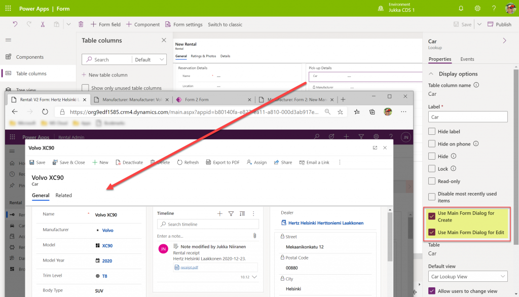
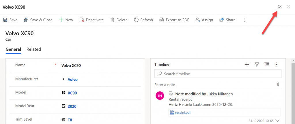
    Our approach was to leverage the Quick View Form to bring in fields from the related parental table (Car) onto the child table (Rental) form. To make the data entry and editing easier we enabled the Main Form Dialog feature for the Car lookup field, which then opens the form in a modal window.

    While this UX is a lot nicer than navigating between full screen forms and page loads, it’s still not all that seamless. The user will be very much aware of the fact that he/she is working on two different tables, while ultimately we’d want to show just a single page that abstracts away all this complexity of the underlying relational data model.

    What is the Form Component Control?

    First of all, it doesn’t have a very sexy name, that’s for sure. During the past few days of exploring the feature, I’ve had to repeatedly go back to the documentation to see what the name was. Even the product team’s announcement “editing related records on a main form in a model driven app” doesn’t sound very exciting. There’s a lot easier way to describe it:

    Forms within forms.

    It’s simple, and it’s very powerful. Unlike the CRM 2013 era feature of Quick View Forms, there’s no requirement to keep the forms as “view only” , nor particularly “quick” in terms of their contents. It’s just regular forms, and they can be used within other regular forms – full edit capabilities included.

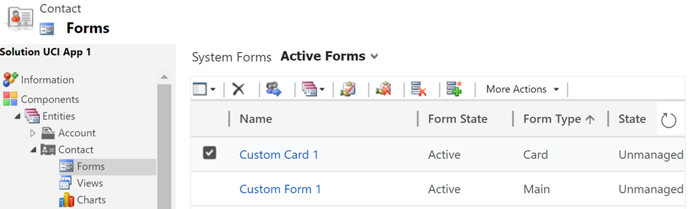
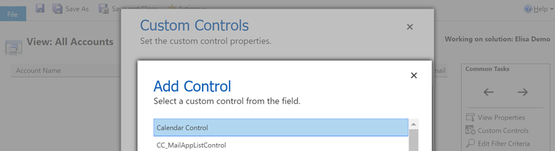
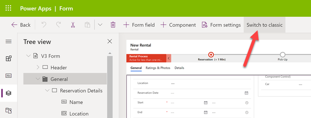
    Let’s add a Form Component Control onto our form and see how it works. Unlike with the Main Form Dialog feature discussed in part 1, this Form Component Control feature is unfortunately not yet available in the modern Power Apps form editor. So, we start with what we still need to do very often in the world of Model-driven apps, meaning hit the “Switch to classic” button to launch the classic Solution Explorer that dates back to CRM 2011.

    On the form where we have a lookup field (in our case the Car lookup on the Rental form), let’s open its properties dialog, go to the Controls tab and click “Add control”. We can see the MS provided PCF control “Form Component Control” in there. Adding it and setting it to be the default control for our web client is easy, but the configuration requires some additional information that doesn’t have a graphical UI (maybe in the modern form editor then once this feature is supported there).

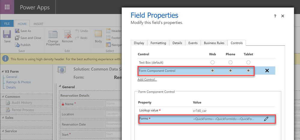
    See the MS documentation page for the detailed steps to take. In short, you’ll need an XML entry that contains the table name (entityname) and the form ID of the main form you want to show for the related table. My configuration looks like this:

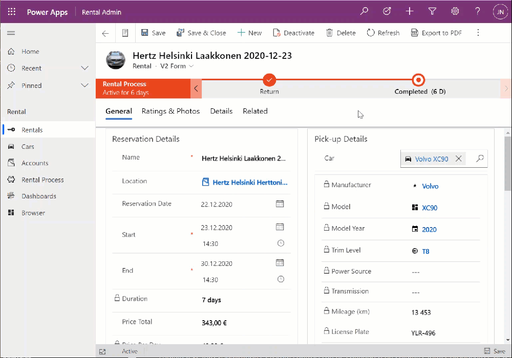
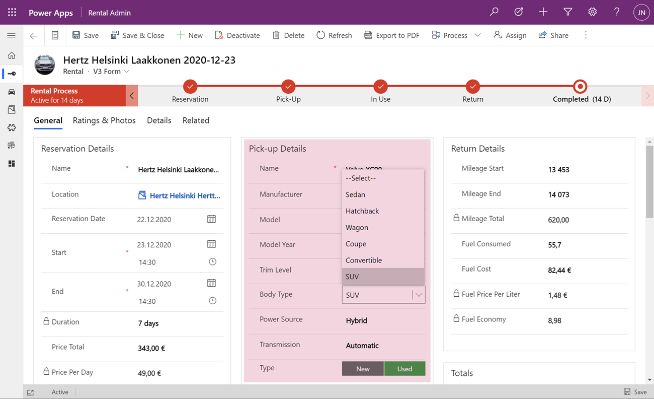
    <QuickForms><QuickFormIds><QuickFormId entityname="cr7d0_car">2F3B241A-4E3F-4AE3-A26F-1AB7BF804636</QuickFormId></QuickFormIds></QuickForms>

    Let’s publish the changes and go test out the experience of editing an existing Rental record where the Car record’s fields have been partially populated. On the place where I previously had the Quick View Form with its locked fields, there are now fields coming from the Car table form. Text fields, lookups, choice fields – they all work exactly the way they would if I was editing data that’s natively stored on the Rental record, rather than the related Car record.

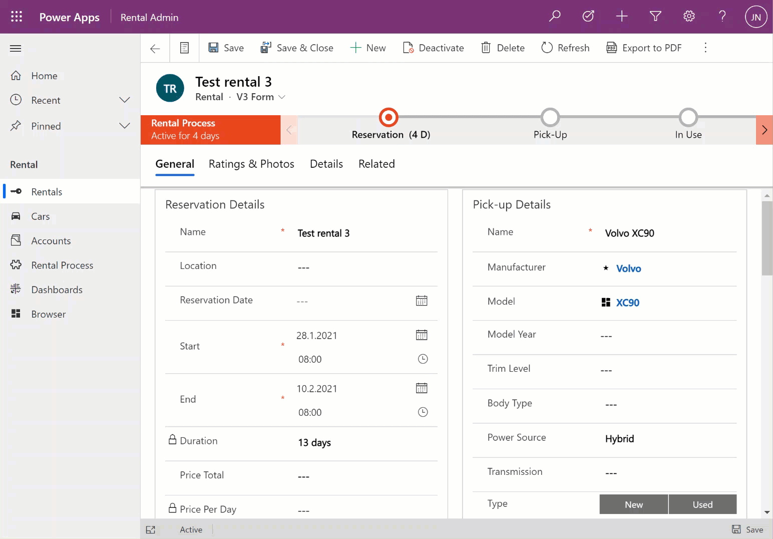
    The save event happens as part of the hosting form, no additional tricks required. Field validation, notifications and error handling is also integrated, regardless of whether the business logic comes from the main form or the embedded form (details in the Docs).

    All in all, this works incredibly well from a user experience perspective in my initial tests. Even if you’re a Dynamics 365 or Power Apps professional you might not realize that the form actually blends two different tables into a single form.

    Main form rendering options via Form Component Control

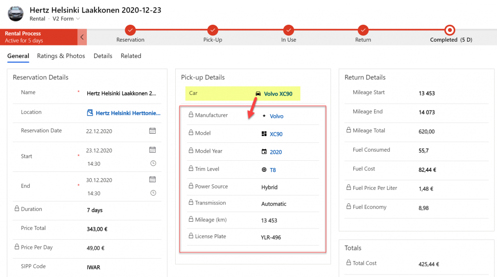
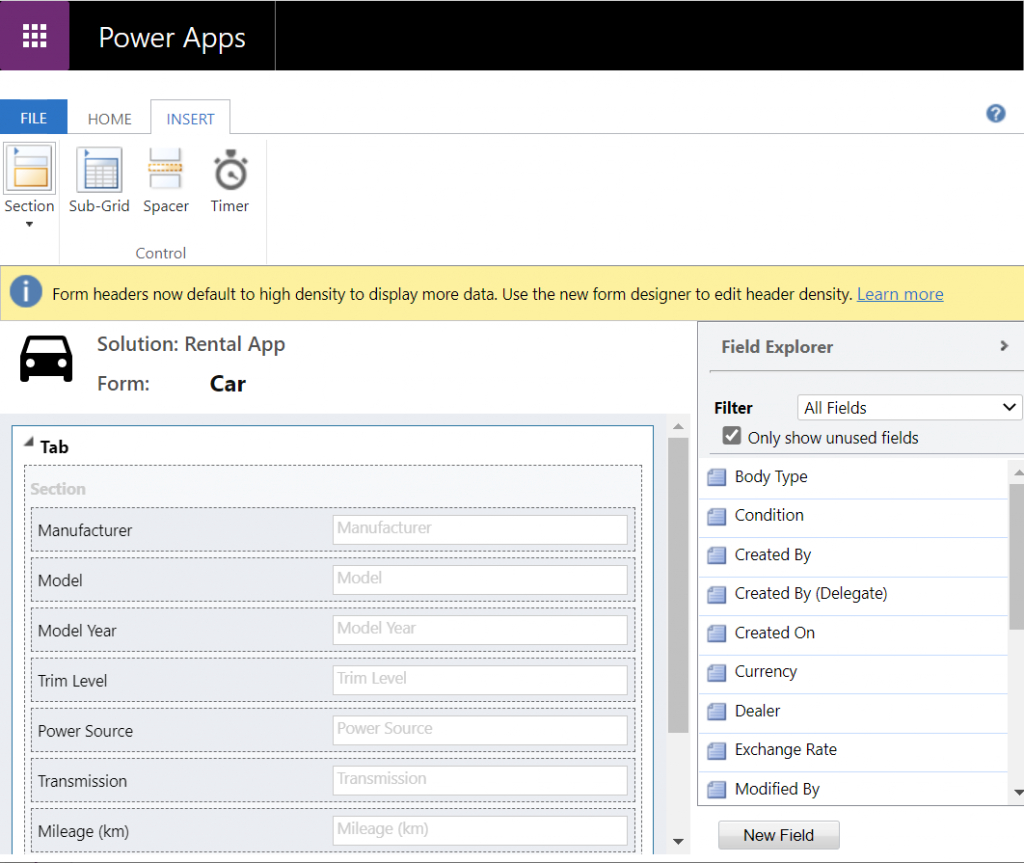
    With the old Quick View Form feature, there was a separate form type you had to create for the table for this specific purpose. It was far more limited in contents and layout than the full table forms, which kind of made sense for the purposes of bringing a few key fields in read-only mode onto a the actual main form of a different table. QVF allowed single column only + no other useful controls than the subgrid:

    The Form Component Control knows no such boundaries. What you can use there are the existing or new main forms for any table. If you place them within a single narrow column on a multi-column form tab, then all of the form contents will be rendered within that column. Since the Unified Interface forms are inherently responsive by default (which is a big benefit compared to Canvas app screens), everything will just reflow into a layout that would resemble a phone screen – even if you’re viewing the form on a widescreen PC monitor.

    What about if we give the Form Component Control a bit more space than a 1/3 of a typical Model-driven table form? The reflow also works the other way around, meaning all of the available screen space will be used. If the area given to FCC can accommodate more columns and the source form has them, they’ll be rendered just like on the “native” viewing experience of that form.

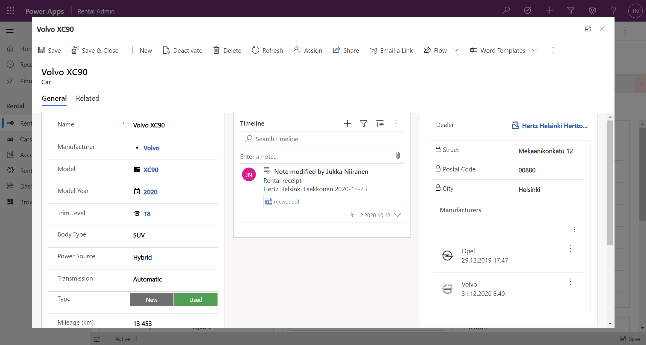
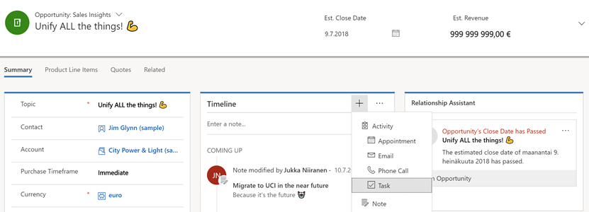
    Below is an example of an alternative form design for the Rental table. Instead of having the related Car shown in the middle of the first form tab, I’ve added a second form tab “Car” and dedicated all the space available in it to a single lookup field that has the FCC control enabled. You’ll see from the static Business Process Flow and the form header that we’re firmly on the Rental form all the time, but the second Car tab shows things like the Timeline for that car record (with a note), further tabs for the car’s Dealer, even a Quick View Form referencing the dealer account related to the Car record – all within on FCC control.

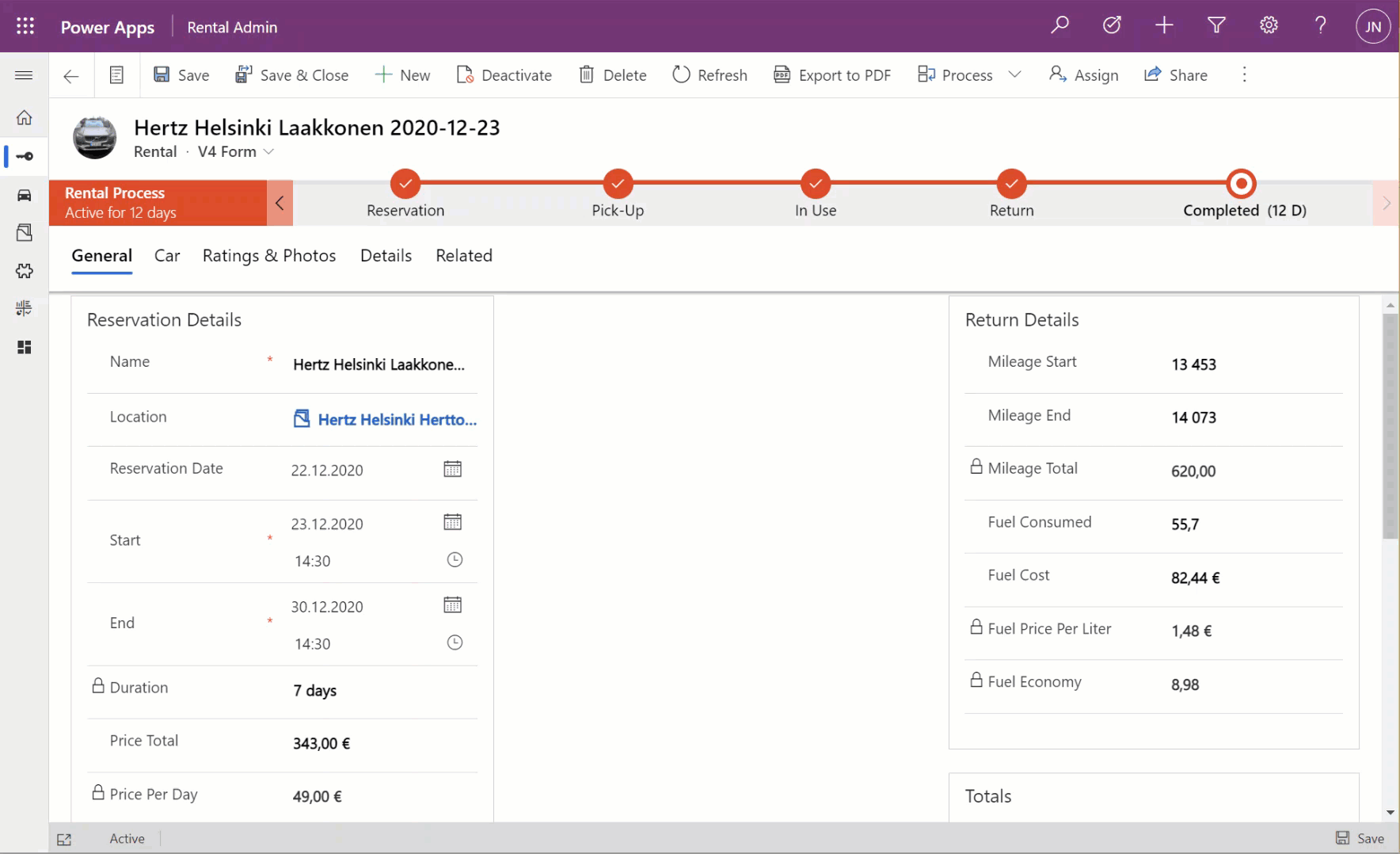
    This to me is just mind-blowing! We are reaching Inception level UX here, with the main forms embedded AND rendered as a full form tab within another form. I could be on the Rental record form, adding an activity via the Timeline control that’s actually linked to the parental Car record. Not the Rental record where the app navigation, form header, Command Bar and everything else visible on the screen is telling me I’m on. I’ve effectively built a form UI that defies the laws of nature I’ve come to expect from Model-driven apps.

    Sure, embedded Canvas apps could do some magic like this already earlier. The big difference is that the user interface of those screens could never match exactly that of a Model-driven app. With FCC there are no visual clues distracting the UX, as everything looks and feels like it’s part of the native experience where Microsoft owns and manages the visual side.

    What about record creation instead of edit?

    The one gap that exists in the inline editing story for Microsoft’s controls like the Editable Grid or this new Form Component Control is that there’s no possibility to use them for adding new rows into a table. They offer the edit experience, but no create experience. Sure, we have the Quick Create Forms feature available for contextual data entry, but it’s not really optimal. The user shouldn’t have to think about if they are editing existing entries or creating new ones. Yes, the difference between these concepts matters to the platform on a technical level. Still, unless there’s a valid business process requirement for making the data entry experience different for create and update scenarios, it’s something I’d prefer to eliminate from the UI.

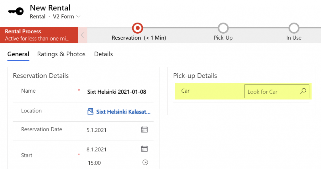
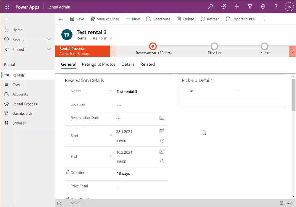
    When there’s a scenario where we essentially have a one-to-one relationship between tables (no “real” 1:1 relationship exists in Dataverse, but there are ways to fake it), one option would be to automatically create the related parental record behind the scenes. With this approach, at the moment when the user will proceed to entering data via the Form Component Control, the lookup field will already be populated and the experience will look pretty seamless:

    What I’ve done here is to create a classic XRM workflow that runs in real-time, triggered by the create event of the Rental record. (Power Automate can’t do real-time yet, so it’s a no go for flow in this case.) The workflow will create a Car record with a placeholder name “(Undefined)” and link it to the Rental record. By the time the first save event for the new Rental record takes place, the FCC can then render the fields from this placeholder Car record on the Rental form.

    In the above example GIF animation you may also spot that the Car name changes transparently from “(Undefined)” to “BMW”, due to what has been selected in the Manufacturer field. This again is another real-time workflow that’s triggered by the update event of the Car record. The end user will not need to take any actions, it’s all just the native autosave feature of Model-driven apps that populates this name field while the user is still entering data into other fields further down the Car form.

    Considerations

    If the new Form Component Control gives us not just the read capabilities from Quick View Forms but also data edit support, then should we just stop using Quick View Forms altogether? Well, it certainly is a good question. Given that QVF dates back to the CRM 2013 era user interface technologies, FCC is much more in touch with how the modern Unified Interface client has been designed to work. It’s built using the Power Apps component framework (PCF) and should in theory be the most future proof choice for Model-driven app form design.

    One downside is that the use of FCC for the pure view scenario is a bit more laborious. If we indeed would want to prevent the user from updating values from the parental record while on the child form, then these fields would need to be set as read-only on the main form itself. Which brings us to the challenge that you’ll need to keep more forms visible in the Model-driven app, whereas classic QVF’s are hidden behind the scenes and only applied as the definition when rendering the main form on which they are used.

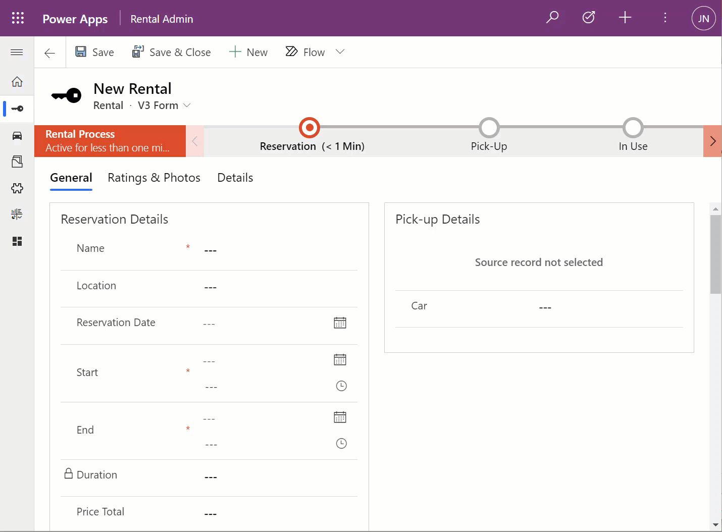
    The create scenario I talked about earlier is also a bit of challenge when analyzed deeper. If indeed the lookup from which the Form Component Control gets the related parental table record to show isn’t populated immediately, you’ll see a message saying “source record not selected”. In most cases that’s going to be quite a confusing message for the end user to encounter, given they are unlikely to have any idea about the forms magic and relational tables being used in to construct the app’s UI.

    “Couldn’t we just hide that control until it the lookup has data?” Well, I can’t think of a no-code way to achieve this. You see, the problem is that the FCC essentially is the same field as the lookup field. Sure, you can have multiple instances of it on the same Model-driven app form. But you can’t use Business Rules to say “hide this field if this other field is empty”, because they are the one and the same. Quick View Forms handle this scenario much better, so let’s hope Microsoft will improve the functionality in FCC to accommodate this create/hide scenario better in future releases.

    WE NEED TO GO DEEPER Inception

    This first public preview release of the Form Component Control has a few limitations that you should be aware of. For instance, you can’t show more than a single tab from the form being rendered via FCC, which isn’t really a big issue unless you really are building an Inception app to confuse the hell out of the classic CRM users at least. Similarly, you can’t have FCC’s within FCC’s, which blocks some crazy recursion scenarios.

  • Relational data on Model-driven forms, part 1: Main Form Dialog

    Relational data on Model-driven forms, part 1: Main Form Dialog

    Model-driven Power Apps are built on top of the relational data model of Microsoft Dataverse (formerly CDS). Planning how you split your business data into different tables is a crucial step in ensuring that your app’s user experience (UX) is optimal for the data entry, consumption and update tasks that the users will need to live with. This is because unlike with Canvas Power Apps, the data model defines much of the user interface behaviour as well.

    The key thing to keep in mind is that you’re not supposed to build the most normalized data model possible, where every concept in your business process is spun into its own little table. Yes, you do want to leverage the power of relationships (one-to-many, many-to-one, and on some rare occasions also many-to-many) to make the data more manageable than a single flat list structure would offer. No, you don’t want to make your users have to think about the Entity Relationship Diagram (ERD) of the system to know how to navigate within your app.

    Despite of the tight coupling of the data model and the UI, there are plenty of things you can configure on Model-driven forms to improve usability. I’ll be drilling into a few recent features that can make it easier to work with related tables from within a single form.

    The scenario: Rental Car app

    I’ll be using an example app that I’ve built for my own purposes: Rental Car App. It contains functionality that allows me to track and analyze information about the rental cars that I use, by adding new Rental records for each reservation I make and then tracking the process all the way until the final invoice and related costs. At the heart of the app there’s the Rental table, which has relationships to both the rental car company information (Account table) as well as the Car table, which again links to a few supporting tables like Manufacturer and Model.

    The rental process stages are modelled via the Business Process Flow feature of Power Apps Model-driven apps. We start with 1) the reservation, then proceed to 2) pick-up at the chosen location, 3) use the car we’ve been given, 4) return it and 5) finalize the process upon ensuring we’ve captured all the required data and that the invoice was what we expected to pay.

    Each rental event will have one car associated with it. However, at the first step of the process, meaning reservation time, we won’t yet have any idea what specific vehicle that will be. (You’ll only know the ACRISS code that describes the level of the vehicle features, like “IWAR” for Intermediate, Wagon, Automatic, Air Conditioning.) Once we get to stage 2 of the process, the pick-up, we’ll be given a specific car that we can describe with properties like Manufacturer, Model, Model Year, Trim Level and so on.

    Car is the parent table of Rental, since there can only ever be a single vehicle for one rental event (for now, let’s ignore the possibility of the car breaking down and getting exchanged during the rental period). A single car will of course be used in many, many rental events. However, since the app user is the customer who’s consuming the rental service from different car rental companies, we won’t have the fleet of vehicles defined in advance for our database. The data entry of the car’s details is therefore always a step within the context of the rental process.

    So, we know that logically the car is a different type of object than the rental event, which is why it should have its own table. From a user experience perspective, though, filling in the details of the car should be just a similar task as describing the duration or price of the rental car reservation. Just a set of fields on the single form. Yet by default what the Model-driven app form will give us is a single lookup field to the related table’s car record, with the expectation that we’d go and work with the Car data on a different form than the Rental form where the rest of the details are.

    Despite of the underlying 1-to-N relationship in the data model, we can improve the user experience by leveraging a couple of neat features in Model-driven apps.

    Quick View Forms

    Model-driven Power Apps have evolved from the XRM platform that Microsoft first used for builing a CRM product of their own in 2003. Around seven years ago when Dynamics CRM 2013 was launched, it introduced this new and exciting “flat UI”. Before that, the experience of using CRM was often a maze of popup windows since opening a new record always gave you a new browser window you now had to juggle on your desktop.

    The boundaries of different entities (which is what tables were called for the first 17 years of the platform we now know as Dataverse) were therefore very tangible indeed. While form subgrids were launched in 2011 to offer some relief, it wasn’t until 2013 when we could start to make the users worry less about the data model and focus more on the business process and actual business data involved in it. A key element in this was the Quick View Form.

    Above is a screenshot from seven years ago of a case entity form that included data from not just the child entities like activities, but also from the parental record of the customer, via a Quick View Form. We can see the email and phone number of the customer, event though they are physically stored on the account entity. It’s not limited to just that N:1 data from “case:account” either, as we can reach down to N:1:N of “case:account:case” by showing all the related cases that this customer has recently opened with our support department.

    Quick View Forms were a seriously powerful feature back when they were released. I did some blogging to demonstrate the possibilities, like building a similar opportunity analytics feature that resembled (well, remotely at least) the concept of an ecommerce recommendation engine that shows “customers who bought this item also bought these other items”.

    The scenario in our Rental Car app is a lot more straightforward. We want to display the key properties of the Car record associated with the Rental record within the form that drives the rental process. By having a lookup field for Car on the form, this allows us to add a Quick View Form control to show the Car table fields embedded on the Rental table form:

    From this static screenshot it would seem like everything is in its right place and the user couldn’t be happier. Right? Well, the challenge here is that the Quick View Form really is just a view. It doesn’t allow editing any of the field values on the related parental table record, let alone creating new records. In short, it’s not as actionable as the data living natively in the Rental table.

    Main Form Dialog (MFD)

    A much more recent entrant into our Power Platform low-code toolkit for designing Model-driven application UI’s is the Main Form Dialog feature. What this allows you to do is to launch a modal window from the lookup field on a Model-driven app form. The user interface doesn’t actually move you fully away from the original record, rather it just renders the (Main) Form of the chosen record from a different table in a Dialog window. It’s not like the CRM 2011 era popup windows, since you remain within the same browser window/tab. Once you’re done with looking at the related record, clicking “X” will return you to exactly same state where you were before clicking in the lookup field. It’s not as jarring an experience as if you’d have fully navigated away from the original form.

    Originally launched as part of 2020 Release Wave 1, the MFD feature was initially available only via the API. At this moment that is still what the documentation says, but I recently discovered that the modern Power Apps form designer now has graphical tools to configure this feature:

    When selecting a lookup field in the form editor, the properties dialog on the right now contains new options to check:

    • Use Main Form Dialog for Create
    • Use Main Form Dialog for Edit

    Oh yeah! We now have the power to keep the users from unintentionally navigating away from the “home” form that acts as the anchor for all relevant details concerning the business process. In the rental car example, the user can now safely click on the Car lookup, examine the available options for properties of the car, change the values, click “Save & Close”, then end up right back to where he or she started from:

    This also works for the experience of adding a new car record. Instead of having to offer a separate Quick Create Form experience for this step that would behave differently from any other occasion where the user interacts with car data, we can launch the full record form in the Main Form Dialog:

    The key benefit with this modal window approach is that there’s almost zero chance of the user wondering into the wrong menu or page of the application after they’re done with creating, editing or just viewing the related record. There is no visible page load that would change the mental context away from the primary record, in this case the Rental event.

    Considerations

    Should you enable the Main Form Dialog feature now on all your lookup fields? Probably not. There will be times when the user may prefer to actually move along in the process and change the context to the parental record. There is no navigation path available in MFD that would support this context change. The user has the option to launch the dialog in full screen mode, but that just expands it to cover the whole screen, rather than doing a page load that would change the navigation position in the sitemap.

    There is currently no way to select which form specifically should be opened in MFD. Presumably the form will be determined by the table’s main form order, as well as the specific form the particular user has last viewed. Depending on the number of scenarios where the same table is leveraged, the forms shown by MFD can therefore be unnecessarily complex for the task at hand.

    In part 2 I will explore the possibilities of how we can streamline this process even further and make the experience of working with related parental table data almost transparent to the user. We’ll be leveraging the brand new Form Component Control to essentially combine the features from the earlier Quick View Forms and Main Form Dialogs.

  • Unified Interface Form Design Notes

    Unified Interface Form Design Notes

    It’s been around a year since Microsoft announced that Dynamics 365 Customer Engagement would be moving from the world of separate web, mobile and Outlook clients into a single Unified Interface (or UCI, as in “Unified Client Infrastructure”). At that time I made a prediction that this level of shift in the client technology would be a long road, and to date that still pretty much holds true.

    Although V9 has been available for quite some time for new cloud instances and also existing customers have been upgrading as the version has become available for them a bit later, the majority of current Dynamics 365 CE users won’t yet be on UCI – at least for the desktop usage. MoCA was already replaced with UCI in V9, so the mobile UI is now on the new infrastructure, no choices there. For the web, there’s still a fair bit of capabilities not yet on Unified Interface, which makes it hard for customers to move over to it.

    Eventually everyone will need to migrate to UCI, though. It’s best to start exploring the scenarios where Unified Interface can fulfill the core needs and to gain the skills needed for designing great user experiences on this new client type. Even though the majority of the customizations will be rendered the same in UCI as on the current web client, there are still details that you should pay attention to. This is a collection of a few observations I’ve made when building a Dynamics 365 Customer Engagement App on UCI. Specifically, I’ll focus on the entity form rendering here, as a continuation of the previous post where I covered the new Card Form type.

    The Header

    Let’s start from the top. Form headers are where you would have previously placed up to 4 fields that you wanted to be always visible to the user when opening the form and scrolling down along it. Great for highlighting properties of the record that users needed to be aware of.

    In UCI there can still be just as many fields on the form header, but unfortunately they won’t always be shown. Even on a 1920*1080 screen resolution you may only see the first 2 fields on the form. The rest are hidden behind a small downward arrow icon that the user would have to discover and the click on to see the remaining header fields. I’m pretty sure most will never even realize the fields’ existence.

    When using a smaller mobile device screen the rendering changes quite significantly. Since on a vertical screen there’s no space for showing a header next to the record primary field (the name), in this form factor the header actually becomes the very first form section to be shown to the user. The nice thing is that it’s really “in your face” for the user. The downside is that this may not be the most logical information to be shown at the start of the form – or at least it will differ from what the user might expect to find there. Especially when creating new records these header fields rarely are the ones where you’d start the data entry process.

    For now, I don’t really have a good guidelince on how to consistently leverage the form header with UCI. You probably want to minimize the number of fields shown there, instead of capitalizing on the full 4 field opportunity, and stick to 1-2 fields max.

    The Footer

    Like the header fields, also the form footer has enjoyed a persistent presence on the XRM entity form. Now with UCI and Dynamics 365 CE, this is no longer the case. On a PC screen the fields do get shown, though, but not in a very nice way.

    As an example, a fairly common use case for the footer has been to present a few entity default fields that were hidden in CRM 2013 upgrade when the record properties dialog was removed from the UI. I’m referring to the created/modified on/by information, which can be very useful in determining the validity of the CRM data and persons responsible of the updates. You can still put them there, but currently the rendering looks so messy that I’d prefer not to show that to customers:

    The icons of these fields are often overlapping, even in full screen. This also highlights one of the current issues with UCI, meaning it doesn’t respect the user’s format settings and instead forces “AM” & “PM” upon users who live in a country where these concepts are never used. (Do also watch out for the date fields that sometimes reverse the order of day and month around, creating interesting results with things like appointment data entry.)

    The upside of the new design is that the footer fields don’t add up an extra row at the bottom, instead they are incorporated into the gray bar containing the record status and update indicators. This is very welcome, since in the old web client with especially entities using the BPF control, you’d sometimes have barely any vertical space left for working on the actual record fields, thanks to all the padding at the top & the bottom. Striking a balance with these responsive screen layouts surely isn’t an easy task for the engineers, with requirements for both information density and touch friendliness being presented to them.

    On a mobile screen you will not see the fields of the footer at all. It doesn’t appear to be rendered anywhere else on the form, so any information presented in this form section will be inaccessible in some scenarios. Much like the header, I would also advise not to put many fields in the footer if you plan on using Unified Interface (or if your users need them while out on the road).

    The Tabs

    The return of the visible tabs is certainly one of the big UX improvements compared to the old web client. Having these anchors visible right at the start of the form’s loading is a great help especially with information heavy forms like what accounts tend to have. Adding the “Related” menu to the end of the tab list to reveal the child entities is also much better than the mystery arrow in the middle of the old Nav Bar at the top of the screen. Left navigation and Proper Tabs, woo-hoo! Go UCI!

    Except that much like the header and footer, the tabs aren’t persistent either. The moment you start scrolling down the form, the tab labels get removed from the screen. Doh! Oh well, I guess we’ll just need to scroll down a bit further without the help of those anchors…

    Except we can’t. Once we reach the end of the tab, it’s a hard stop. No matter how much you spin your mouse wheel or swipe your finger on a touch screen, there will be no more of the form revealed to you. You see, in order to go further DOWN on the form you’ll need to scroll all the way UP, reveal the tab labels and then click/press on them. The longer your forms are, especially when reflown as a single column view on a smartphone screen, the longer it will take for your users to reach the next tab.

    Having the tabs as containers with hard boundaries might be an understandable design choice from a UX perspective. Getting lost on an endless list of scrolling fields and sections will not be fun for the users, so bringing some structure into this navigation experience is welcome. On the mobile form factor there’s also the Semantic Zoom option to help the user understand the form’s different tabs and sections. Just a shame that also the Semantic Zoom icon is hidden once move down an inch on the form…

    Here’s an idea to upvote: Ability to Dock “Tabs” on top of Unified Client Interface Tabs.

    We’re Getting There

    Despite of these few challenges, there is a lot to like about the way Unified Interface changes the user experience of entity forms:

    • Quick View Forms truly blend into the native form fields in UCI, whereas with the legacy web client the rendering was always quite clumsy.
    • Timeline is far better at exposing related activities, notes, posts than the earlier tabbed UI hiding most of the content.
    • Subgrids are actually actionable, with access to full grid features like sorting, select multiple.
    • Subgrid content rendering can be customized via custom control configuration options like Card Forms.
    • Business Process Flow consumes less vertical space (although BPF stage fields being hidden by default may cause challenges).
    • Visual hierarchy is much more obvious than even with the web client “refresh UI”.

    A big bonus is also the fact that by default you’ll get the same form customizations for desktop and for mobile users. It may or may not be suitable for real life mobile use cases, but at least you get the starting point for designing a mobile optimized UCI App to be targeted for specific scenarios that only need a subset of full form functionality.

    The key thing to keep in mind when considering the choice between the classic web client and UCI is this, though: UCI is the future. It will be continuously updated with more supported features and optimized for the end user experience with the latest browsers and devices. These updates don’t even require the customer to schedule their version upgrades via the CDU calendar, since from V9 onward all the Dynamics 365 online updates will be deployed automatically to customer environments. See the new continuous deployment policy that Microsoft just announced for more details.

    More and more areas of the classic XRM UI will be moved over to Unified Interface with every release. Although we don’t yet know any dates for end of support for the web client nor the target date for UCI’s full parity, the next wave of features in October 2018 release will be published as release notes on July 23rd at the Microsoft Business Application Summit. Better keep an eye on that one!

  • Card Forms and List Views in Unified Interface

    Card Forms and List Views in Unified Interface

    Since the beginning of time, meaning early days of MS CRM, we’ve grown accustomed to the fact that record fields in Dynamics 365 Customer Engagement can be presented either via entity forms or entity views. The entity form shows the editable fields of a single record, whereas the entity view gives us a list of many records from the same entity. Views used to be read only, but as Microsoft finally provided a first-party editable grid feature in December 2016 update for Dynamics 365, that blurred the lines between a view and a form to some extent.

    Showing views on a form has been possible since already 2011 when subgrids were introduced. Now with the expanding feature set of CDS for Apps and their Model-driven Apps (formerly XRM), it’s actually possible to also show forms within a view. No, not just any random form, as that wouldn’t really make all that much sense. After all, if you want to look at an actual entity form with several tabs and sections worth of data, you’re going to want to click away from the view and show the entity form in full screen mode. In Unified Interface there’s even a nice shortcut for you to keep browsing the other records in the source view without having to navigate away from the entity form you’ve opened:

    The scenario for showing form style content within a view is for a different type of a need: presenting several fields from one record in a view when there is no space available for showing columns side by side. This is of course related mostly to the vertical layout of a phone app that has more pixels available from top down than left to right. You could however encounter this type of a layout need when embedding views onto either forms or dashboards, with a narrow space available for any single record from the view to identify itself with its fields.

    The Unified Interface already has a built-in capability to address this scenario with its automatic reflow. If you take the “My Active Contacts” view as an example, when in the web client on a wider screen you’ll see the view columns in the traditional format. However, if you start making the screen (or “viewport” as the developers like to call it) more and more narrow, you’ll eventually reach a point where the presentation mode changes to remove all the columns & sideways scrolling bar, replaced with a card like UI. It will by default show the entity icon and the first three columns available in the original view definition.

    If you want to have more control over how the information would be presented in its compact, mobile friendly format, then the entity Card Form is a tool that you should take a look at. Available as one form type alongside the more familiar Main Form, Quick View Form and Quick Create Form, the Card Form was introduced originally with the Interactive Service Hub (ISH) client. Since this was a very limited client type that predated the Unified Interface, most customers and many consultants probably haven’t worked with it in the past. Now that Unified Interface is set to take over the world from the legacy web client sometime in the future, it’s about time to get familiar with these features.

    Unfortunately Microsoft doesn’t yet provide much documentation about the use of Card Forms. The references in the current documentation are also somewhat misleading, since the term “card form” is also used in reference to what is actually a Quick View Form. Many people will surely have an image in their minds about the Card Form being something like the example shown below. It is not.

    The customization UI in the application itself isn’t that helpful either. Out of the ~14 default forms that the contact entity currently has in a sales focused Dynamics 365 Customer Engagement instance, 4 forms contain the word “card” in their name, but only one is actually of the type Card Form!

    Ignore the false cards and head straight to either the default “Contact Card form”, or alternatively create a brand new one. You’ll land on the classic form editor experience that will present to you the fixed layout and available features of a Card Form:

    It looks like there are familiar elements from the Main Form available here: header, details, footer. What’s different is that there aren’t much properties you could play around with when it comes to the sections, meaning any labels or layout options that a traditional form would have. The maximum number of fields you can drag from the field explorer and drop onto the Card Form are:

    • Header: 3
    • Details: 4
    • Footer: 4

    Given that the intention is to provide just the key attributes of a record in a view, these numbers should be plenty. In fact, you might want to be cautious about not including too many fields onto the Card Form to keep it visually pleasing to the eye. As you’ll see from the example of how the form renders, there will be no form labels provided for any of the fields in the header or details sections, so be sure to only include the kind of fields that will be obvious to the user based on just the data of the field or the context in which the view is available (not just a bunch of date fields, for example). Also note that the footer currently appears to be expanded by default when the view renders, although there’s an upward arrow for you to collapse it for an individual record (you’d think this would be the other way around). You can control whether the footer is expanded by default or not by going to System Settings – General – Set the default card state for Interactive Dashboards.

    How will you then determine where this card form layout will appear? This is where the Custom Control Framework comes into play. We now have a control type in standard Dynamics 365 Customer Engagement called “Read Only Grid” that is different from the “Read-only Grid (default)” control. When you switch one of the clients (web, phone, tablet) to utilize this new control instead, you’ll get the option to link your default or custom Card Forms as the way how the view contents should be rendered. (more…)

  • In Praise Of Code and No-Code

    In Praise Of Code and No-Code

    Two weeks ago Neil Benson wrote an excellent article on LinkedIn, as a response to a claim that everyone working as a functional consultant in a Dynamics 365 project team should also know how to write code. This really resonated with me and I shared the article, along with a bit of commentary of my own. My post, in turn, started to gain quite a lot of traction on the LinkedIn feed. It looks like we had touched upon a topic of great interest within the network of CRM professionals.

    If you read my post above, it pretty much summarizes the main points I wish to bring out in this discussion:

    1. There is much more to ensuring Dynamics 365 project success than being able to do hands-on software development.
    2. A big chunk of the value delivered by Microsoft’s cloud platform is not relying on custom code development.
    3. The remaining chunk that is custom code driven work should be left to professional developers and not copy-paste heroes.

    There have been some very good arguments written in the comments section of the LinkedIn post, so I urge you to also view them for gaining greater perspective on the topic. I see a lot of resemblance with the “should designers code” meme in the original assumption that functional consultants would be able to do their jobs better if they also were familiar with developing custom code. Much of what has been said in the heat of that debate between coders and non-coders probably applies here, too:

    Alan Cooper’s four part article covers the dilemmas in general software development teams with such great insights and depth that I won’t even attempt to dive in the same direction here. In practical terms of a CRM project, when it comes to the availability of skills and experience needed in carrying out the wide range of tasks during the project’s lifecycle, the manager in charge of resources is always going to need to do some juggling. The less you ask the team members to juggle between completely different kinds tasks, the more likely they’ll able to focus on actual customer value generating activities rather than keeping all the balls in the air simultaneously. Here’s how Neil Benson put it:

    “Asking a functional consultant, with no formal computer science education or experience as a professional coder, to find and copy someone else’s JScript from Stackoverflow and paste it into your Dynamics solution is asking for trouble.”

    I don’t touch code myself but I do try to get my hands dirty on a wide variety of technologies. For example, today I spent a few hours getting familiar with Azure Service Bus, testing how without writing a single line of code I was able to push plugin execution context data into a cloud based message queue and work with it via a GUI in Azure Logic Apps. Now, I would never recommend myself as a person you should hire to set up your production ESB, but I do feel like I need to have a deeper understanding of these technologies than I could gain just by watching through the flashy demos in Microsoft keynotes. Seeing the different sides and reading/hearing what those with deep expertise on a particular technology have to say about it, that is essential. Going and actually trying to step into the shoes of an expert for that technology – probably an unnecessary detour.

    Skimming the bits from the top without diving deep into the dirty details of writing real code might sound like being afraid of all the complexity that awaits beneath the surface. However, the lack of code in a solution doesn’t mean that the complexity of the solution couldn’t be high. The CRM Tip Of The Day post “The story of the small change” perfectly illustrates the way in which individual configuration items built entirely via the graphical tools provided by MS can have dependencies that require you to have a rigorous testing process in place. It’s not just the changes of a system either, since you can easily use workflows and business rules to build a level of complexity into your business logic that doesn’t reveal itself in the test scenarios the consultant behind the design might have thought of. Whether you’re delivering the end product via code or configuration, bugs will sneak in there and eat away a part of your life – be it before or after production deployment.

    The argument for doing things via point’n’click configuration “because it’s so much faster to build” shouldn’t be the one and only argument. Yes, it is often much, much faster to put together the first iteration of a solution via graphical tools. This in itself can be a huge value for the business because you can validate the proposed solution quickly with the relevant stakeholders. Often you’ll only get to the actual requirements when demonstrating live parts of what the initial requirements said. Now, the main reason why Real Developers are often afraid of what “citizen developers” might come up with when given quick tools for building no-code apps is that they may lack the experience of seeing the full lifecycle of a business application. They’ll mistake the first PoC as being equivalent to the final production solution, with little thought given to the work that still remains ahead. This experience isn’t something you must necessarily gain via writing code yourself – a no-code functional consultant just needs to gain sufficient exposure to the various stages of the process via working as a part of the CRM project delivery team.

    I think we all need to be able to see “beyond code” when building solutions on top of platforms like Dynamics 365 Customer Engagement. Going full-on no-code in your design approach is probably going to unnecessarily limit the value that could be gained from an extensible application platform, forcing you to unsustainable workarounds and resulting in poor UX for the system end users. At the other end of the spectrum, always resorting to your custom built components before having a thorough analysis of the configuration capabilities and complementary cloud services found within your ecosystem of choice will likely increase the solution’s TCO and put the long term reliability of your complex business application at risk as changes in related processes, personnel and technologies occur over time.

    Please feel free to leave comments on how you see the role of code & no-code work evolving in Dynamics 365 projects.

  • From AppSource to Solutions to Dynamics 365 Apps

    From AppSource to Solutions to Dynamics 365 Apps

    In my previous blog post I presented the various different meanings that an App can have in Dynamics 365 Customer Engagement. Now that we’re aware of this jungle, let’s grab a machete and start making our way deeper into the heart of it, to understand how a system customizer can survive in there.

    Before there was Microsoft AppSource for Dynamics 365, the methods available for distributing apps in a generic sense were pretty basic: you downloaded a zip file (or several) from a location provided by some party, then navigated to the solutions menu in your XRM environment and started importing them. When there were updates to those apps, you needed to repeat the procedure. If there were some other configuration steps needed in getting the application properly set up, you had to read the friendly manual and complete those. In a more tech savvy environment the Package Deployer might have been used here, but that was hardly a task for the accidental CRM administrator.

    What AppSource aims to change in the Dynamics 365 app distribution process is similar to what the smartphone app stores did a decade ago, i.e. simplify the steps for the customer and also provide a better channel for app developers to deliver their updates. When you go to AppSource and choose to either install a free App or start a trial on a paid one, the next screen will provide an instance selector to determine where in your Office 365 tenant you want to put this App in. Also presented are the checkboxes for agreeing on both Microsoft’s as well as the ISV’s legal terms.

    From here you’ll be taken into Dynamics 365 Administration Center. This part of the process nor the UI of the admin center isn’t very intuitive, so let’s pause here for a moment. While you’ll land on the Solutions view of an Instance after clicking on “Agree”, on the logical level we should be paying attention to the Applications tab instead. The chosen ISV (or MS) App will have been added as a row in the applications list, which applies to the whole tenant. In this example we see that North52 Business Process Activities is now available in our tenant. It doesn’t have any configuration options in this UI, but the Microsoft apps like Portal Add-on or Voice of the Customer both have an additional “Configure” button that is accessed via this Manage Applications screen.

    If we click back to the Instances tab in the admin center, select one of our instances and click the Solutions icon on the right side, we’re now presented with the list of solutions available to this instance via the AppSource delivery channel. It is not the same as going to your XRM instance and clicking Settings – Solutions, as there can be more solutions within that instance. For example, the organization specific solutions that you’ve created as a container for your own customizations. Not even the managed/unmanaged status of those solution has anything to do with what’s shown in the admin center, because whatever zip files you imported directly into your XRM instance as a solution is only visible from within the XRM UI.

    The solutions list in the admin center is also different in the way that it shows also the solutions you haven’t installed in the instance. These are applications that someone, either MS or your D365 admin, has made available in your tenant and possibly installed them into some other instance (a test sandbox, for example). To get them installed you don’t have to go to AppSource, rather you can start the process from here.

    What makes this view so relevant for the Dynamics 365 instance administrator is that here’s where you’ll see what solutions have upgrades available. In the above example, Microsoft has released a new version of the Relationship Insights solution. Since they don’t want to accidentally break your dev/test/production orgs by changing the solutions on their own, they are rather giving you the controls to click on the “Update” icon for the particular instance when you’re ready for it. This same process is applied also for third party ISV solutions to deliver updated versions of their apps.

    Now when we have deployed the app from AppSource and the Solutions view in the Dynamics 365 Administration Center for our chosen instance shows the status as “installed”, let’s use the Office 365 app launched to navigate to our Dynamics 365 start page, meaning home.dynamics.com. And… there’s nothing new here. Even if we click the “Sync” button to refresh the My Apps view, our AppSource app doesn’t appear. What gives?

    At this point we need to take a step back from the UI and think about how these different components relate with one another. On the highest level we have AppSource, which is more of a marketing UI for products. From there we get Applications into our Dynamics 365 Administration Center. These manifest themselves as single solution rows for an instance when viewed via the admin center, but they can actually contain N separate solution files (look at Dynamics 365 Portals, for example). Finally, these solutions may or may not contain Apps – from 0 to N. This diagram illustrates these four conceptual levels and their relationships:

    In our example we’ve installed North52, which is an administrator/customizer tool designed for “building simple or complex business rules using point-click editor, eliminating C# and JavaScript coding”. In short, it’s an app for configuring apps, but it’s not a business app in itself. That doesn’t mean it wouldn’t need a UI, of course, but the Command Bar shortcuts and the dedicated home page web resource with navigation options quite frankly is much better suited for this type of a power user tool than the new Unified Interface apps that are supposed to work even on 4″ mobile phone screens.

    This brings us back to the App Module concept that was briefly mentioned in my earlier blog post. Before V9 and the Unified Interface there wasn’t so much benefit in building separate Apps for different functional areas of the XRM platform, as we had the one master UI for the instance available anyway. When the features are migrated over to the new Unified Interface, basically everything must be an App. In v9.0 we’ve yet to see how the more complex admin features will be implemented as Unified Interface versions, so currently it’s a somewhat jarring experience of 2011 meets 2018 for the system customizers.

    Even when all the actual business application functionality has moved over to Unified Interface, there will still be many scenarios in which presenting an AppSource app as a Dynamics 365 App Module App doesn’t necessarily make any sense. UI extensions like Checklists will not have much use outside the actual business entity in which they are used. Any app that connects to an external web service to enrich the contents of Dynamics 365 records mainly needs a configuration admin UI somewhere. Sure, there’s nothing stopping developers from using the App Designer to define an App for their solutions, since all you technically need is a single HTML web resource to publish an App with a single menu item. However, separating the tool from the XRM instance in which it lives isn’t going to make the UX of configuring features any easier, so I’m not really hoping for the app clutter to increase this way.

    Both the AppSource marketplace and the App Module in Dynamics 365 Customer Engagement provide significant improvement on how the business application features can be presented to business users and decision makers. What they don’t do is completely remove the need for Dynamics 365 system administrators to understand how the various layers and parts of the application platform are wired. XRM will likely remain an environment that’s just inherently more complex than an iPhone screen with its pretty app icons lined up just the way the single device user likes to see them.

  • Configuring Custom Controls for Views in Dynamics 365 CE V9

    Configuring Custom Controls for Views in Dynamics 365 CE V9

    The new Unified Interface that launched in v9.0 of Microsoft Dynamics 365 Customer Engagement gave us all the possibility to try out the next generation CRM user experience in new trial orgs or sandboxes. While the CDU process for upgrading existing customer environments to V9 has not yet been made available by Microsoft (which gives them some time to iron out the remaining wrinkles with a steady stream of Service Updates), now’s a good time to explore what’s new and what’s changing with the imminent arrival of Unified Interface.

    One of the most exciting platform enhancements from a developer perspective is surely the arrival of the Custom Control Framework. Known as CCF for short (no, not that Microsoft CCF you senior members of the community might recall), this is essentially the mechanism through which all of the data visualization in the XRM platform will be handled in the Unified Interface. Not just the custom developed UI components from partners but also everything that Microsoft builds. Take a look at the default solution of a V9 org and you’ll already see a wealth of these components listed in there:

    The bad news is that as of now there’s no documentation nor API available for developers to build new or extend existing controls via CCF. It’s coming, but it just ain’t ready quite yet. In the meantime, us system customizers can get familiar with the concept by tinkering with the configuration options that ship with V9.

    Custom Controls for Views

    Back when the Editable Grid first launched, the feature was rolled out in an “all or nothing” style. What this meant was that you were able to enable it on the entity level, but then it was the only view type that any user would see in the UI (at least in the specified client type). Sure, they were given the option to switch from editable to classic read-only grid if they spotted the option, but the system customizer wasn’t able to target the powers of Editable Grid to only views that actually benefited from this feature.

    V9 has taken this a step further and introduced a Custom Control setting for each individual entity view. This gives us the option to set that only a specific view like “Edit Account Details” would only present the grid in the editable format with all the pros and UX cons that this particular control introduces over a read-only view. This doesn’t apply in the classic web UI (or the “Refreshed UI” as the V9 release refers to it) but on the Unified Interface side we can now see the power that this granular control over controls has on the user experience.

    New View Controls in V9

    In addition to the Editable Grid, there are a number of other grid types that a V9 org presents as options for the system customizer. In the screenshot above you’ll see the Calendar Control having been chosen as the data visualization type for the view. This opens up a number of configuration options that can be set right in the UI, like the date field data sources, description label, colors and so on. What we see here is essentially an example of the point & click configurability that a CCF based control can offer when used in the Dynamics 365 CE solution.

    The Calendar Control is also responsive to the client type. When access via a browser app using the Unified Interface style (in this case a custom Subscription Management app), you’ll see a somewhat ugly legacy calendar with the week days presented horizontally. When viewed via the Dynamics 365 for Phones app it will render in a the above format of vertically stacked records per day. (Yes, those day of the week and month texts are presented in Finnish regardless of the app language setting being English, because that’s how Microsoft prefers things to be).

    There are also other control types available for views in V9 currently, such as Timeline Control. That specific control appears to require quite a specific format of source data that fits the scenario of the Company News Timeline solution, so you might not find it useful in your own customization work. What might be worth noticing is that there are in fact two separate read-only grids available in the current release: the default one and the Read Only Grid with settings to control the entity card form and data reflow behavior.

  • Activity Management Enhancements in Dynamics 365 (v8.2)

    Activity Management Enhancements in Dynamics 365 (v8.2)

    Whenever a new version of Dynamics CRM and now Dynamics 365 (the XRM part) are released, the first thing you should review is the “what’s new” documentation that Microsoft produces for three different audiences: users, admins/customizers and developers. For the “December 2016 update for Dynamics 365” a.k.a version 8.2 of what used to be called CRM, these articles can be found from the following links:

    As always, there’s way more goodies in there that a single blog article could ever hope to cover in meaningful level of detail. One area that deserves a mention in terms of the core XRM platform enhancements is the way activities can now be presented in the UI, so let’s focus on those in this here post.

    Display the associated activities of the related entities

    If you’ve happened to read my ancient CRM 2011 era blog post about how subgrids ain’t what associated views used to be, then the concept of activity rollup may be familiar to you. The way Dynamics CRM has worked up to this point is that for out-of-the-box core entities like Account and Opportunity the activities from under the child entity were presented also under the parent entity’s Associated Activities View. If you created a custom entity under the Account, though, then none of the activities linked to it would show up in the rollup view. A major inconvenience for any XRM scenarios where you then had to instruct the users not to track their activities against any of the child entity records but rather put them all to the Account level.

    In v8.2 this limitation has now been addressed by the product team:

    “We added a new flag called Rollup View in the customization user interface, on the Relationship Behavior form. It lets customizers indicate that associated activities of the related entity should be included in the Activity Associated View for the primary entity.”

    Woo-hoo! Let’s go and try this one out in an example scenario with a custom entity called “Account Plan” that we’ve linked to the standard Account entity via N:1 relationship. Meaning: there can be several Account Plans (per year, for example) for a single Account. Being the “plan” and all, you’d find it pretty natural to track tasks and other upcoming activities against this record, but also would probably prefer to have access to them from under the parent Account of this plan.

    When we open up the relationship configuration screen and have a look at the Relationship Behavior section, we find our usual list of actions where cascading behavior can be configured. Down at the bottom there’s a new option: Rollup View. This is where the magic will happen for activity rollup between the two entities. (Note: if the field is disabled, make sure your entity is enabled for activities before trying to enable the Rollup View.)

    CRMv82_Associated_Actitivies_01

    With the Rollup View behavior set to “Cascade All”, we can now go and do some activity entry on the Account Plan form. Let’s use the Social Pane to add some tasks that are set regarding this particular plan. Normally this would be the only place where we’d see them (aside from the owner’s My Activities view and their task list synced to Outlook, of course), but thanks to our cascading relationship behavior this will no longer be the case. Let’s navigate up in the hierarchy towards the Account record.

    CRMv82_Associated_Actitivies_02

    Now, in addition to the activities that have been either directly set regarding the Account or one of the built-in roll-u enabled child entities, we also see those activities created from the Account Plan form listed in the Social Pane of the Account record. A tiny step towards the mythical “Customer 360”, but a major improvement nonetheless for ensuring the complete communication history for a particular customer account is easily accessible for the Dynamics 365 end user. In case you were wondering: yes, these child entity activities also roll up the account hierarchy, so a global group’s top account may end up having a BIG list of emails in its Social Pane.

    crmv82_associated_actitivies_03

    As for another follow-up question related to the article from five years ago: no, the activity subgrid still won’t show any of these “special” relationships. The feature is specific to the Activity Associated View, which is also a “special” thing in the XRM platform, supported by another “special” component called the Social Pane. The implications from this are laid out bare in the feature documentation:

    “The primary entity for the relationship must be Account, Contact, or Opportunity. This is because these are the only entity forms in the system where the Activity Associated View appears. You can’t specify any other primary entity for activity rollups.”

    So, this is not a generic Holy Grail to presenting activity data in XRM just the way we’d want to, but one big rock rolled in the ditch from that long road at least.

    Control how activities are sorted by date

    Another new feature in v8.2 that touches upon the same functional area is related to the Social Pane configuration options. Traditionally, these words would not have existed anywhere near each other – aside from the countless feature requests on MS Connect CRM Ideas forum. Everybody liked the CRM 2013 feature in terms of rich presentation and inline editing capabilities, and simultaneously loathed it for being a completely uncustomizable component placed smack in the middle of most XRM entity forms.

    (more…)

  • CDM: New Data Model For The Common Good?

    CDM: New Data Model For The Common Good?

    The first new component of the upcoming Dynamics 365 platform that has reached a stage of public preview is the Microsoft Common Data Model (CDM). Available via PowerApps, CDM can be provisioned in your Office 365 tenant with only a few clicks, so there’s little reason for not having a look an early look at it. In fact, you only need to sit back and relax while watching CRM MVP Scott Durow walk you through a first look at the Common Data Model:

    So, there you have it! That’s what CDM looks like when accessed via the PowerApps web management UI. Any questions?

    Yeah, I actually do have a couple.

    How will this work with CRM and AX?

    What we have available in the preview is pretty much the most straightforward part of the very big puzzle to put together, meaning a database on Azure with some preconfigured tables and data model management tools. We do not yet know much about how the Dynamics CRM and Dynamics AX functionality will be linked to CDM as part of the Dynamics 365 cloud platform, so there’s plenty room for speculation, which honestly is mostly what I’m about to do here. In a way I’m just continuing on the theme of my previous post about Dynamics 365 and its potential implications for XRM, to pass the time as we wait for Microsoft’s plans to be revealed in more detail.

    Right now the only way to push data into CDM is a Flow. If you’ve ever played with automation tools like IFTTT or Zapier, then you’ll quickly grasp the idea of Microsoft Flow. The application itself shouldn’t be underestimated just because of its current simplistic demo scenarios that usually are along the lines of “when a new row is added to a SharePoint list, send an email to this address”. Built on top of Azure Logic Apps, there’s actually a next generation BizTalk type of cloud integration platform under the hood, which should provide plenty of future potential for advanced messaging solutions to orchestrate business processes across a number of different systems.

    Flow_copy_CRM_account_to_CDM

    Once Dynamics 365 Enterprise arrives and gives us the features of CRM and AX in one seamless cloud environment, there’s naturally going to be a need for something a lot more than a “build your own” type of Flow integration. Keeping the Sales and Operations apps of D365 in sync with the customer and transaction data managed in the process of making an delivering a sale involves a fair amount of business logic. If you’ve ever designed and developed a custom integration for this type of a scenario, you’ll know the requirements can quickly grow a bit hairy. Assuming Microsoft can come along and say “we’ll take care of that hairy part, don’t you worry about it” then who could resist it?

    The reason CDM exists is that there will be more than one physical database in the Dynamics 365 suite. It’s not all XRM, which means you can’t find the Operations app entities inside your CRM solution files. For the business processes to work seamlessly, someone needs to keep those database closely in sync with one another. From reading through the Common Data Model tutorials, we can see that at least as of now, Flow is not the system that can handle it:

    “Today, when you use Microsoft Flow to import data or export data, it is not a full synchronization service. Whenever an object is added to one service, it will be imported into the other system. However, that means if an object is deleted from one system it will not be deleted in the other system.”

    So, the sync part is still in the “To Be Implemented” bucket. So is security, since the passing of a record from CRM to CDM via Flow will not carry over any details about who should have the rights to do some CRUD work on it. Again, it may not sound like such a mission impossible to build. However, if you’ve ever faced the requirement in a Dynamics CRM project to implement SharePoint document library integration with account records that includes not just linking the folders but also enforcing the account access rights on the documents, you’ll know the struggle is real. Sure, a collaboration solution like SharePoint has very different security concepts than a system designed for structured business records management like CRM or ERP. But if Microsoft hasn’t been able to offer OoB synchronization of access rights across Dynamics CRM and SharePoint despite of the clear business demand for it, maybe we’d be foolish to expect that it will all be seamless inside the Dynamics 365 world either.

    The thing here is that unless the solution provided by Microsoft is going to be fairly advanced, it might not be an actual solution. It’s like the old saying from the dawn of the internet:

    Some people, when confronted with a problem, think “I know, I’ll use regular expressions.” Now they have two problems.

    When confronted with the need to integrate processes across two different cloud business applications, there’s always the danger of someone rushing into thinking “I know, I’ll build a database in the middle to unify the process data”. So we end up with three cloud business applications… Now, I’m not saying that Microsoft wouldn’t have the type of application architecture masterminds working on the Dynamics 365 platform that can solve these complex problems when developing a new product. I’m just afraid that things may still turn out a bit more complex in reality than the marketing pitch for the new product launch might lead people to believe.

    What limitations will this impose on customization?

    The one reason why many of us love the capabilities of the Dynamics XRM platform is the awesome flexibility it offers us to customize the application to meet the specific needs of customers. And by “customize” I actually mean “configure”, since these days you can build such amazing features for business users without writing a single line of Javascript or C#. With Dynamics 365 now promising to deliver so many preconfigured apps for different departments’ needs, as well as making them all work together, I bet some of us are thinking about whether there’s a potential threat to the platform’s flexibility buried in the new approach Microsoft is taking. (more…)

  • A Million Voices: VoC Survey Results Analysis

    A Million Voices: VoC Survey Results Analysis

    A few weeks ago I launched a demo survey built on Voice of the Customer, the brand new survey tool from Microsoft. The goals I had for this exercise were twofold: 1) see how these type of interactive tools could be used in live events like eXtremeCRM 2016 Warsaw, and 2) gain some experience on what it is actually like to work with incoming survey response data inside Dynamics CRM. In this post I’ll mainly be focusing on the latter one, although the example data we’ll be looking at are the live answers you & other readers of this blog submitted via the eXtreme MVP Survey.

    VoC_survey_page

    As you may know, Voice of the Customer (or VoC as we’ll refer to it from now on) is a pure XRM solution. Although the actual customer facing survey forms are of course not presented via the Dynamics CRM client UI, everything that you use for configuring the survey questions and logic, as well as the incoming survey responses, is managed with CRM entities and stored into the CRM database. The reason this is such a big deal is that most of you will already possess the skills needed for leveraging such data via views, charts and dashboards as it’s just XRM all the way. Furthermore, you’re free to design business processes around the survey functionality with tools like real-time workflows or business rules. Naturally you’re also able to interact with the survey entities and records via the latest CRM Web API, should you come across some integration scenarios where data needs to either flow in or out to another system.

    The flip side of this coin is that VoC is unfortunately very XRM-ish to work with. If you compared it to dedicated survey apps that do nothing but questionnaire design (like SurveyMonkey, Surveypal and the likes), survey publishing and response data analysis, then there’s still quite a big gap for Microsoft to work on bridging when it comes to the end user experience of this tool. In a way this is quite understandable since the value proposition of VoC really is all about the tight integration with your customer data and the ability to send survey invitations automatically as a part of your customer facing processes; such as a survey link being emailed to a customer after a support case is closed in CRM, to gather quick ratings and design automatic escalation paths if the KPI’s are not met. Nevertheless, since VoC does also support creating pretty advanced surveys for collecting quantitative data from a broad target group in more traditional campaign style satisfaction surveys, as well as anonymous survey links presented on website, it’s good to understand what it’s like analyzing such data inside Dynamics CRM.

    VoC_Survey_Summary_report

    There are a lot of components in the VoC solution right out of the box. First off, there are four SSRS reports: Survey Summary, Question Summary, Net Promoter Score and Survey Export. The first two are general purpose reports with tables and charts summarizing the data either across a single survey or a specific question, as illustrated in the screenshots shown here. The NPS report is naturally aimed for this particular survey type, whereas the export one is a single huge matrix for dumping out the raw survey response data into Excel for further manipulation.

    VoC_Question_Summary_report

    For more interactive data analysis there are eight dashboards in the VoC solution. However, these may not be all that useful for many real life scenarios, since they suffer from the same limitation as all Dynamics CRM dashboards: there are no global filters you can apply for all the dashboard components. Meaning, unlike with an SSRS report launched from CRM, you can’t set the context of the dashboard to be a specific survey. Yes, with the new “interactive experience dashboards” introduced in CRM 2016 you do get this type of filters, but since right now those features are limited to the Interactive Service Hub only (which in turn has a fair number of limitations for general use), it’s not exactly the kind of solution we’d need right here.

    That doesn’t mean we couldn’t build pretty dashboards to summarize our survey responses, though. I had a go at this with the eXtreme MVP Survey and it turned out pretty well. Have a look (click for a larger image):

    VoC_eXtremeMVP_dashboard_page_1_small

    In the survey form I had three pages full of questions and I constructed the corresponding pages as personal CRM dashboards. This allowed me to both monitor the incoming responses during the survey data collection period as well as present the results to the audience at the MVP Showcase session in eXtremeCRM. It looks good, it appears very familiar to existing CRM users and it gets the job done without having to resort to any complex report development. (more…)