Since the beginning of time, meaning early days of MS CRM, we’ve grown accustomed to the fact that record fields in Dynamics 365 Customer Engagement can be presented either via entity forms or entity views. The entity form shows the editable fields of a single record, whereas the entity view gives us a list of many records from the same entity. Views used to be read only, but as Microsoft finally provided a first-party editable grid feature in December 2016 update for Dynamics 365, that blurred the lines between a view and a form to some extent.
Showing views on a form has been possible since already 2011 when subgrids were introduced. Now with the expanding feature set of CDS for Apps and their Model-driven Apps (formerly XRM), it’s actually possible to also show forms within a view. No, not just any random form, as that wouldn’t really make all that much sense. After all, if you want to look at an actual entity form with several tabs and sections worth of data, you’re going to want to click away from the view and show the entity form in full screen mode. In Unified Interface there’s even a nice shortcut for you to keep browsing the other records in the source view without having to navigate away from the entity form you’ve opened:
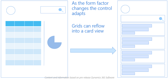
The scenario for showing form style content within a view is for a different type of a need: presenting several fields from one record in a view when there is no space available for showing columns side by side. This is of course related mostly to the vertical layout of a phone app that has more pixels available from top down than left to right. You could however encounter this type of a layout need when embedding views onto either forms or dashboards, with a narrow space available for any single record from the view to identify itself with its fields.
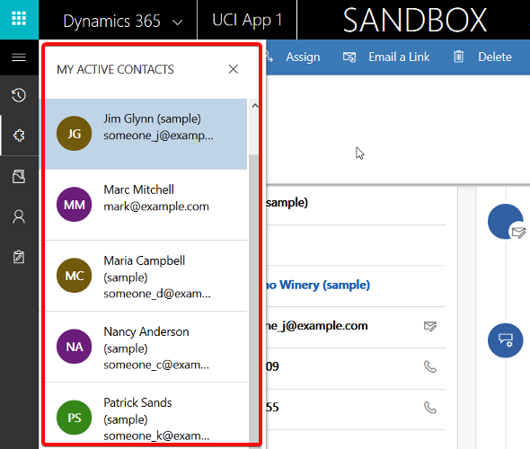
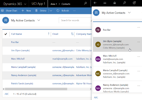
The Unified Interface already has a built-in capability to address this scenario with its automatic reflow. If you take the “My Active Contacts” view as an example, when in the web client on a wider screen you’ll see the view columns in the traditional format. However, if you start making the screen (or “viewport” as the developers like to call it) more and more narrow, you’ll eventually reach a point where the presentation mode changes to remove all the columns & sideways scrolling bar, replaced with a card like UI. It will by default show the entity icon and the first three columns available in the original view definition.
If you want to have more control over how the information would be presented in its compact, mobile friendly format, then the entity Card Form is a tool that you should take a look at. Available as one form type alongside the more familiar Main Form, Quick View Form and Quick Create Form, the Card Form was introduced originally with the Interactive Service Hub (ISH) client. Since this was a very limited client type that predated the Unified Interface, most customers and many consultants probably haven’t worked with it in the past. Now that Unified Interface is set to take over the world from the legacy web client sometime in the future, it’s about time to get familiar with these features.
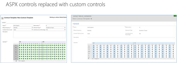
Unfortunately Microsoft doesn’t yet provide much documentation about the use of Card Forms. The references in the current documentation are also somewhat misleading, since the term “card form” is also used in reference to what is actually a Quick View Form. Many people will surely have an image in their minds about the Card Form being something like the example shown below. It is not.

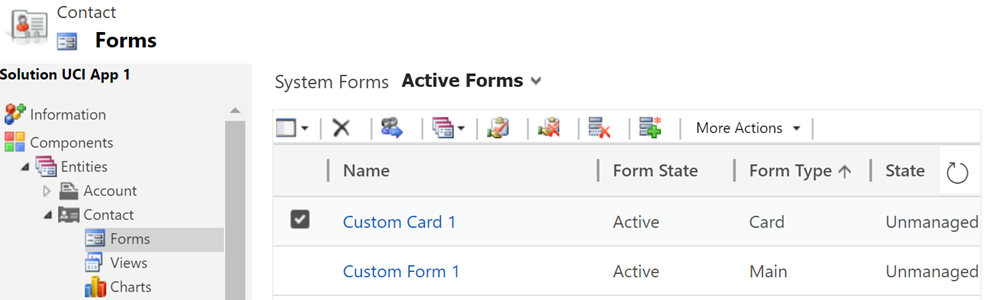
The customization UI in the application itself isn’t that helpful either. Out of the ~14 default forms that the contact entity currently has in a sales focused Dynamics 365 Customer Engagement instance, 4 forms contain the word “card” in their name, but only one is actually of the type Card Form!
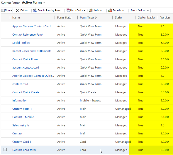
Ignore the false cards and head straight to either the default “Contact Card form”, or alternatively create a brand new one. You’ll land on the classic form editor experience that will present to you the fixed layout and available features of a Card Form:
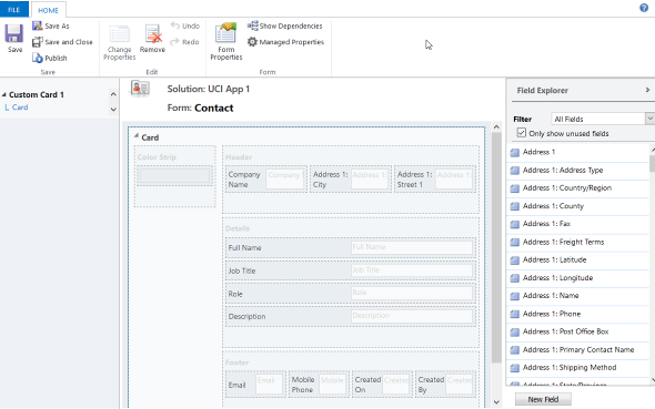
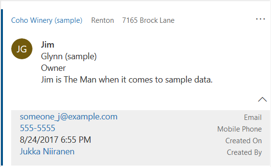
It looks like there are familiar elements from the Main Form available here: header, details, footer. What’s different is that there aren’t much properties you could play around with when it comes to the sections, meaning any labels or layout options that a traditional form would have. The maximum number of fields you can drag from the field explorer and drop onto the Card Form are:
- Header: 3
- Details: 4
- Footer: 4
Given that the intention is to provide just the key attributes of a record in a view, these numbers should be plenty. In fact, you might want to be cautious about not including too many fields onto the Card Form to keep it visually pleasing to the eye. As you’ll see from the example of how the form renders, there will be no form labels provided for any of the fields in the header or details sections, so be sure to only include the kind of fields that will be obvious to the user based on just the data of the field or the context in which the view is available (not just a bunch of date fields, for example). Also note that the footer currently appears to be expanded by default when the view renders, although there’s an upward arrow for you to collapse it for an individual record (you’d think this would be the other way around). You can control whether the footer is expanded by default or not by going to System Settings – General – Set the default card state for Interactive Dashboards.
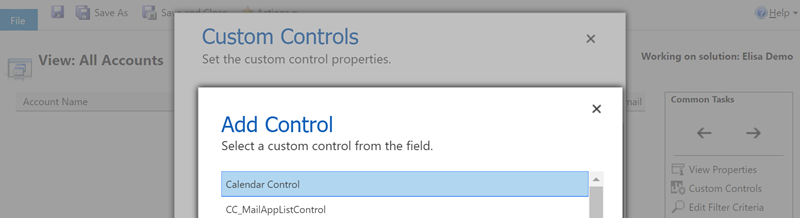
How will you then determine where this card form layout will appear? This is where the Custom Control Framework comes into play. We now have a control type in standard Dynamics 365 Customer Engagement called “Read Only Grid” that is different from the “Read-only Grid (default)” control. When you switch one of the clients (web, phone, tablet) to utilize this new control instead, you’ll get the option to link your default or custom Card Forms as the way how the view contents should be rendered. (more…)