Tag: visualizations

  • Account address capture & mapping with Power Apps

    Account address capture & mapping with Power Apps

    In the Power Apps team blog there was an announcement of the GA availability of Geospatial Features for Canvas apps. In short, we now have a preview of two new controls powered by Azure Maps:

    • Address Input control which suggests the correct address based on partial street names and autocompletes attributes like city, postal code, country, latitude/longitude.
    • Interactive Map control to show one or more records from a dataset as pins or cards on a visual map .

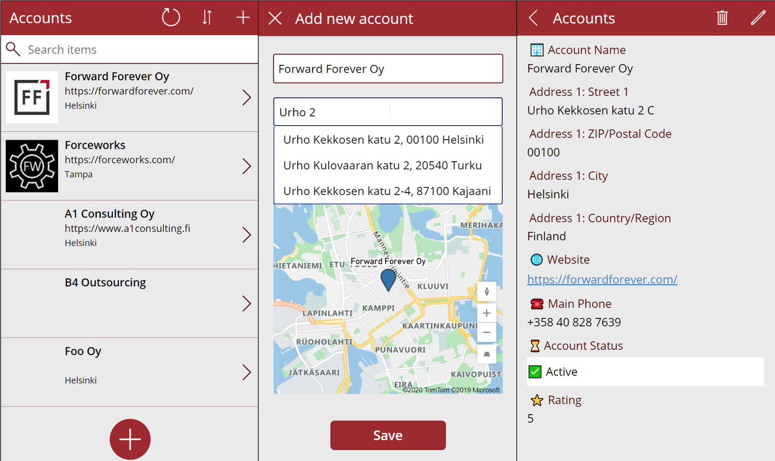
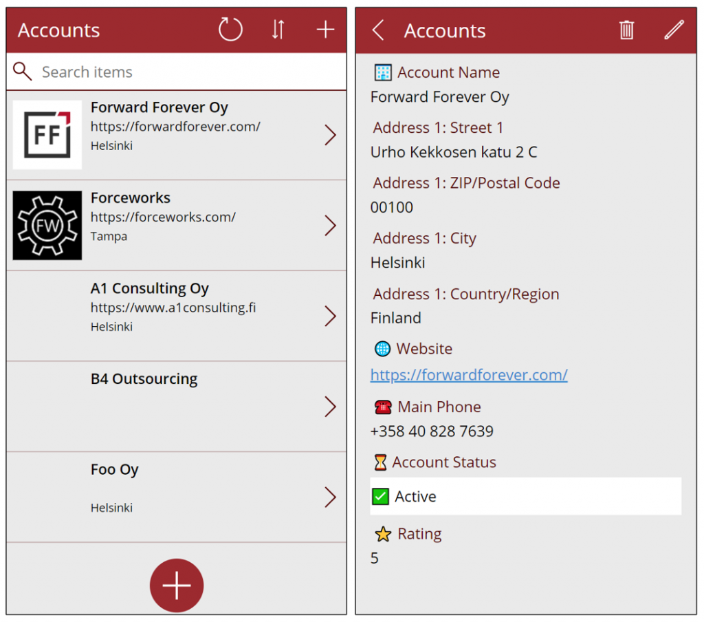
    I decided to do a quick test of how to leverage these new capabilities in a simple scenario where we are managing account address information via a Canvas app running on a phone screen. Here is the end result:

    Simple yet effective! Let’s explore the steps I needed to perform to achieve this functionality.

    Source data

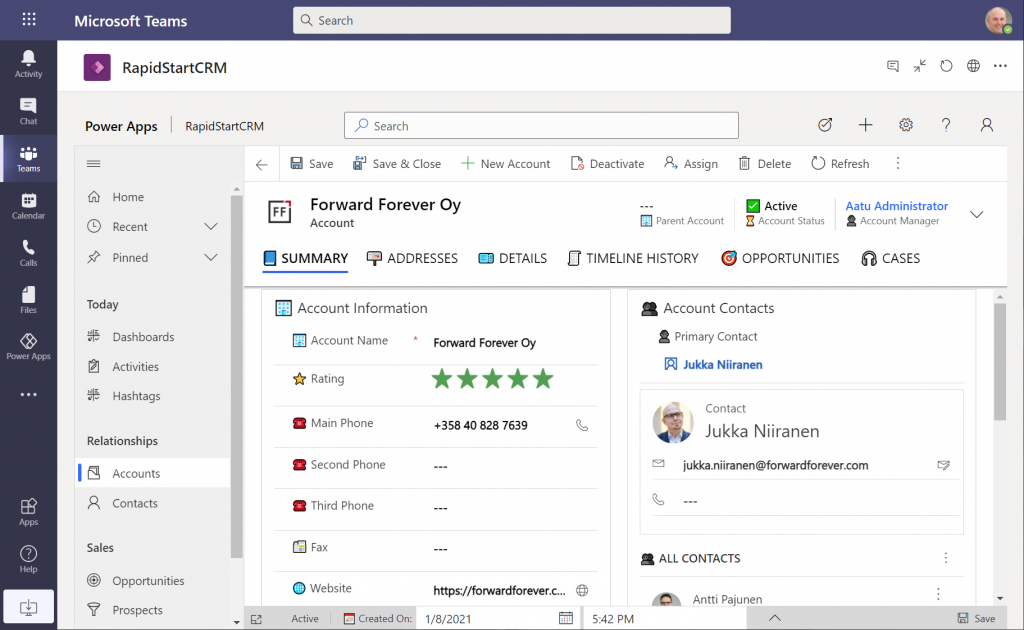
    As a starting point, I’m using a pure Dataverse environment with no Dynamics 365 components. Instead, I’ve installed the free RapidStartCRM solution to give me a simplified CRM data model, plus a fully working Model-driven Power App. I could embed this inside Microsoft Teams and use it via a channel tab, for example:

    In our scenario I want to offer the users a simplified UI to be used on a phone screen, with only a small subset of the full features found in the Model-driven app. I’ll focus just on the account data, which means I can simply start by going to make.powerapps.com and choose to generate the mobile app based on a data source. In this case I’ll select the account table in the Dataverse environment where RapidStartCRM is deployed. This gives me the basic 3-screen UI for browsing, viewing and editing records (yeah, I know, “rows” – but I refuse to adopt this part of the latest MS BizApps naming bingo results just yet).

    I want to create a custom data entry UX for this demo scenario, so I’ve added a “+” button at the bottom of the gallery screen to launch a new screen where I’ll be leveraging the geospatial features.

    Address Input control

    It’s never a fun task to enter the address details when creating new account records, especially when on a mobile device. Instead of asking the user to fill the various fields included in an address, we’ll add the new Address input control from the Input menu onto our “Add new account” screen. From the control’s documentation page we can see there are a number of input properties we could use, but it works quite well just by dropping it as a field onto the form and starting to enter text:

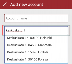
    In my case, I did limit the country set to “FI” to give me just Finnish streets for my demo app. It looks like you need to enter the street name and number before anything is suggested by the Azure Maps API, but you’re allowed to have small typos in the street name, so there’s some fuzzy matching logic applied here.

    The real benefit of the Address input control is in the 19 output properties you get from it. Ultimately I’ll want to use them to A) show the map control based on lat/lon and B) store the data onto the new account record the app will create. But first, it’s nice to see the control’s output on the screen while updating values, so I’ve added a few labels where I display the results from the selected address. To do this, I’ll reference properties like AddressInput1.PostalCode and AddressInput1.Municipality to construct a nice looking string for the text property of the label:

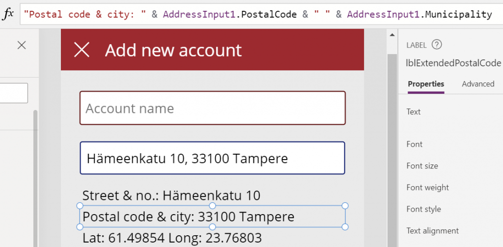
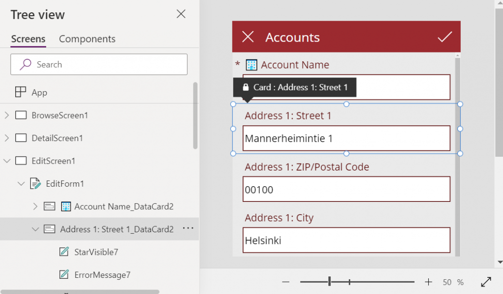
    This exercise will also help me in identifying how I’ll need to concatenate properties like StreetName and StreetNumber to create a valid value for the Dataverse account table’s Street 1 field eventually.

    Map control

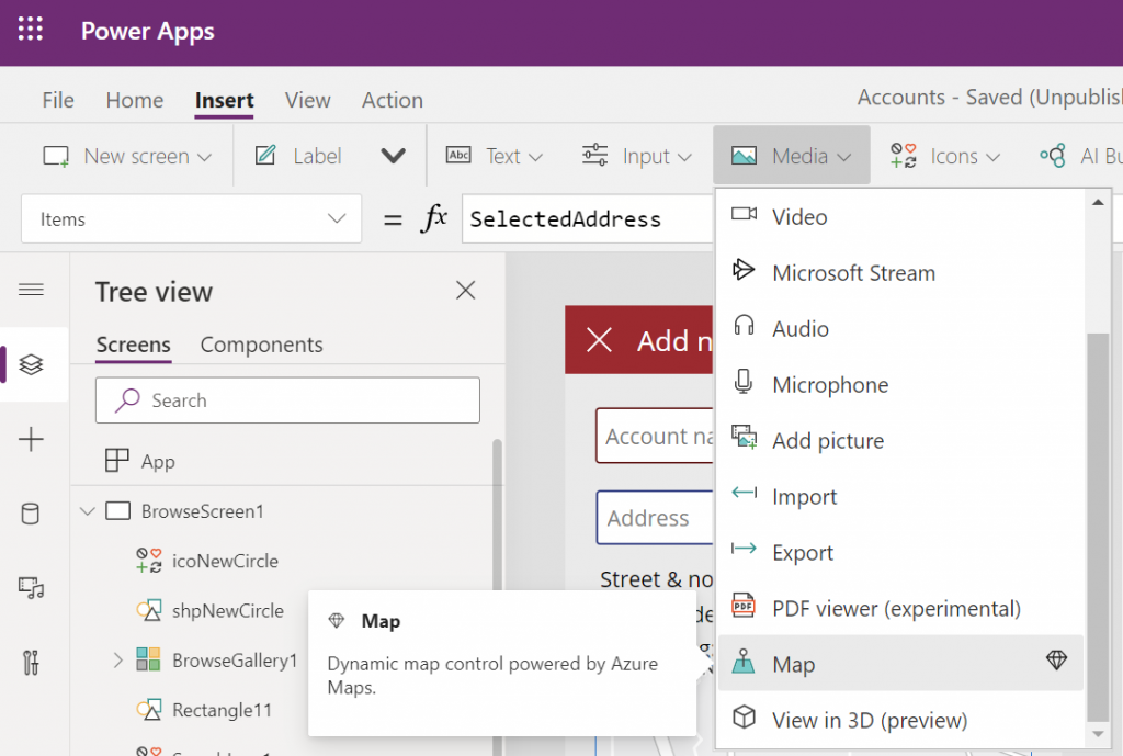
    Seeing a map view where the address we’ve inputted is physically located is a big factor in the app’s user experience. We’ll want to give visual confirmation to the user that the address is actually at a location where they expected it to be, plus the ability to zoom in/out on the map to explore the surroundings. So, while in the Power Apps maker studio, let’s click on the Media dropdown and add the Map control onto our screen.

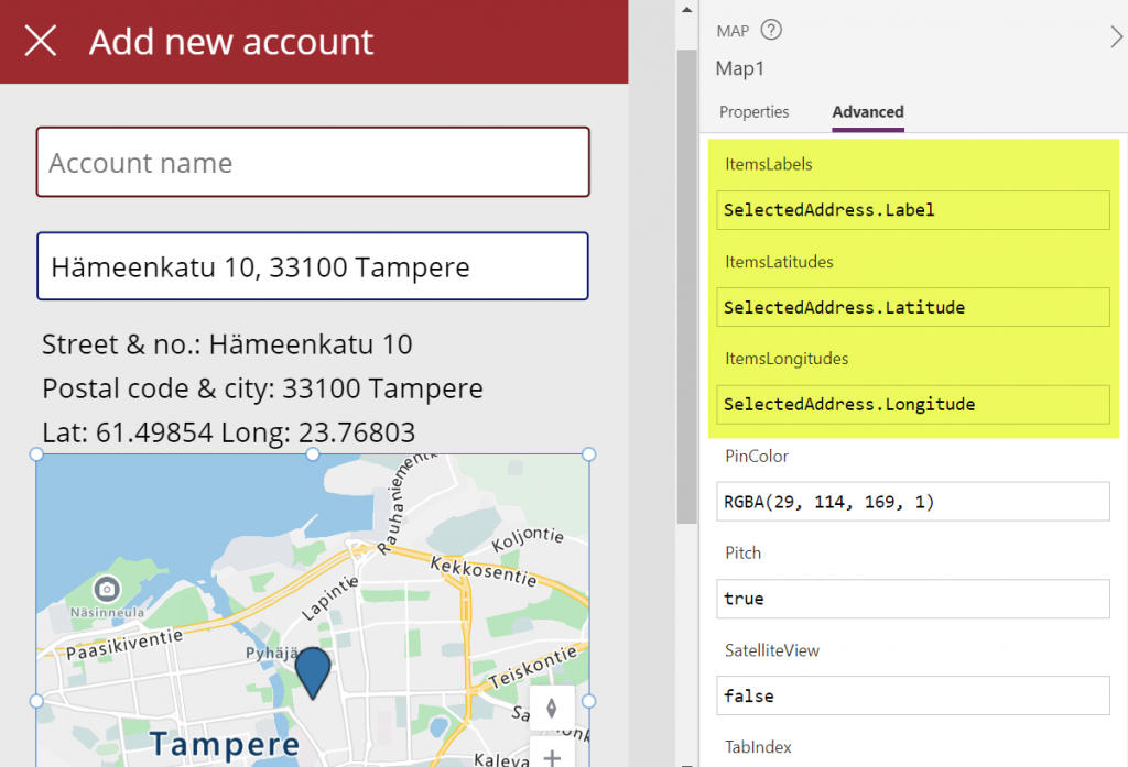
    Hmm, how do we then tell the Map control to zoom in to the address we’ve selected in the Address input control? I had to browse the Interactive map component documentation for quite a while to figure out a way to do this, as it wasn’t entirely obvious how to visualize an individual address rather than a table of records. What I ended up doing was to go into the OnChange property of the Address input control and create a SelectedAddress variable to be set to the chosen address whenever the field’s value changes:

    Set(SelectedAddress, Table({Label:tiAccountName.Text, Longitude:AddressInput1.SelectedLongitude, Latitude:AddressInput1.SelectedLatitude}))

    Note that in my app I’ve got a Text input control tiAccountName into which the user is requested to type in the name of the new account being created, before proceeding to work with the Address input control. I’m picking that name as the label to be shown on the map pin.

    Then in the properties of the Map control I’m setting the values of ItemsLabels, ItemsLatitudes and ItemsLongitudes properties to reference my SelectedAddress variable’s respective properties:

    There’s a variety of other input properties for the Map control, many of which I didn’t yet tweak in my demo app. For example, setting the default location to be that of the current location of the user’s device might be a good idea, but a quick test in the browser didn’t yet tell me how exactly I’d then replace that with my custom location from the variable. I’m sure the will be plenty of ways to optimize these map parameters when connecting them with your app’s business logic and data.

    Saving the account + address

    Finally we need to store the account name and address details onto a new Dataverse record in the account table. As we aren’t working with the form control here, it’s time to use the Patch function. I always need to check the Docs page for the exact syntax, but when working with simple text fields in the target table, the formula isn’t all that complex. On my Save button of the “Add new account” screen I’m running this:

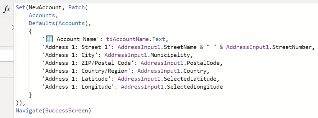
    I’m storing the results of the Patch function also inside a NewAccount variable, so that I could reference the values further in the UI if needed (confirmation dialogs, for example). No error handling or anything else fancy here in the demo app, instead I’m just navigating the user to a “Success!” screen after the record has (hopefully) been saved in Dataverse:

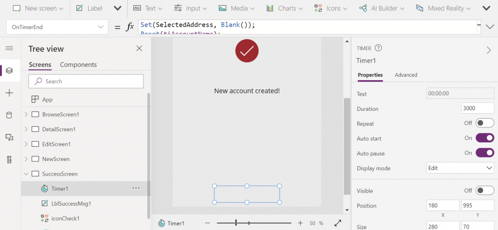
    The “Success!” screen has an invisible timer control set to auto start and a duration of 3000 milliseconds. In the OnTimerEnd I’m doing housekeeping like setting the SelectedAddress variable to Blank(), resetting the Account name text input, then navigating the user onto the account browse screen that will show our newly created account somewhere in the gallery. Another option would of course be to take the user onto the full Edit Screen of the record, to enter further details via the standard form control if needed:

    That’s all there is to it! All in all, my first impression from these new geospatial features is quite a positive one. It’s important to note that since they are using Azure Maps service behind the scenes, these controls have the “premium diamond” next to them in the UI. This means you’ll need to have a premium license like Power Apps Per App or Power Apps Per User for users who are taking advantage of these address mapping features. Also keep in mind that the Power Platform environment where your app lives in must be enabled for geospatial features by the admin.

  • Using CSS color names for SVG icons in Power Apps Canvas app

    Using CSS color names for SVG icons in Power Apps Canvas app

    In my previous post we took the contents of an open source SVG icon library from GitHub and imported that into a Canvas app as a static Excel table, with the help of Power Query. This time we’ll explore how working with the icon colors can be expanded compared to the standard functionality offered by Power Apps Maker Studio.

    Standard color picker

    If we are inserting any of the out-of-the-box icons into our app screen, Power Apps offers a color picker that works the same as when defining the color of a text font. The first option is the standard palette with theme colors and, um, “standard” colors:

    Then there’s the “any color you could imagine” option where you can either pick the color from the sliders, type in the hex code or use the RGBA code:

    The third option is a bit more hidden, so you’ll only find it when using the formula bar. You see, Power Apps actually supports also the CSS color names, so you could type in the value as “DarkBlue” and get exactly that for your icons:

    The Power Apps documentation contains a list of built-in colors supported and their CSS color names. Now, the idea of having the standard CSS palette with its easy to understand color names instead of cryptic Hex codes or RGB values sounds attractive for a low-code citizen developer like me. However, there isn’t really any convenient way to browse through these colors and see the results in the Canvas app UI. Unless we build one for ourselves!

    Custom color picker

    Just like with the SVG icon definitions, we can use the option for importing static reference data from an Excel table to enhance the app maker experience. What we’d need first is a suitable list of the CSS color names, alongside their attributes. Rather than searching for the perfect table online, I just grabbed the data from this CSS Color Codes page on RapidTables. What I especially liked about this page was that the colors were grouped based on the color “family”, meaning different tables for red colors, orange colors, yellow colors and so on. That’s the way I’d really want the colors to be organized, rather than the alphabetic list over on docs.microsoft.com. With some copy & paste, I ended up with an Excel table like this:

    You can grab my .xlsx file here. Let’s import that into our app via the Excel static data connector, as a table called ColorTable:

    We can now add a gallery control into our app and use the columns from our ColorTable as values for the fields in this palette browsing gallery:

    “Wait, how did that visual color indicator get there?” Oh, that’s easy! We just added a rectangle into the gallery and used the ColorValue function to reference the Color Name column from the table that we imported from Excel:

    What I didn’t add there into our gallery yet was the Color Group information. That’s because I want to have this as a separate parameter that I can use to narrow down the list of CSS color names presented in the list. Let’s name the first gallery to “galColors” and create a second horizontal gallery called “galColorGroup”, which will contain a list of all the group names included in our Excel table.

    How do we get just a single “Green” and not all of the 19 different instances of that same text string in the source table’s “Color Group” column? We use the Distinct function and tell it we’re looking for data in the ColorTable data source and the distinct values should come from this particular column:

    The Distinct function returns a table with the single column “Result” as seen from the formula bar preview. We’ll add label into our gallery and populate the text value with this Result directly. To set the fill of the label’s rectangle area we’ll use the same ColorValue function as in our first gallery and point that to the Result column. Now we’ve got ourselves a galColorGroup gallery with 11 distinct values visualized:

    Let’s use the selected Color Group now as a filter to list only that group’s CSS color names in the other gallery. For galColor the Items parameter should read:

    Filter(ColorTable, 'Color Group' = galColorGroup.Selected.Result)

    While we’re at it, let’s also add labels on top of each gallery to state the currently selected value. For galColorGroup, we’ll want both the group’s name as well as the number of items returned after the Filter has been applied in the galColor gallery. We’ll concatenate the selected item’s name plus the CountRows result from the galColor gallery into a single text string like this:

    "Color group: " & galColorGroup.Selected.Result & " (" & CountRows(galColor.AllItems) & ")"

    For the second label, the selected color’s CSS name is enough for us:

    "Color: " & galColor.Selected.'Color Name'

    Now we can click on a value in the Color Group gallery like “Gray” and be presented with a filtered list of the 10 available shades of grey:

    Using selected CSS color name as SVG icon color

    The last bit is connecting the color with the icon library we imported in my earlier blog post. As a quick recap, the SVG icon shapes can be defined in the image property of a Power Apps image control by constructing the XML in the following way:

    "data:image/svg+xml;utf8, " & EncodeUrl(
        "<svg version='1.1' id='Layer_1' xmlns='http://www.w3.org/2000/svg' xmlns:xlink='http://www.w3.org/1999/xlink' x='0px' y='0px'
    	 viewBox='0 0 24 24' style='enable-background:new 0 0 24 24;' xml:space='preserve'>
    <path fill='" & "Black" & "' d='" & ThisItem.path & "'/>
    </svg>"
    )

    You’ll notice that while we pulled the path’s attribute “d” from the dynamic value of ThisItem.path, we had left the path’s fill attribute hardocded as “Black”. Changing this to a dynamic value will allow us to render the SVG icons in any color we’ve chosen elsewhere. To make this work in conjunction with the CSS color name picker functionality we’ve built into our app, let’s add a button above galColor and use the OnSelect event to set a variable called SelectedColor to be the CSS color name of our choice:

    Now we’ll just change the SVG icon’s XML definition to reference this variable’s value as the fill color:

    This allows us to combine the earlier SVG icon gallery with our CSS color name gallery and make the color choice reflected visually immediately on all the visible icons:

    The visual part is what I love about this example of working with icons and colors in Power Apps. It’s a great exercise for learning how to work with data sources from the outside world and seeing how the Power Apps Canvas app UI changes as you modify your formulas and shape your galleries. Being able to inject dynamic values into XML that the app then renders in real time is a demonstration of how the low-code app development tools available in Power Platform can serve to unlock your creative powers, even if you have no skills on actual “pro code” development. Understanding how different color values can be passed on from one place to another and transformed via functions along the way also teaches you a lot more than using the standard color picker to set the static fill value of a single control.

    For me personally, it’s also an exploration of how to leverage configuration data when building Canvas apps. Coming from the Model-driven app customization world of XRM, my mind is still somewhat fixed on thinking via metadata, even though I’m trying to make the leap into UX first Canvas apps building (see this presentation for some of my tips on surviving that leap from Dynamics 365 to Power Apps). The possibility of importing static tables from Excel that are then preserved within the app is an interesting option to try and make the app building process a bit more structured than what the maker tools in Power Apps offer. I’m going to continue my experimentation and try to turn this example app into something that could offer reusable logic and configuration data when generating brand new apps.

  • Using SVG icons in Power Apps Canvas apps

    Using SVG icons in Power Apps Canvas apps

    When creating business applications on Microsoft Power Platform, a major difference between the traditional “CRM style” Model-driven apps and the modern “mobile first” Canvas apps is the possibility of visualizing data and available features in the app. Yes, having well-structured data to begin with is of course a fundamental requirement of being able to construct a meaningful business app. The freedom of pixel perfect visuals that Power Apps can deliver in the Canvas style apps is, however, an important factor when it comes to the perceived value that the end users can get from accessing the app.

    If you’re willing to spend time in generating static images for all the different areas of your app UI and, more importantly, to reflect the state of your app in relation to the data that the user is viewing, then the sky’s the limit for what you could achieve with Power Apps. Now, considering that these low-code/no-code tools aren’t exactly targeted for professional app development teams that would have designers equipped with the tools & skills to create amazing graphics on demand, we often need to explore more frugal ways to make the app visuals serve their purpose. For those of us with next to zero skills in graphic design, sources of free / open source digital illustrations like IconFinder are like a gift from above. There are also a number of awesome icon libraries available on GitHub. Here’s an example of Simple Icons:

    Static graphics like PNG files can already do wonders to your Power App UI, but wouldn’t it be nice if you could also leverage the more scalable and adaptable SVG’s (Scalable Vector Graphics)? Especially for monochrome line drawings like the ones you’ll see a lot in today’s flat app UI, an SVG with transparent background and also a configurable color would be highly useful. Unfortunately, Power Apps today doesn’t support SVG file manipulation when imported as images. There’s a built-in set of icons that come with the Maker studio, which most probably are vector graphics, but you cannot add your own icons into that list. What this means is that if you import an SVG image into your app, there’s not going to be any more parameters available for you to adjust than if you had brought in a JPEG. Doh!

    A Canvas app that I’m currently building requires a large number of icons that should be dynamically changed based on a variable. For the purpose of mapping the suitable icon with a specific value and testing the UI, I wanted to bring in a whole library of icons and play around with it in Power Apps Maker Studio. In order to have better control over the icon appearance, I wanted to be able to modify the actual XML definition that makes up the SVG icon. Here are the steps how I managed to get the data inside the app and also how to render the SVG icons from the XML that I dynamically modify with formulas.

    Combining your SVG files into an Excel table

    Excel is a data source in Power Apps that allows you to import a static table of data into the app and store it there for all the app users to consume, without having to work with connections to external data sources. This type of resource file was quite convenient for my purposes, so the first thing I had to figure out was how to get a folder full of SVG files imported into an Excel table where each icon’s definition is represented on one row. In the above example of Simple Icon library, this would be the contents of the folder “\simple-icons-develop\icons”.

    Power Query in Excel has the “From Folder” option available when using “Get Data / From File”, which brings in not just a single file but rather all the files inside a specific folder. Great, that’s what I needed! Oh, but the source files I have are SVG which Excel doesn’t understand. No problem, let’s just change the file type to XML by renaming the files with by running this in the Command Prompt after navigating to that folder:

    ren *.svg *.xml

    This is what we should now have:

    Now we’re ready to consume the folder contents in Excel. Using “From Folder” and selecting “Transform Data” in the import prompt, we see a view like this:

    A good start, but we need to do some transformations to this data. First, in the Content column, click on the two downward arrows for “Combine Files” and see the results:

    Awesome, now we’re actually inside the XML file structure! What we’re really after is the <path> element in SVG , which is the ultimate drawing that creates the lines, curves and shapes. We don’t have to understand anything about its syntax (well, at least I don’t) but we need this data to get Power Apps to render the SVG shape inside an image control. Since it’s currently a table in the Power Query Editor, we click on the two parting arrows to expand its contents, which consists of a single attribute called “d”.

    We’ve now got everything we need, so the last steps are in removing unnecessary columns and renaming the existing ones. The first three ones are what we want to save into our Excel table, so let’s simplify the column names to “name”, “title” and “path”, then click Close & Load. You should have a beautiful Excel file with as many rows as you had files in the source folder. Before saving and closing the .xlsx, give the table a sensible name that you want to have showing up as the data source name in Power Apps.

    Visualizing SVG data from Excel inside Power Apps

    How does one actually turn the XML definition data into a visible image in Power Apps? There’s a great blog post from Laura GB titled PowerApps – SVG Introduction, which gives us all the details needed to make the Image control render our SVG data. To see how it works in practice, let’s first bring in our Simple Icons Excel table into Power Apps as a data source:

    Next we can add a horizontal gallery onto our screen an choose to use the imported table “icons” as our data source:

    Our table has the three columns we left in there when working with Power Query. From the default mapping we can see that the gallery item’s Subtitle1 label has “ThisItem.path” as the Text value. This is the data we’ll want to use in the image control of the gallery item, but first we’ll need to wrap it into something that gives Power Apps the context around it needed to render the SVG image, since we only imported the one attribute and not the complete XML. However, since this XML part will be exactly the same for any icons that we want to display from this Excel table, it can consist of static text, inside which we’ll inject a few dynamic values with the Power Apps formulas. Adapted from Laura’s post, this is how the Image property of the Image control inside the Gallery item should look like:

    "data:image/svg+xml;utf8, " & EncodeUrl(
        "<svg version='1.1' id='Layer_1' xmlns='http://www.w3.org/2000/svg' xmlns:xlink='http://www.w3.org/1999/xlink' x='0px' y='0px'
    	 viewBox='0 0 24 24' style='enable-background:new 0 0 24 24;' xml:space='preserve'>
    <path fill='" & "Black" & "' d='" & ThisItem.path & "'/>
    </svg>"
    )

    The important part is how we construct the “d” attribute from ThisItem.path on line 4, as that will be the only dynamic value in our SVG for now. Here’s what the result will look like:

    It works! We can now design a gallery that will allow us to conveniently browser through the complete collection of 1007 icons in the library, by having a live “thumbnail” of the icon in a smaller 100*100 image control. To then view the selected icon in a larger format, let’s add a new image control outside the gallery and set it’s Image property to reference the Image of the selected item from Gallery1. Since these are vector graphics, there should be no loss of quality, no matter how large we set the image size to be:

    If we now want to use these imported SVG icons from anywhere else in our app, we can just do a LookUp to the data source with the icon name and return its path, like this:

    LookUp(icons, name = "microsoftexcel", path)

    Using this when wrapped within the same formula we used earlier for showing the gallery’s selected item’s path will now give us a rendering of the SVG icon that matches our LookUp function:

    “Hmm, wont this kind of library of a thousand icons make our app size huge?” Not really. Since we are only storing the shapes instead of the pixels, the payload will actually be very compact for each icon. In this example with the Simple Icons library, here’s how much storage the different parts consumed:

    • Icons folder from the GitHub project: 1.5 MB
    • Excel file with icon XML imported via Power Query: 661 KB
    • .msapp file of the example app with static Excel data imported: 592 KB

    By taking just what we need (the shape information) and leaving out the static XML file’s overhead we’ve actually managed to shrink the 1007 icons into a much smaller space with our Power App. The other benefit is that further adjustment like icon color can now be set in our own formulas. In a follow-up post I’ll continue adding features into this icon library browser app to make use of exactly this capability.

  • Visualizing Your Progress with CRM Goals

    Dynamics CRM is a great tool for making your business processes more quantifiable. Sure, you can maintain a list of your open sales opportunities in an Excel sheet and plan your customer meetings with your Outlook calendar, as many organizations do. You can get a pretty good understanding of the current status with such personal productivity tools that come with your Office package, so why bother using any other software for it?

    Things become a lot more challenging if you need to be able to track your progress over time, let alone manage a team of individuals who are all using personal tools instead of a shared information repository. “How did we meet the monthly sales targets during the past quarter?” “How many meetings did our sales reps have with current vs. potential customers?” Having an always up to date report of not only the historical results but also estimates of how you’re performing during the current measurement period may become an overwhelming task if you need to create such reports manually.

    CRM_goalsDynamics CRM 2011 introduced the goal management feature that allows you to configure a specific measurement criteria just once, define a target value for a certain time period and user, then just sit back and watch the goal progress chart get updated on a daily basis. It’s a generic feature that can be utilized for calculating pretty much any results that are based on data stored and maintained on CRM entities. Sales quotas are a typical example of leveraging CRM goals, but you shouldn’t look at the goal management feature as something that can only be used for tracking formally agreed targets associated with individual employees. Any metric that can be reflected as a quantity in CRM data can potentially be turned into a goal record.

    Set Your Own Recurring Goals

    There are a few aspects about goal management in Dynamics CRM that may stand in the way of organizations truly starting to leverage the feature. First of them is related to how the goals are by default presented as records that you need to separately create for each and every time period where the measurement should be applied. This means that if you would be interested in tracking a goal on a monthly level, you’d have to enter 12 different records into CRM with mostly the same field values, with the only difference being the “From” and “To” date fields (or alternatively selecting the fiscal period as defined in CRM system settings). Even though you can leverage Excel export/import to create more goal records in bulk, it’s still a tedious sounding step that may keep you from even starting to experiment with the goal management feature.

    If you’re not dealing with a hard variable like a sales quota that will have a concrete effect on someone’s salary, then there’s an easier way to get started with goals. Instead of configuring them for a fixed time period, you can set them to be dynamically measured for the last X months, next Y days and so on. I’ve introduced the topic in a previous post, so I won’t dig into the details here, but basically what you can do to create a continuous goal for a dynamic time period is to set the “From” and “To” values as wide apart as you want and then restricting the measured time period in your Rollup Query definition instead.

    In my example, I wanted to create a goal record that would measure how many web forms have been submitted per month in an online campaign that leverages the ClickDimensions Web Forms for automating the process and, naturally, tracking all of the data into the CRM database directly. What I did was 1) add a new Goal Metric for counting the number of Posted Form records, 2) enter a bogus time period of 6 years, 3) set the target value that I want to achieve for monthly downloads and 4) create a new Rollup Query in which I defined the criteria to be “Created On in last 30 days” and defined a specific Web Form record that I want to track the submissions from.

    CRM_2013_recurring_goal_configuration

    Once I saved the record and clicked on Recalculate, I received the current count of Posted Forms that meet this criteria. From here on to eternity this goal will now show the count of submitted forms in the last 30 days, as well as a percentage indicator of how close or far I am from the monthly target of 10 forms. All it took was a few minutes of configuring the goal, now the system will take care of updating it every 24 hours to show the latest result. Time well spent, eh?

    Make Your Goals Visible

    Another potential pitfall with the goal management feature is that while the calculation engine behind the scenes will now maintain these metrics, there’s no guarantee that the users will remember to pay attention to this data. If they know where to go and look for the data, they can access the goal record in a view that will display target, actual and percentage values. If they are really advanced users, they may even know how to display the goal data on a chart that can be opened up from the right side of this view. And, if they have a great CRM administrator in their organization, he or she may have configured the relevant goals to be shown on their role based dashboards.

    That’s a lot of ifs, though. Unfortunately it is quite common that not all of the skills required to get this process right, from business analysis to CRM system customization, may always be available to produce an outcome that would lead to the business value of goals being fully presented to the end users. As we know, user adoption is typically the bigger challenge that CRM system implementations will face, rather than the technical limitations of the underlying software platforms. If it’s not really, truly obvious for the users how the new system will benefit them and make their everyday lives easier, they are unlikely to invest time in frequently visiting it and browsing through the various views and dashboards to review the information available there. So, with the goals feature, is there any other way we could promote the usefulness of these automatic calculations to the users?

    I’ve recently started working at a company called Digital Illustrated, which delivers solutions based on various Microsoft technologies, including Dynamics CRM. The guys at my new office have developed a cool new app for Windows Phone: CRM Goals. As the name suggests, this is an application that enables you to review your Dynamics CRM goal information via a WP8 smartphone screen. The really cool part about it is that you can select the goals you want to show as a Live Tile right on the Windows Phone start screen! For example, I can select the above mentioned eBook download campaign goal and choose a place for it among my other frequently used apps like Dynamics CRM and Yammer:

    Digital_Illustrated_CRM_Goals_for_Windows_Phone

    Now, instead of me having to remember to review the goal in CRM, it’s available to me one the place I visit tens of times every day: my smartphone start screen. The likelihood of me keeping an eye on the campaign target has increased to a whole new level – even if I was already an active CRM user. Also, the convenient presence of these metrics on my personalized mobile start screen can very easily spark up new ideas of other processes where I could leverage the Dynamics CRM goal management feature. All it took was placing the information from CRM into the context of my existing daily workflow.

    If you’re using CRM Online and have a Windows Phone device, then why not go and grab the free CRM Goals app to better visualize your own personal goals?

  • Turn the flat Dynamics CRM 2011 charts into 3D

    We’ve got charts and dashboards!” Yes, ok, so that’s the common initial reaction to one of the most visible new features of Microsoft Dynamics CRM 2011. After playing around with the OOB charts in CRM 2011 Beta and building a few of your own personal charts with the simplified editor that’s available right in the end-user UI, the next reaction is likely to be “I wish I could do more with these charts“.

    The good news is: you absolutely can! The bad news? It requires a bit of XML editing. Now don’t go running away all scared, because it doesn’t take a .NET developer to perform some basic tweaks into the CRM 2011 charts. Heck, even I was able to figure it out after an hour of surfing around the documentation and blog posts on Microsoft Chart Controls for .NET 4.

    In this quick example I will take the a custom chart I built in the solution customization UI for CRM 2011 and inject some more parameters into it to enhance the presentation. The first thing we’ll need to do is select the chart you want to modify in CRM and click Export Chart to grab the XML definition for the chart.

    Open the XML file in the editor of your choice and have a look at the structure. Inside the <presentationdescription> tag you’ll find details about the <Chart> in question. What we’ll want to do in this example is insert more attributes inside the <ChartArea> tags. From MSDN Library we can find the following piece of information:

    The Chart control supports 3D charts. To use 3D charts, set the respective chart area’s Area3DStyle.Enable3D property to True.

    So, we know we’ll want to have the <Area3DStyle> tag in there with some parameters. In my chart we can apply the following addition into the chart definition XML:

    <ChartAreas>
    <ChartArea BorderColor=”White” BorderDashStyle=”Solid”>
    <AxisY IsLabelAutoFit=”False” TitleForeColor=”59, 59, 59″ TitleFont=”{0}, 10.5px” LineColor=”165, 172, 181″ IsReversed=”False”>
    <MajorGrid LineColor=”239, 242, 246″ />
    <LabelStyle Font=”{0}, 10.5px” ForeColor=”59, 59, 59″ />
    </AxisY>
    <AxisX IsLabelAutoFit=”False” TitleForeColor=”59, 59, 59″ TitleFont=”{0}, 10.5px” LineColor=”165, 172, 181″ IsReversed=”False”>
    <MajorGrid Enabled=”False” />
    <MajorTickMark Enabled=”False” />
    <LabelStyle Font=”{0}, 10.5px” ForeColor=”59, 59, 59″ />
    </AxisX>
    <Area3DStyle Enable3D=”True” LightStyle=”Realistic” WallWidth=”5″ IsRightAngleAxes=”true” />

    </ChartArea>

    Once we save the XML file and import it into a new CRM chart, the results will be the following:

    There you go, that’s all there’s to it. Or more specifically, that’s just the beginning of what the visualizations in Dynamics CRM 2011 are capable of. Have a look at the MSDN Library for Visual Studio 2010 on articles about using Chart Controls or browse the Chart Controls for .NET Framework forum for questions and answers on how to work with the charts available in CRM 2011. Downloading the Sample Environment for Microsoft Chart Controls might also be a good place to start.