It’s been around a year since Microsoft announced that Dynamics 365 Customer Engagement would be moving from the world of separate web, mobile and Outlook clients into a single Unified Interface (or UCI, as in “Unified Client Infrastructure”). At that time I made a prediction that this level of shift in the client technology would be a long road, and to date that still pretty much holds true.
Although V9 has been available for quite some time for new cloud instances and also existing customers have been upgrading as the version has become available for them a bit later, the majority of current Dynamics 365 CE users won’t yet be on UCI – at least for the desktop usage. MoCA was already replaced with UCI in V9, so the mobile UI is now on the new infrastructure, no choices there. For the web, there’s still a fair bit of capabilities not yet on Unified Interface, which makes it hard for customers to move over to it.
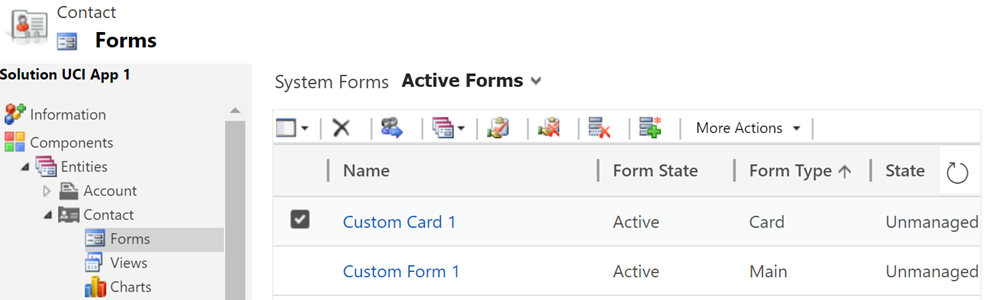
Eventually everyone will need to migrate to UCI, though. It’s best to start exploring the scenarios where Unified Interface can fulfill the core needs and to gain the skills needed for designing great user experiences on this new client type. Even though the majority of the customizations will be rendered the same in UCI as on the current web client, there are still details that you should pay attention to. This is a collection of a few observations I’ve made when building a Dynamics 365 Customer Engagement App on UCI. Specifically, I’ll focus on the entity form rendering here, as a continuation of the previous post where I covered the new Card Form type.
The Header
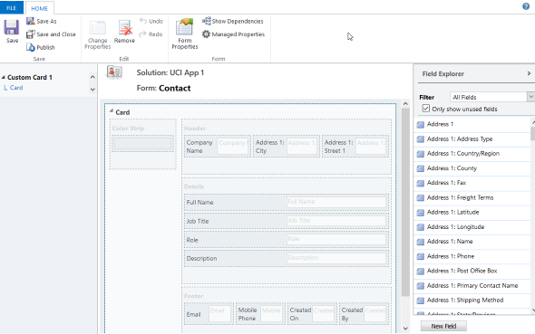
Let’s start from the top. Form headers are where you would have previously placed up to 4 fields that you wanted to be always visible to the user when opening the form and scrolling down along it. Great for highlighting properties of the record that users needed to be aware of.
In UCI there can still be just as many fields on the form header, but unfortunately they won’t always be shown. Even on a 1920*1080 screen resolution you may only see the first 2 fields on the form. The rest are hidden behind a small downward arrow icon that the user would have to discover and the click on to see the remaining header fields. I’m pretty sure most will never even realize the fields’ existence.
When using a smaller mobile device screen the rendering changes quite significantly. Since on a vertical screen there’s no space for showing a header next to the record primary field (the name), in this form factor the header actually becomes the very first form section to be shown to the user. The nice thing is that it’s really “in your face” for the user. The downside is that this may not be the most logical information to be shown at the start of the form – or at least it will differ from what the user might expect to find there. Especially when creating new records these header fields rarely are the ones where you’d start the data entry process.
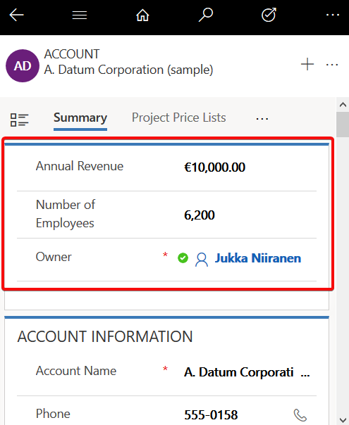
For now, I don’t really have a good guidelince on how to consistently leverage the form header with UCI. You probably want to minimize the number of fields shown there, instead of capitalizing on the full 4 field opportunity, and stick to 1-2 fields max.
The Footer
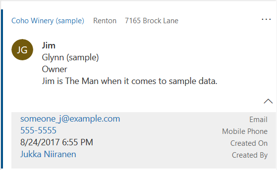
Like the header fields, also the form footer has enjoyed a persistent presence on the XRM entity form. Now with UCI and Dynamics 365 CE, this is no longer the case. On a PC screen the fields do get shown, though, but not in a very nice way.
As an example, a fairly common use case for the footer has been to present a few entity default fields that were hidden in CRM 2013 upgrade when the record properties dialog was removed from the UI. I’m referring to the created/modified on/by information, which can be very useful in determining the validity of the CRM data and persons responsible of the updates. You can still put them there, but currently the rendering looks so messy that I’d prefer not to show that to customers:
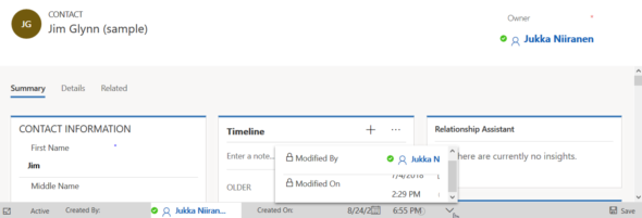
The icons of these fields are often overlapping, even in full screen. This also highlights one of the current issues with UCI, meaning it doesn’t respect the user’s format settings and instead forces “AM” & “PM” upon users who live in a country where these concepts are never used. (Do also watch out for the date fields that sometimes reverse the order of day and month around, creating interesting results with things like appointment data entry.)
The upside of the new design is that the footer fields don’t add up an extra row at the bottom, instead they are incorporated into the gray bar containing the record status and update indicators. This is very welcome, since in the old web client with especially entities using the BPF control, you’d sometimes have barely any vertical space left for working on the actual record fields, thanks to all the padding at the top & the bottom. Striking a balance with these responsive screen layouts surely isn’t an easy task for the engineers, with requirements for both information density and touch friendliness being presented to them.
On a mobile screen you will not see the fields of the footer at all. It doesn’t appear to be rendered anywhere else on the form, so any information presented in this form section will be inaccessible in some scenarios. Much like the header, I would also advise not to put many fields in the footer if you plan on using Unified Interface (or if your users need them while out on the road).
The Tabs
The return of the visible tabs is certainly one of the big UX improvements compared to the old web client. Having these anchors visible right at the start of the form’s loading is a great help especially with information heavy forms like what accounts tend to have. Adding the “Related” menu to the end of the tab list to reveal the child entities is also much better than the mystery arrow in the middle of the old Nav Bar at the top of the screen. Left navigation and Proper Tabs, woo-hoo! Go UCI!
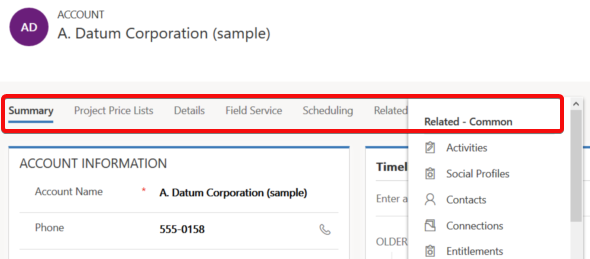
Except that much like the header and footer, the tabs aren’t persistent either. The moment you start scrolling down the form, the tab labels get removed from the screen. Doh! Oh well, I guess we’ll just need to scroll down a bit further without the help of those anchors…
Except we can’t. Once we reach the end of the tab, it’s a hard stop. No matter how much you spin your mouse wheel or swipe your finger on a touch screen, there will be no more of the form revealed to you. You see, in order to go further DOWN on the form you’ll need to scroll all the way UP, reveal the tab labels and then click/press on them. The longer your forms are, especially when reflown as a single column view on a smartphone screen, the longer it will take for your users to reach the next tab.

Having the tabs as containers with hard boundaries might be an understandable design choice from a UX perspective. Getting lost on an endless list of scrolling fields and sections will not be fun for the users, so bringing some structure into this navigation experience is welcome. On the mobile form factor there’s also the Semantic Zoom option to help the user understand the form’s different tabs and sections. Just a shame that also the Semantic Zoom icon is hidden once move down an inch on the form…
Here’s an idea to upvote: Ability to Dock “Tabs” on top of Unified Client Interface Tabs.
We’re Getting There
Despite of these few challenges, there is a lot to like about the way Unified Interface changes the user experience of entity forms:
- Quick View Forms truly blend into the native form fields in UCI, whereas with the legacy web client the rendering was always quite clumsy.
- Timeline is far better at exposing related activities, notes, posts than the earlier tabbed UI hiding most of the content.
- Subgrids are actually actionable, with access to full grid features like sorting, select multiple.
- Subgrid content rendering can be customized via custom control configuration options like Card Forms.
- Business Process Flow consumes less vertical space (although BPF stage fields being hidden by default may cause challenges).
- Visual hierarchy is much more obvious than even with the web client “refresh UI”.
A big bonus is also the fact that by default you’ll get the same form customizations for desktop and for mobile users. It may or may not be suitable for real life mobile use cases, but at least you get the starting point for designing a mobile optimized UCI App to be targeted for specific scenarios that only need a subset of full form functionality.
The key thing to keep in mind when considering the choice between the classic web client and UCI is this, though: UCI is the future. It will be continuously updated with more supported features and optimized for the end user experience with the latest browsers and devices. These updates don’t even require the customer to schedule their version upgrades via the CDU calendar, since from V9 onward all the Dynamics 365 online updates will be deployed automatically to customer environments. See the new continuous deployment policy that Microsoft just announced for more details.
More and more areas of the classic XRM UI will be moved over to Unified Interface with every release. Although we don’t yet know any dates for end of support for the web client nor the target date for UCI’s full parity, the next wave of features in October 2018 release will be published as release notes on July 23rd at the Microsoft Business Application Summit. Better keep an eye on that one!