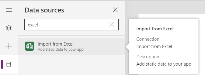
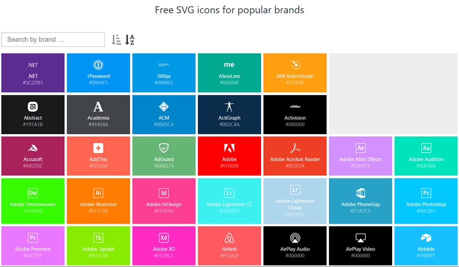
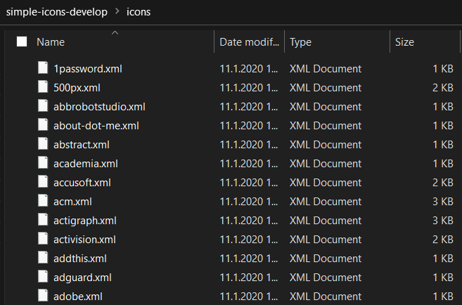
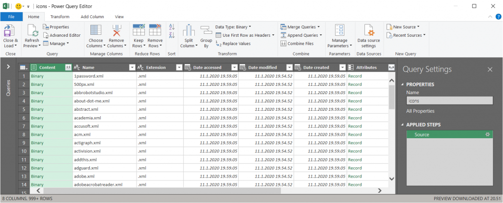
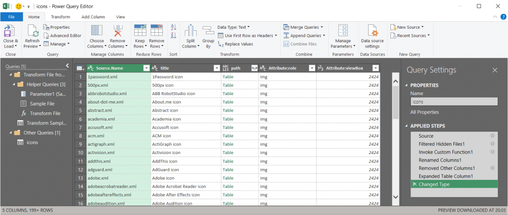
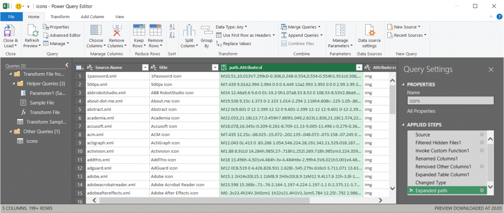
In my previous post we took the contents of an open source SVG icon library from GitHub and imported that into a Canvas app as a static Excel table, with the help of Power Query. This time we’ll explore how working with the icon colors can be expanded compared to the standard functionality offered by Power Apps Maker Studio.
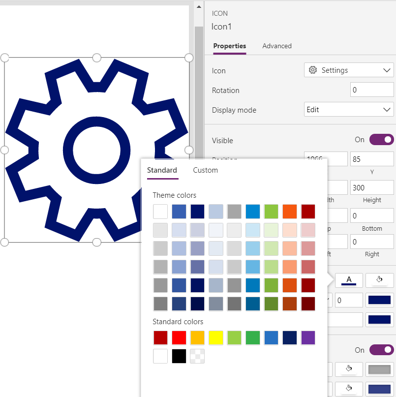
Standard color picker
If we are inserting any of the out-of-the-box icons into our app screen, Power Apps offers a color picker that works the same as when defining the color of a text font. The first option is the standard palette with theme colors and, um, “standard” colors:
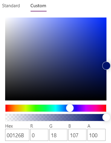
Then there’s the “any color you could imagine” option where you can either pick the color from the sliders, type in the hex code or use the RGBA code:
The third option is a bit more hidden, so you’ll only find it when using the formula bar. You see, Power Apps actually supports also the CSS color names, so you could type in the value as “DarkBlue” and get exactly that for your icons:
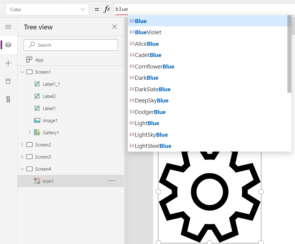
The Power Apps documentation contains a list of built-in colors supported and their CSS color names. Now, the idea of having the standard CSS palette with its easy to understand color names instead of cryptic Hex codes or RGB values sounds attractive for a low-code citizen developer like me. However, there isn’t really any convenient way to browse through these colors and see the results in the Canvas app UI. Unless we build one for ourselves!
Custom color picker
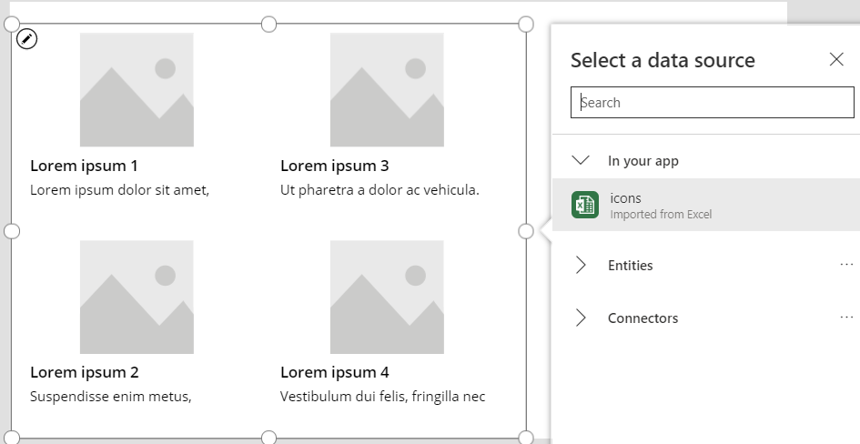
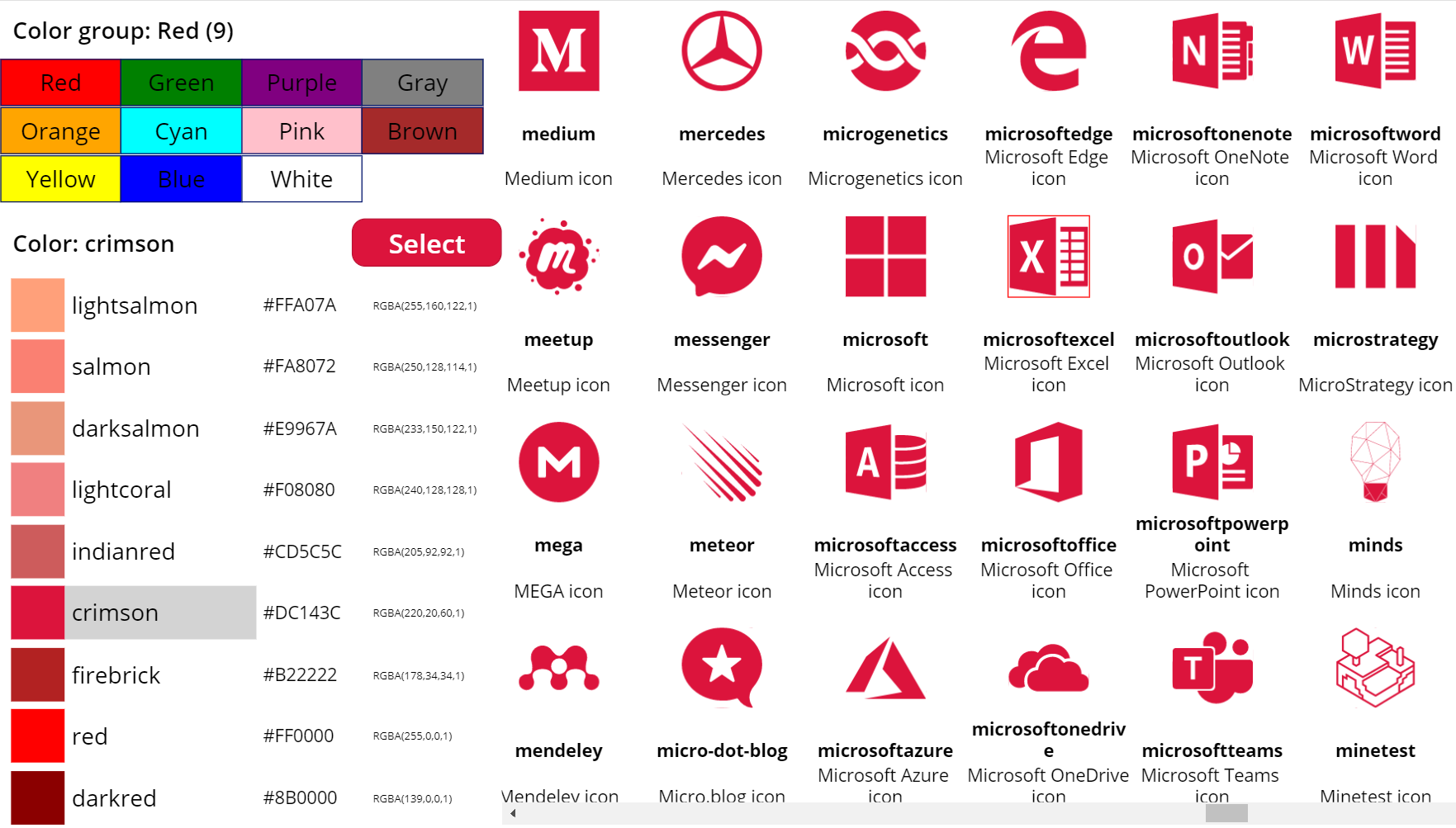
Just like with the SVG icon definitions, we can use the option for importing static reference data from an Excel table to enhance the app maker experience. What we’d need first is a suitable list of the CSS color names, alongside their attributes. Rather than searching for the perfect table online, I just grabbed the data from this CSS Color Codes page on RapidTables. What I especially liked about this page was that the colors were grouped based on the color “family”, meaning different tables for red colors, orange colors, yellow colors and so on. That’s the way I’d really want the colors to be organized, rather than the alphabetic list over on docs.microsoft.com. With some copy & paste, I ended up with an Excel table like this:

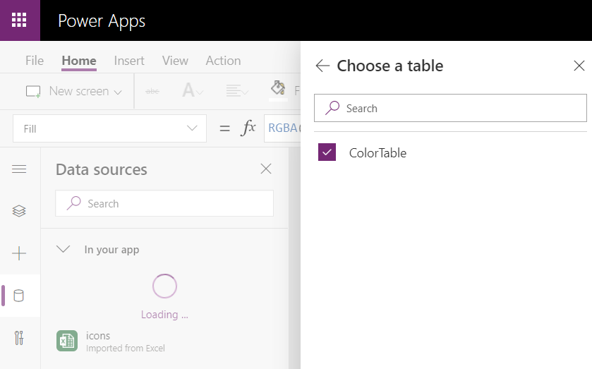
You can grab my .xlsx file here. Let’s import that into our app via the Excel static data connector, as a table called ColorTable:
We can now add a gallery control into our app and use the columns from our ColorTable as values for the fields in this palette browsing gallery:
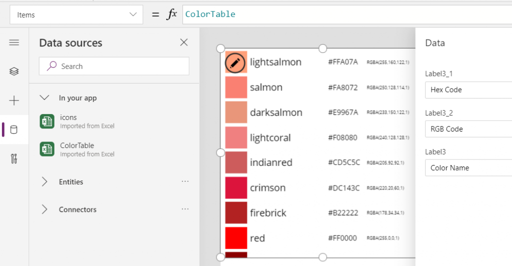
“Wait, how did that visual color indicator get there?” Oh, that’s easy! We just added a rectangle into the gallery and used the ColorValue function to reference the Color Name column from the table that we imported from Excel:

What I didn’t add there into our gallery yet was the Color Group information. That’s because I want to have this as a separate parameter that I can use to narrow down the list of CSS color names presented in the list. Let’s name the first gallery to “galColors” and create a second horizontal gallery called “galColorGroup”, which will contain a list of all the group names included in our Excel table.
How do we get just a single “Green” and not all of the 19 different instances of that same text string in the source table’s “Color Group” column? We use the Distinct function and tell it we’re looking for data in the ColorTable data source and the distinct values should come from this particular column:

The Distinct function returns a table with the single column “Result” as seen from the formula bar preview. We’ll add label into our gallery and populate the text value with this Result directly. To set the fill of the label’s rectangle area we’ll use the same ColorValue function as in our first gallery and point that to the Result column. Now we’ve got ourselves a galColorGroup gallery with 11 distinct values visualized:
Let’s use the selected Color Group now as a filter to list only that group’s CSS color names in the other gallery. For galColor the Items parameter should read:
Filter(ColorTable, 'Color Group' = galColorGroup.Selected.Result)
While we’re at it, let’s also add labels on top of each gallery to state the currently selected value. For galColorGroup, we’ll want both the group’s name as well as the number of items returned after the Filter has been applied in the galColor gallery. We’ll concatenate the selected item’s name plus the CountRows result from the galColor gallery into a single text string like this:
"Color group: " & galColorGroup.Selected.Result & " (" & CountRows(galColor.AllItems) & ")"
For the second label, the selected color’s CSS name is enough for us:
"Color: " & galColor.Selected.'Color Name'
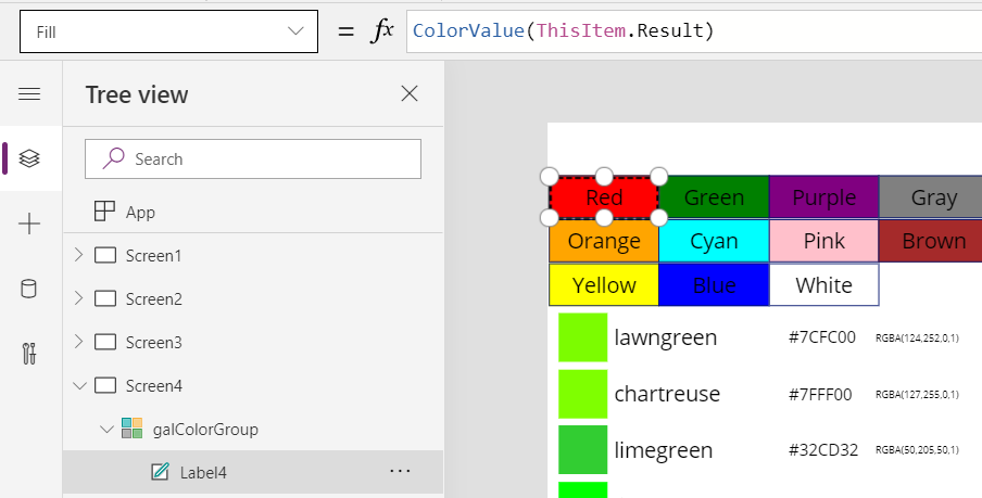
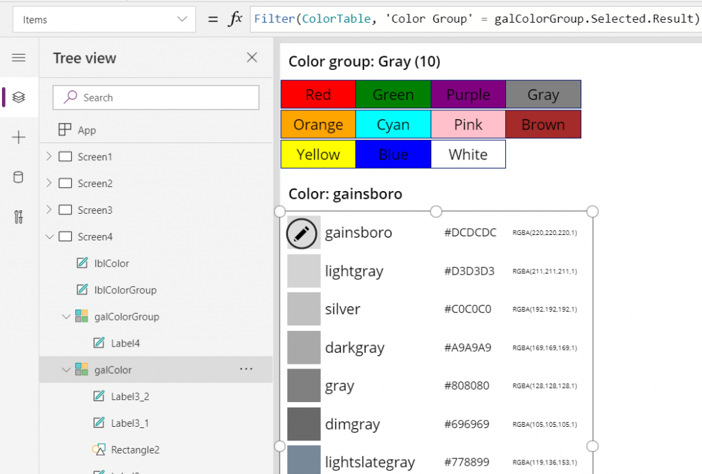
Now we can click on a value in the Color Group gallery like “Gray” and be presented with a filtered list of the 10 available shades of grey:
Using selected CSS color name as SVG icon color
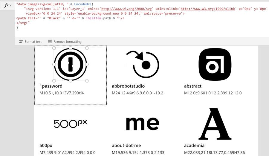
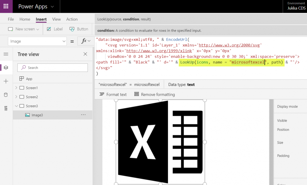
The last bit is connecting the color with the icon library we imported in my earlier blog post. As a quick recap, the SVG icon shapes can be defined in the image property of a Power Apps image control by constructing the XML in the following way:
"data:image/svg+xml;utf8, " & EncodeUrl(
"<svg version='1.1' id='Layer_1' xmlns='http://www.w3.org/2000/svg' xmlns:xlink='http://www.w3.org/1999/xlink' x='0px' y='0px'
viewBox='0 0 24 24' style='enable-background:new 0 0 24 24;' xml:space='preserve'>
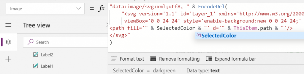
<path fill='" & "Black" & "' d='" & ThisItem.path & "'/>
</svg>"
)
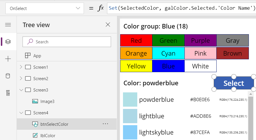
You’ll notice that while we pulled the path’s attribute “d” from the dynamic value of ThisItem.path, we had left the path’s fill attribute hardocded as “Black”. Changing this to a dynamic value will allow us to render the SVG icons in any color we’ve chosen elsewhere. To make this work in conjunction with the CSS color name picker functionality we’ve built into our app, let’s add a button above galColor and use the OnSelect event to set a variable called SelectedColor to be the CSS color name of our choice:
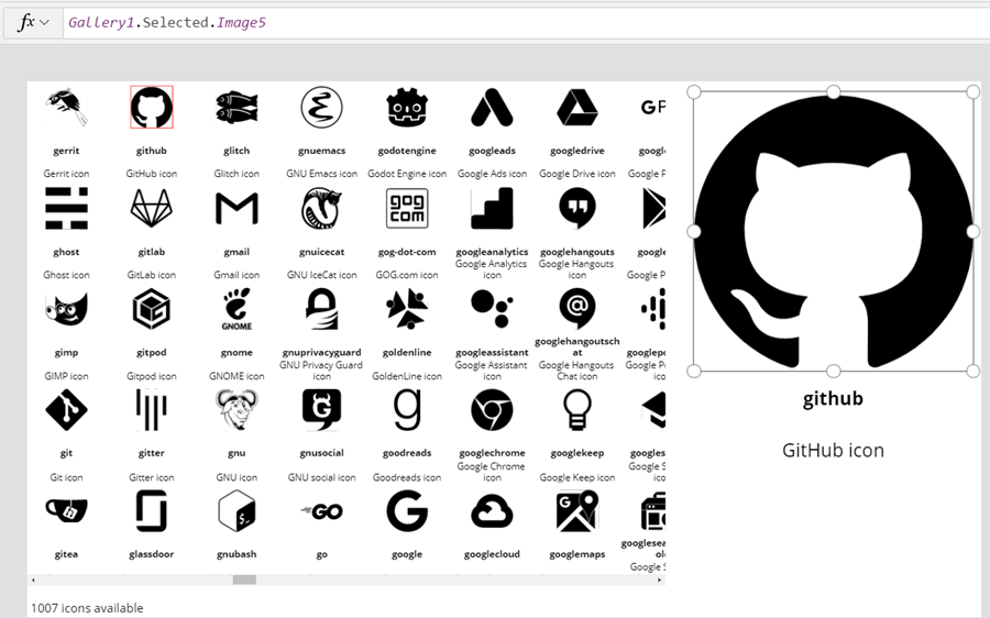
Now we’ll just change the SVG icon’s XML definition to reference this variable’s value as the fill color:
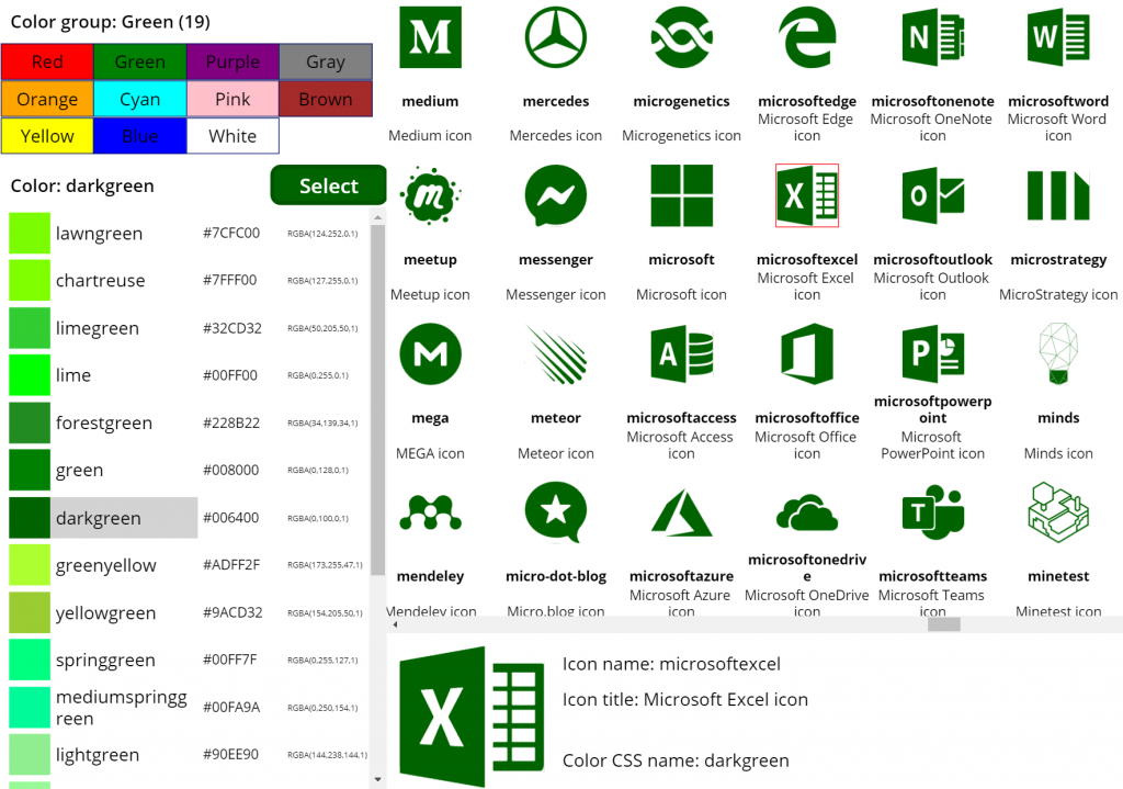
This allows us to combine the earlier SVG icon gallery with our CSS color name gallery and make the color choice reflected visually immediately on all the visible icons:
The visual part is what I love about this example of working with icons and colors in Power Apps. It’s a great exercise for learning how to work with data sources from the outside world and seeing how the Power Apps Canvas app UI changes as you modify your formulas and shape your galleries. Being able to inject dynamic values into XML that the app then renders in real time is a demonstration of how the low-code app development tools available in Power Platform can serve to unlock your creative powers, even if you have no skills on actual “pro code” development. Understanding how different color values can be passed on from one place to another and transformed via functions along the way also teaches you a lot more than using the standard color picker to set the static fill value of a single control.
For me personally, it’s also an exploration of how to leverage configuration data when building Canvas apps. Coming from the Model-driven app customization world of XRM, my mind is still somewhat fixed on thinking via metadata, even though I’m trying to make the leap into UX first Canvas apps building (see this presentation for some of my tips on surviving that leap from Dynamics 365 to Power Apps). The possibility of importing static tables from Excel that are then preserved within the app is an interesting option to try and make the app building process a bit more structured than what the maker tools in Power Apps offer. I’m going to continue my experimentation and try to turn this example app into something that could offer reusable logic and configuration data when generating brand new apps.