Tag: Excel

  • Excel cannot be beaten

    Excel cannot be beaten

    Happy 40th birthday, Microsoft Excel!🎉

    I wish I could start this post by “the first time I used Excel…” But that’s impossible since it feels like Excel has always been there. Not on my very first 386sx PC in the early 90s, no. Back then I was mostly doing games, music, and the occasional pre-internet discussions in different forums (my previous post is all about that). When I started my business studies and when I got my first job roles, though, Excel was just how things got done. A lot of things.

    When I got the chance to visit Redmond for the first time as part of the Microsoft MVP Summit, of course I bought a souvenir from the Microsoft company store that was about Excel. Today, I’m still extremely happy to wear this beautiful shirt:

    The significance of Microsoft Excel and spreadsheet software in general can hardly be overstated. It is truly the nr. 1 business app. Many people could easily do without the other MS Office products, replacing them with Google’s apps or whatever modern tools have emerged in the past couple of decades. But Excel? So many folks would simply hate having to use anything else.

    Why is Excel so unbeatable? Why do so many companies try to fight it nevertheless? Let’s reflect on that.

    Trying to fight Excel

    I started working with customer data analytics and direct marketing at the turn of the millennium. Back in 2000, there was no SaaS. Instead, companies invested in server software and hardware to do things that today’s Excel workbooks with 1 million row limit could easily handle. This scarcity of apps also meant that everything which did not have a dedicated server + client combo in place was done with Excel.

    The Holy Grail of “Customer 360” required a central database for customer information, which meant years/decades of trying to migrate the Excel-based business processes into CRM systems. At the start of such a journey, everyone was quick to agree that “yeah, this thing shouldn’t really be in Excel workbooks”. Once a system was in place, however, the question turned to “can I export this info into Excel?”

    “In the analytics industry there is a standing joke that “Export to Excel” is the most used feature of any analytics software.”

    Hjalmar Gislason: Export to Excel — business software’s most common feature?

    Why do people want to go back to the world of spreadsheet after they have deployed a purpose built business application for the data in question? Because FREEDOM!!!

    Sure, the apps that are designed for specific business processes can give readymade views into the data that you can open with a click. They usually also offer automation that could perform actions like data updates, notifications, summaries, integration, and all sorts of tasks that would be much more laborious when working with spreadsheets.

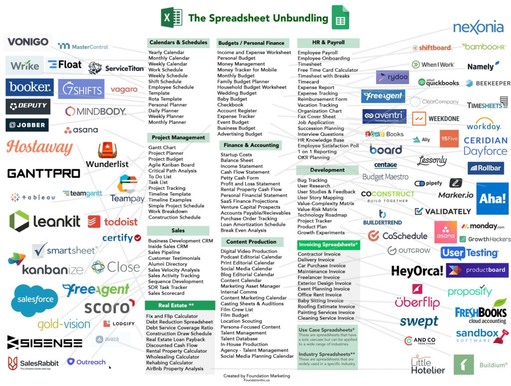
    It all sounds incredibly useful, especially before you have any such apps in place. The idea of being able to rely on a tool from developers that have already figured out what you’d want the computer to do is just beautiful. Everybody wants to spend less time thinking about “how do I do this” and would rather have “an app for that”. This has given birth to countless SaaS solutions that are simply unbundling Excel spreadsheets into dedicated apps:

    And yet none of the apps can escape the “I wish this worked like Excel” request from the users. Inevitably there will come a time when either the features of the app feel like a constraint that gets in the way – or the users just can’t figure out the intended process of how to do things in this specific, unique application that they’ve not used for this purpose before.

    Why Excel rocks

    For a business applications guy like me, it’s natural to see a process managed with Excel and immediately jump into thinking what data models, interfaces, automations and integrations could be put in place to make everything more efficient. Starting from CRM, the assignments I have been given usually always include the “M” – managing things. Not just for a single PC user but for a group of users, sometimes spanning to thousands of individuals.

    Business apps with a clear separation of the server-side database and logic from the client-side UI are indeed a better way to managing things involving many users. Yet we often forget that it’s not enough to cover 80% of the tasks with built-in features of our slick, modern web apps. The employees who are in charge of end-to-end processes must complete 100% of what their role requires. If our minimum viable product doesn’t have complete coverage, the users need to figure out a way to get the remaining work done.

    That’s where Excel is the hero. It adapts to the needs of the user unlike anything else available to typical information workers. Whereas Word documents are often just digital versions of paper docs, Excel introduces dimensions not found from the physical office tools. Its UI invites the users to model their problem domain in a 2D digital canvas – much like a box of Legos will invite kids (and grown ups) to build abstract plastic versions of real-world things.

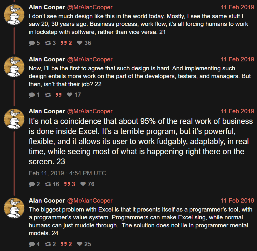
    Mr. Alan Cooper, the father of Visual Basic, calls this the fudgability of software. “[Excel is] a terrible program, but it’s powerful, flexible, and it allows its users to work fudgably, adaptably, in real time, while seeing most of what is happening right there on the screen.”

    Sometimes we need rigidity in business processes. We want to have repeatable outcomes that aren’t different based on who is operating the tools, or where & when. Business apps are excellent for facilitating a common way of working. At the same time, we must remember that a significant portion of information work consists of ad-hoc requirements and fuzzy processes adapting to incomplete data.

    That’s when we rely on the humans to understand what should be done. They, in turn, will rely on available tools that allow them to tackle data processing needs without unnecessary limitations. Meaning spreadsheets in most cases. Yeah, I wish more people were able to turn those repeatedly used Excel sheets into low-code solutions with Power Platform tools, yet that’s a bit too much to ask from individual workers most of the time. Most often, Excel is just a better fit.

    LLMs only wish they could be like Excel

    AI is supposedly eating the software world. It certainly is eating all of the available capital (and more) in trying to turn computers that used to be reliable into something that’s… not. The advantages of having the computer understand natural language and being able to respond to any question are of course huge. If only there wasn’t that minor inconvenience that we can’t know if the response is correct or not.

    Microsoft, a.k.a. The Copilot Company, has of course been fearlessly approaching the idea of combining creative large language models with software that is normally used for precise calculations. The result is news headlines like this: Microsoft launches Copilot AI function in Excel, but warns not to use it in ‘any task requiring accuracy or reproducibility’. Okay, cool, I only ever used Excel for fun and games anyway, so no worries about those accuracy gaps…

    The area where creativity and conceptual problem solving could be very useful is in designing how to get from an Excel into an app. I’m optimistic about the LLM-based Maker features accelerating and expanding the possible Power Platform solutions that can be built for varying types of business problems. If we don’t expect AI to work the same way every time, but rather use it as a force multiplier for fudgability, the risks of hallucinations breaking the business processes should be much lower.

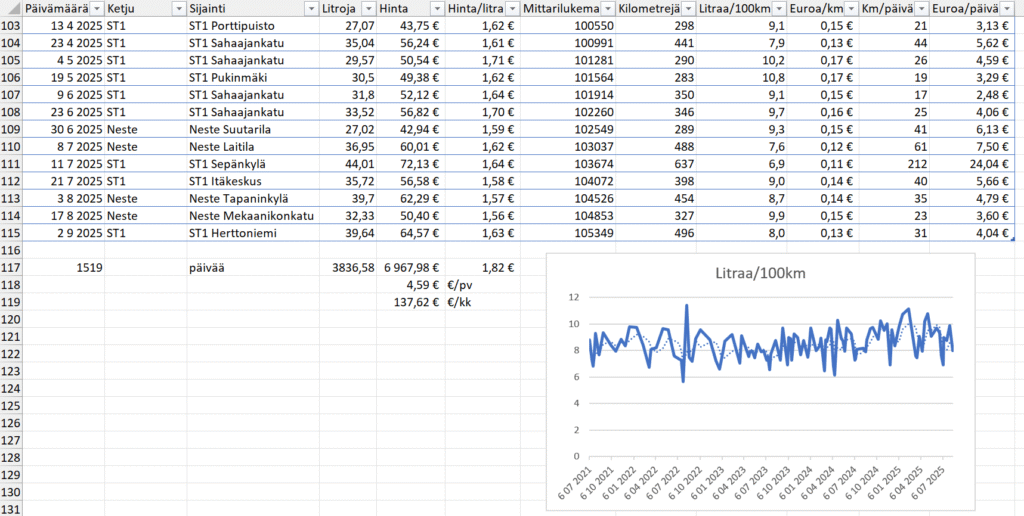
    Let’s look at one case where I’d like to see AI replace Excel in my personal life. For 4 years now, I’ve been tracking the expenses related to my car using an Excel workbook. Fuel amount, cost, mileage are an example of what I’ve entered there after every visit to the gas station:

    Many, many times, I’ve thought to myself “I should turn this into an app”. After all, what kind of a Power Platform evangelist would just keep working on an Excel file for years without modernizing the process? Yet whenever I started to think about the details of what should be there to replicate everything my workbook provides (there are other sheets there, too), I realized it’s a heck of a lot of work to achieve parity with what Excel gives me. No rational reason ever existed for me to put in all the work to achieve something that I’d be happier using. It could have been a community demo, sure, but I always had other stuff to work on.

    Now, when we are living in the age of agentic AI, surely it’s about time to replace the Excel? Well, if I could just give that file to an AI tool and make the machine modernize it for me, why not. Last week, when Lovable announced their file uploads feature and claimed “you can now drop files directly into Lovable and turn them into apps and websites”, I decided to try it out. Sure enough, the vibe-coding tool was able to generate a web app from the .xlsx file:

    The only problem? The data is not correct. Like, I only wish my 2019 Ford Focus 1.5 EcoBoost was able to run 100 km on 0.8L… In reality, the React app generated by Lovable was not able to handle the “big data” of around 200+ lines of data in the Excel workbook and instead chose to read only parts of it. The AI chatbot of course will claim this app has “real calculations from your Excel”, but we all should know at this point how LLMs are just manipulation machines that you shouldn’t spend time arguing with.

    I never have to worry if Excel is trying to manipulate me. It may not always understand what I’m trying to do, yet the machine never pretends that it did the work it promised to do while giving out a bogus number instead. The math is not based on vibes. Today, we have LLM-based AI features inside our spreadsheets that are sometimes able to call deterministic tools like Python to do real calculations. But we have no certainty that AI would always resort to such tools when needed, instead of just making shit up.

    That doesn’t stop companies from trying to make AI in Excel work. OpenAI has funded startups like Endex that develop Excel add-ins for injecting LLM magic into spreadsheets. Microsoft is also aiming beyond Excel Copilot with their recent preview launch of Agent Mode in Excel. Could these tools already replace a financial analyst creating Excel workbooks with formulas and business metrics? I decided to give Agent Mode a try on the day it came out:

    You can check out the experience and end results from the video. In short: Excel Agent Mode ain’t necessarily a tool you should yet rely on…

    If you can’t beat them, join them

    Instead of seeing Excel as something that should be replaced, perhaps a better strategy is trying to accept the fact that Excel files will always exist. Because people want to experience the control that Excel gives them, instead of limiting themselves to the GUI prison of your business app. Similarly, they’d prefer if the numbers that get shown to them would be based on verifiable math rather than on-demand hallucinations of “vibe working” tools.

    I’m somewhat biased here because this is the route we have taken when building FinModeler. A SaaS application that helps business founders or financial advisors to create detailed financial models with its simple web-based wizard UI. And then, producing an Excel workbook for you, complete with dynamic formulas that allow you to adjust the model with the tool you know and love.

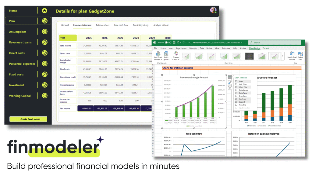
    It’s not your typical product built on Power Platform. Not simply because of the full-fidelity Excel workbook generator feature. But rather the whole SaaS delivery model of offering a canvas app that requires zero installation differs from the expected way of partners shipping products on Microsoft’s low-code platform. In many ways, this is not how business apps are supposed to work – but we’ve done it anyway!

    Today, anyone can check out how this combination of Power Platform + Excel works in practice by signing up for a free 14d trial of the FinModeler app. There’s a lot more that we can do in future versions of the product, besides just creating extensive Excel workbooks. The fact that the financial model data is stored in a structured Dataverse database is a much better position to build new features than if we’d need to rely on Excel files alone. Still, it’s essential that the users have the possibility to interact with the model that offers them the ultimate level of control and confidence.

    Spreadsheets are forever

    The moral of the story is: it’s not either/or. We are all better off when there are different types of tools available for working with business data and processes. Both structured apps and fudgable spreadsheets serve a clear purpose. Similarly, we have room for both deterministic, reliable software as well as creative and unpredictable AI. Trying to force people into choosing just one tool never works.

    Recent estimates say Excel is used by over a billion human users. In the near future, there will be countless AI agents built that will also try their best to learn how to work with Excel spreadsheets. What I’ve learned is that while you can (and often should) go beyond spreadsheets to evolve and improve your processes, it’s foolish to think that you could replace Excel entirely. Turn it around instead and think of all the data manipulation and calculation features you don’t have to build into your own software, thanks to Excel being there to handle it with ease.

    After 25 years of working professionally in the field of customer data and business applications, I’m proud to once again add a sticker onto my laptop that celebrates the magical powers of Excel:

  • Using CSS color names for SVG icons in Power Apps Canvas app

    Using CSS color names for SVG icons in Power Apps Canvas app

    In my previous post we took the contents of an open source SVG icon library from GitHub and imported that into a Canvas app as a static Excel table, with the help of Power Query. This time we’ll explore how working with the icon colors can be expanded compared to the standard functionality offered by Power Apps Maker Studio.

    Standard color picker

    If we are inserting any of the out-of-the-box icons into our app screen, Power Apps offers a color picker that works the same as when defining the color of a text font. The first option is the standard palette with theme colors and, um, “standard” colors:

    Then there’s the “any color you could imagine” option where you can either pick the color from the sliders, type in the hex code or use the RGBA code:

    The third option is a bit more hidden, so you’ll only find it when using the formula bar. You see, Power Apps actually supports also the CSS color names, so you could type in the value as “DarkBlue” and get exactly that for your icons:

    The Power Apps documentation contains a list of built-in colors supported and their CSS color names. Now, the idea of having the standard CSS palette with its easy to understand color names instead of cryptic Hex codes or RGB values sounds attractive for a low-code citizen developer like me. However, there isn’t really any convenient way to browse through these colors and see the results in the Canvas app UI. Unless we build one for ourselves!

    Custom color picker

    Just like with the SVG icon definitions, we can use the option for importing static reference data from an Excel table to enhance the app maker experience. What we’d need first is a suitable list of the CSS color names, alongside their attributes. Rather than searching for the perfect table online, I just grabbed the data from this CSS Color Codes page on RapidTables. What I especially liked about this page was that the colors were grouped based on the color “family”, meaning different tables for red colors, orange colors, yellow colors and so on. That’s the way I’d really want the colors to be organized, rather than the alphabetic list over on docs.microsoft.com. With some copy & paste, I ended up with an Excel table like this:

    You can grab my .xlsx file here. Let’s import that into our app via the Excel static data connector, as a table called ColorTable:

    We can now add a gallery control into our app and use the columns from our ColorTable as values for the fields in this palette browsing gallery:

    “Wait, how did that visual color indicator get there?” Oh, that’s easy! We just added a rectangle into the gallery and used the ColorValue function to reference the Color Name column from the table that we imported from Excel:

    What I didn’t add there into our gallery yet was the Color Group information. That’s because I want to have this as a separate parameter that I can use to narrow down the list of CSS color names presented in the list. Let’s name the first gallery to “galColors” and create a second horizontal gallery called “galColorGroup”, which will contain a list of all the group names included in our Excel table.

    How do we get just a single “Green” and not all of the 19 different instances of that same text string in the source table’s “Color Group” column? We use the Distinct function and tell it we’re looking for data in the ColorTable data source and the distinct values should come from this particular column:

    The Distinct function returns a table with the single column “Result” as seen from the formula bar preview. We’ll add label into our gallery and populate the text value with this Result directly. To set the fill of the label’s rectangle area we’ll use the same ColorValue function as in our first gallery and point that to the Result column. Now we’ve got ourselves a galColorGroup gallery with 11 distinct values visualized:

    Let’s use the selected Color Group now as a filter to list only that group’s CSS color names in the other gallery. For galColor the Items parameter should read:

    Filter(ColorTable, 'Color Group' = galColorGroup.Selected.Result)

    While we’re at it, let’s also add labels on top of each gallery to state the currently selected value. For galColorGroup, we’ll want both the group’s name as well as the number of items returned after the Filter has been applied in the galColor gallery. We’ll concatenate the selected item’s name plus the CountRows result from the galColor gallery into a single text string like this:

    "Color group: " & galColorGroup.Selected.Result & " (" & CountRows(galColor.AllItems) & ")"

    For the second label, the selected color’s CSS name is enough for us:

    "Color: " & galColor.Selected.'Color Name'

    Now we can click on a value in the Color Group gallery like “Gray” and be presented with a filtered list of the 10 available shades of grey:

    Using selected CSS color name as SVG icon color

    The last bit is connecting the color with the icon library we imported in my earlier blog post. As a quick recap, the SVG icon shapes can be defined in the image property of a Power Apps image control by constructing the XML in the following way:

    "data:image/svg+xml;utf8, " & EncodeUrl(
        "<svg version='1.1' id='Layer_1' xmlns='http://www.w3.org/2000/svg' xmlns:xlink='http://www.w3.org/1999/xlink' x='0px' y='0px'
    	 viewBox='0 0 24 24' style='enable-background:new 0 0 24 24;' xml:space='preserve'>
    <path fill='" & "Black" & "' d='" & ThisItem.path & "'/>
    </svg>"
    )

    You’ll notice that while we pulled the path’s attribute “d” from the dynamic value of ThisItem.path, we had left the path’s fill attribute hardocded as “Black”. Changing this to a dynamic value will allow us to render the SVG icons in any color we’ve chosen elsewhere. To make this work in conjunction with the CSS color name picker functionality we’ve built into our app, let’s add a button above galColor and use the OnSelect event to set a variable called SelectedColor to be the CSS color name of our choice:

    Now we’ll just change the SVG icon’s XML definition to reference this variable’s value as the fill color:

    This allows us to combine the earlier SVG icon gallery with our CSS color name gallery and make the color choice reflected visually immediately on all the visible icons:

    The visual part is what I love about this example of working with icons and colors in Power Apps. It’s a great exercise for learning how to work with data sources from the outside world and seeing how the Power Apps Canvas app UI changes as you modify your formulas and shape your galleries. Being able to inject dynamic values into XML that the app then renders in real time is a demonstration of how the low-code app development tools available in Power Platform can serve to unlock your creative powers, even if you have no skills on actual “pro code” development. Understanding how different color values can be passed on from one place to another and transformed via functions along the way also teaches you a lot more than using the standard color picker to set the static fill value of a single control.

    For me personally, it’s also an exploration of how to leverage configuration data when building Canvas apps. Coming from the Model-driven app customization world of XRM, my mind is still somewhat fixed on thinking via metadata, even though I’m trying to make the leap into UX first Canvas apps building (see this presentation for some of my tips on surviving that leap from Dynamics 365 to Power Apps). The possibility of importing static tables from Excel that are then preserved within the app is an interesting option to try and make the app building process a bit more structured than what the maker tools in Power Apps offer. I’m going to continue my experimentation and try to turn this example app into something that could offer reusable logic and configuration data when generating brand new apps.

  • Using SVG icons in Power Apps Canvas apps

    Using SVG icons in Power Apps Canvas apps

    When creating business applications on Microsoft Power Platform, a major difference between the traditional “CRM style” Model-driven apps and the modern “mobile first” Canvas apps is the possibility of visualizing data and available features in the app. Yes, having well-structured data to begin with is of course a fundamental requirement of being able to construct a meaningful business app. The freedom of pixel perfect visuals that Power Apps can deliver in the Canvas style apps is, however, an important factor when it comes to the perceived value that the end users can get from accessing the app.

    If you’re willing to spend time in generating static images for all the different areas of your app UI and, more importantly, to reflect the state of your app in relation to the data that the user is viewing, then the sky’s the limit for what you could achieve with Power Apps. Now, considering that these low-code/no-code tools aren’t exactly targeted for professional app development teams that would have designers equipped with the tools & skills to create amazing graphics on demand, we often need to explore more frugal ways to make the app visuals serve their purpose. For those of us with next to zero skills in graphic design, sources of free / open source digital illustrations like IconFinder are like a gift from above. There are also a number of awesome icon libraries available on GitHub. Here’s an example of Simple Icons:

    Static graphics like PNG files can already do wonders to your Power App UI, but wouldn’t it be nice if you could also leverage the more scalable and adaptable SVG’s (Scalable Vector Graphics)? Especially for monochrome line drawings like the ones you’ll see a lot in today’s flat app UI, an SVG with transparent background and also a configurable color would be highly useful. Unfortunately, Power Apps today doesn’t support SVG file manipulation when imported as images. There’s a built-in set of icons that come with the Maker studio, which most probably are vector graphics, but you cannot add your own icons into that list. What this means is that if you import an SVG image into your app, there’s not going to be any more parameters available for you to adjust than if you had brought in a JPEG. Doh!

    A Canvas app that I’m currently building requires a large number of icons that should be dynamically changed based on a variable. For the purpose of mapping the suitable icon with a specific value and testing the UI, I wanted to bring in a whole library of icons and play around with it in Power Apps Maker Studio. In order to have better control over the icon appearance, I wanted to be able to modify the actual XML definition that makes up the SVG icon. Here are the steps how I managed to get the data inside the app and also how to render the SVG icons from the XML that I dynamically modify with formulas.

    Combining your SVG files into an Excel table

    Excel is a data source in Power Apps that allows you to import a static table of data into the app and store it there for all the app users to consume, without having to work with connections to external data sources. This type of resource file was quite convenient for my purposes, so the first thing I had to figure out was how to get a folder full of SVG files imported into an Excel table where each icon’s definition is represented on one row. In the above example of Simple Icon library, this would be the contents of the folder “\simple-icons-develop\icons”.

    Power Query in Excel has the “From Folder” option available when using “Get Data / From File”, which brings in not just a single file but rather all the files inside a specific folder. Great, that’s what I needed! Oh, but the source files I have are SVG which Excel doesn’t understand. No problem, let’s just change the file type to XML by renaming the files with by running this in the Command Prompt after navigating to that folder:

    ren *.svg *.xml

    This is what we should now have:

    Now we’re ready to consume the folder contents in Excel. Using “From Folder” and selecting “Transform Data” in the import prompt, we see a view like this:

    A good start, but we need to do some transformations to this data. First, in the Content column, click on the two downward arrows for “Combine Files” and see the results:

    Awesome, now we’re actually inside the XML file structure! What we’re really after is the <path> element in SVG , which is the ultimate drawing that creates the lines, curves and shapes. We don’t have to understand anything about its syntax (well, at least I don’t) but we need this data to get Power Apps to render the SVG shape inside an image control. Since it’s currently a table in the Power Query Editor, we click on the two parting arrows to expand its contents, which consists of a single attribute called “d”.

    We’ve now got everything we need, so the last steps are in removing unnecessary columns and renaming the existing ones. The first three ones are what we want to save into our Excel table, so let’s simplify the column names to “name”, “title” and “path”, then click Close & Load. You should have a beautiful Excel file with as many rows as you had files in the source folder. Before saving and closing the .xlsx, give the table a sensible name that you want to have showing up as the data source name in Power Apps.

    Visualizing SVG data from Excel inside Power Apps

    How does one actually turn the XML definition data into a visible image in Power Apps? There’s a great blog post from Laura GB titled PowerApps – SVG Introduction, which gives us all the details needed to make the Image control render our SVG data. To see how it works in practice, let’s first bring in our Simple Icons Excel table into Power Apps as a data source:

    Next we can add a horizontal gallery onto our screen an choose to use the imported table “icons” as our data source:

    Our table has the three columns we left in there when working with Power Query. From the default mapping we can see that the gallery item’s Subtitle1 label has “ThisItem.path” as the Text value. This is the data we’ll want to use in the image control of the gallery item, but first we’ll need to wrap it into something that gives Power Apps the context around it needed to render the SVG image, since we only imported the one attribute and not the complete XML. However, since this XML part will be exactly the same for any icons that we want to display from this Excel table, it can consist of static text, inside which we’ll inject a few dynamic values with the Power Apps formulas. Adapted from Laura’s post, this is how the Image property of the Image control inside the Gallery item should look like:

    "data:image/svg+xml;utf8, " & EncodeUrl(
        "<svg version='1.1' id='Layer_1' xmlns='http://www.w3.org/2000/svg' xmlns:xlink='http://www.w3.org/1999/xlink' x='0px' y='0px'
    	 viewBox='0 0 24 24' style='enable-background:new 0 0 24 24;' xml:space='preserve'>
    <path fill='" & "Black" & "' d='" & ThisItem.path & "'/>
    </svg>"
    )

    The important part is how we construct the “d” attribute from ThisItem.path on line 4, as that will be the only dynamic value in our SVG for now. Here’s what the result will look like:

    It works! We can now design a gallery that will allow us to conveniently browser through the complete collection of 1007 icons in the library, by having a live “thumbnail” of the icon in a smaller 100*100 image control. To then view the selected icon in a larger format, let’s add a new image control outside the gallery and set it’s Image property to reference the Image of the selected item from Gallery1. Since these are vector graphics, there should be no loss of quality, no matter how large we set the image size to be:

    If we now want to use these imported SVG icons from anywhere else in our app, we can just do a LookUp to the data source with the icon name and return its path, like this:

    LookUp(icons, name = "microsoftexcel", path)

    Using this when wrapped within the same formula we used earlier for showing the gallery’s selected item’s path will now give us a rendering of the SVG icon that matches our LookUp function:

    “Hmm, wont this kind of library of a thousand icons make our app size huge?” Not really. Since we are only storing the shapes instead of the pixels, the payload will actually be very compact for each icon. In this example with the Simple Icons library, here’s how much storage the different parts consumed:

    • Icons folder from the GitHub project: 1.5 MB
    • Excel file with icon XML imported via Power Query: 661 KB
    • .msapp file of the example app with static Excel data imported: 592 KB

    By taking just what we need (the shape information) and leaving out the static XML file’s overhead we’ve actually managed to shrink the 1007 icons into a much smaller space with our Power App. The other benefit is that further adjustment like icon color can now be set in our own formulas. In a follow-up post I’ll continue adding features into this icon library browser app to make use of exactly this capability.

  • Access Option Set Labels in Dynamics CRM OData Feeds via Power Query

    Access Option Set Labels in Dynamics CRM OData Feeds via Power Query

    If you’re using Dynamics CRM Online without direct access to the underlying SQL Server database, there may have been a few occasions when you’ve wished for more flexible options for reporting and customer data analytics than what is possible via configuring CRM charts or developing Fetch XML based reports in Visual Studio. Late last year Microsoft enabled support for accessing the secured OData feeds from CRM Online via the Excel Power Query tool, which opened up some interesting options for building modern BI solutions on top of the CRM data up in the Microsoft cloud.

    CRM_OData_Excel

    For a non-developer who hasn’t leveraged OData before it might come as a bit of a surprise that not all of the business data is necessarily readily available via the feeds when examining a particular CRM entity. One crucial thing that’s missing is the option set values. More specifically, it’s the label values that are not accessible via the entity tables retrieved via the OData feed, as all we have access to are the numerical values representing the labels (1, 2, 3, 4… 10001), but not the human readable versions.

    CRM_OptionSet_Value_Label

    From a reporting perspective, it’s very likely that any chart or table that you wish to build is going to leverage one or more option set fields. Formerly known as picklists, these are basically the dropdown fields on CRM entity forms that allow the user to select one value from a list of predefined values. Much more convenient for reporting purposes than free text fields, as I’m sure you’d agree.

    So, what are our options then? We could of course manually create new tables into the Excel workbook that store the mapping of ID values and labels, but that just doesn’t sound like a fun exercise at all. More importantly, that would only give us a static list of option set values that couldn’t adapt to the changes in CRM customizations. Nope, not a good approach from report maintenance perspective, so let’s not go there.

    As a bit more efficient workaround we could be adventurous and import a copy of the CRM solution file containing the entity customizations as an XML data source into Power Query and then pick out the necessary mappings from there. Due to the power of Power Query, this would actually technically work, and we could even set it to reference a file location from where the latest customizations would dynamically be imported upon workbook refresh. Still, that would leave us the burden of setting up an automated export system that would produce the customizations.xml file to reflect the latest changes.

    After a bit of poking around in the OData feed data source, it turns out the optionset labels are actually included there. The tricky part is that they’re not simply a [Record] link that you can drill into and expose the values from your existing entity data set. Nope, they reside in a specific table of their own, called PicklistMappingSet. In this tutorial I’ll show you how to retrieve the data for a “Leads by Source” chart created with Power View, taken from an OData feed data source pointing to Dynamics CRM Online, using Power Query to pull the data into a data model built with Power Pivot.

    1. The Data Source: Power Query

    PowerBI_CRM_Odata_1To follow the steps you should have the latest Power Query version installed in your Excel client. I’ve already covered how to access CRM OData feeds from Power Query in a previous article, so please refer to that one if you haven’t done the exercise before. After connecting to the OData feed URL we should select the tables that we want to work with from the data source navigator pane. By minimum you should grab the LeadSet and PicklistMappingSet to build the chart.

    The problem with CRM and OData is that by default the feed will pull down each and every record in the table. The query performance is less than stellar with CRM Online and if you have a high number of leads (status doesn’t matter, also the closed ones will get downloaded), you might be waiting for a while before the query is completed. If you want to move on a bit faster then check out this great tip by Andre Margono on how to set up a query filter for the Dynamics CRM OData query (for example, only active leads).

    The real beauty of Power Query is in the query steps you can use for manipulating the workbook queries. Before we go there, though, let’s create a duplicate of the PicklistMappingSet query. This will make it easier for us to map the values into our actual leads table later on, as well as preserve the original option set value table available for further queries.

    PowerBI_CRM_Odata_2

    Open up the new duplicate query you’ve added into the edit mode by double clicking on it, which launches the Power Query query editor (yes, query is the word of the day). The first step we’re going to add for the query involves expanding a column that only shows a green “Record” value by drilling into it from the small icon next to the column label. Do this to the ColumnMappingId column and just load up all the columns found from behind it.

    PowerBI_CRM_Odata_3

    You’ll see the Record column transformed into three new columns as a result of drilling down into the data. The column we’re interested in is ColumnMappingId.Name, which has the names for all option set fields in our source CRM system. For this example we want to see the LeadSource field, so add a new filter for this value, just as you would in a normal Excel data table.

    PowerBI_CRM_Odata_4

    By now you might have noticed that the Applied Steps box in the Query Settings pane is collecting all of the actions that we’re performing on the query and storing them as steps. If you make an error in your selection, just click the delete symbol next to the steps to get rid of it. (more…)

  • Dynamics CRM OData Feeds and Power Query: What’s the [Record]?

    Dynamics CRM OData Feeds and Power Query: What’s the [Record]?

    Now that Power BI has hit the GA milestone (general availability), I decided to spin up a trial subscription for it and get familiar with the tools that it offers. My previous experiment with connecting to CRM Online OData feed with Excel 2013 Power Query seemed to be one of the very few blog posts that come up when you search for information on the topic. In that article I never bothered to go deeper into actually working with the CRM data as the big news really was that the latest version of Power Query was finally able to access data from CRM Online, thanks to the added support for Office 365 authentication on the OData feed.

    I repeated the steps for connecting my Excel 2013 Power Query to a CRM 2013 organization hosted on CRM Online and started to think about a simple report I could build. Opportunities tend to be a nice entity for demonstrating your typical reporting needs on summing money values based on sales process stage, owner etc. so I selected the OpportunitySet to be included in my workbook query. Scanning through the columns showed that I had every field I needed, but there was one problem: I couldn’t see the actual data in them. Instead of the Estimated Revenue figures or Owner names all I had was a link that read “Record”.

    Dynamics_CRM_Odata_Reporting_1_small

    “Hmm, well, a link’s a link so let’s click on it then. (Click) Okay, so now I’ve drilled down into an individual value. I no longer have a grid of opportunity records and columns, which kinda sucks. Oh, and also I can’t see any Undo button to take me back.”

    Life would be so much easier if you just read the manual before starting to use new tools, but ain’t nobody got time for that in the fast paced IT consulting world, right? After a bit of trial and error I figured out what the procedure for turning that [Record] link into actual data values is. Since it’s not immediately obvious, I decided to write it down onto this blog post, so that anyone else experimenting with using Power Query and Dynamics CRM Odata feeds can move on faster than I did.

    In all the columns that display the record link you can see a small icon with two parting arrows on the right side of the column header. This is where you can drill down to the column contents and choose which attributes for that field you would like to include in your query data. For example, when I click on the CustomerId column on the OpportunitySet query, the following menu opens up:

    Dynamics_CRM_Odata_Reporting_2_small

    Once you click OK, the values for the chosen columns to expand will be shown on the query editor grid. Repeat this for each column you plan to leverage on your report. As you expand more columns, you’ll notice that the Applied Steps dialog in the query settings pane will list each of them as a step. You can also see that these fields will be included on the formula bar, which will read something like Table.ExpandRecordColumn and then a list of our chosen attributes.

    Dynamics_CRM_Odata_Reporting_4_small

    After we’ve expanded all the necessary columns, we can then proceed with using this data in our report. While Power Query is the component in Excel 2013 that pulls the data into our Data Model, it doesn’t necessarily offer all the tools that we’d want to use for working with the data set. Move over to Power Pivot instead to define relationships between different tables, rename the columns, create calculated columns and do any other manipulation with the data before presenting it on a report layout. Then finalize your work on the Power View canvas and design the report that you wanted.

    Dynamics_CRM_Odata_Reporting_5_small

    There’s an excellent tutorial available on the U2U Blog that covers all of the steps in more detail: Dynamics CRM 2013 and Power BI for Office 365 – Part 1 and Part 2. Wish I had also found that earlier on, but better late than never…

    There should also be a Part 3 coming up that will talk about how to upload the report onto Office 365 Power BI for publishing it to the end users. I’m quite interested in seeing what will be the procedure here, because I’ve not seen much information about how to consume OData feeds in the Power BI portal. In fact, this tweet by Jamie Thomson implies that some OData features would have been dropped from the product:

    PowerBI_OData_suppor

    When I click around in the Power BI Admin Center, I don’t see any options for adding a new data source that would be an OData feed. If I’d like my report contents to get updated after I’ve uploaded it, I’d need to set up the Scheduled Data Refresh feature. However, the list of supported data sources doesn’t mention anything about Dynamics CRM. This leads me to believe that the current version of Power BI doesn’t yet support using CRM OData feeds as data sources in reports published on the Power BI portal.

    With an on-premises Dynamics CRM instance you could of course set up a direct SQL Server data source and publish it to Power BI via the Data Management Gateway component. However, the much more interesting cloud scenario of building Power View reports that leverage data from CRM Online directly seems to be beyond the current feature set offered by Power BI, unless I’m mistaken. Let’s hope that we get more information about the possibilities of Power BI for CRM Online customers when Microsoft presents their latest Dynamics product roadmaps at Convergence 2014 in a few weeks time.

  • Connecting to CRM Online OData feed with Excel 2013 Power Query

    The latest version of Excel contains a Get External Data menu option for linking the workbook to an OData data feed. Knowing that Dynamics CRM 2011 and 2013 both provide an OData endpoint, this would seem like a great option for retrieving data from a CRM Online based system for reporting purposes, since direct database connections aren’t available in the cloud. Unfortunately, if you try to enter the CRM Online OData URL as a feed link, you’ll get this error message:

    CRM_OData_feed_Excel_error

    “We can’t use the data from this feed.” Bummer. The reason behind the error messages is that Excel and PowerPivot have not been able to support the authentication mechanism required for accessing the CRM Online OData feed. There is a workaround that you could apply if you’ve got the CRM Outlook client installed on the same machine, as described in this video by Ed Martinez, but in general using PowerPivot for CRM Online reporting has been quite restricted.

    Power BI December 2013 Update

    Last summer Microsoft announced the preview program for Power BI, their cloud based business intelligence suite, containing tools for publishing reports in Office 365. The Power BI umbrella also covers client side components, including Power Pivot (now spelled as two separate words apparently) and Power Query, that bring new capabilities to Excel. To get an understanding of the features included or under development, I encourage you to watch this Power BI demo from WPC 2013, which definitely deserves the Coolest Tech Demo of 2013 trophy if you ask me.

    PowerBI

    The latest December 2013 Update for Power BI announcement mentions the following enhancements:

    “Power Query can now connect to more data sources:

    • Sybase IQ
    • Exchange
    • Dynamics CRM Online

    Hey, that last part sounds great! So, what does it mean in practice for us CRM people? Well, the Power BI Preview subscription still doesn’t provide the option to provision a CRM Online instance for the same Office 365 instance, so there’s not that much new things visible on the cloud side yet if you spin up a preview org. On the client side, however, there is now an updated version of Power Query Preview for Excel 2013 that gives us the possibility to finally connect to a CRM Online OData feed directly. Let’s explore that in more detail. (more…)

  • Dynamics CRM Data Visualization with Excel 2013 GeoFlow

    Excel_2013There are some great new features available in Excel 2013 that can take your Dynamics CRM data visualization onto a whole new level without the need to invest in new server infrastructure or build traditional OLAP cubes on your SQL Server. With the recent announcement of the GeoFlow Preview for Excel 2013, I decided to see what I could make of this tool when combined with some data pulled from CRM.

    Working with Cloud Data

    Although the feature parity of CRM Online and Dynamics CRM on-premises is on quite a high level these days in terms of the application platform capabilities, one unfortunate limitation has been that you can’t easily tap into the CRM Online data with analytical applications like Excel PowerPivot. Naturally the direct SQL database table connection is unavailable, but also the OData feeds that would be such a neat way for performing some pivot magic have been off limits, as PowerPivot doesn’t support the claims based authentication of CRM Online. Oh, and as far as I know, this also applies to an IFD configured on-premises server  (if anyone knows how to connect to the OData feed with AD authentication while using an IFD CRM, do leave a comment below).

    With the new capabilities of Excel 2013, there is now a workaround available that allows you to access OData feeds from CRM that require Windows Live ID / Microsoft Account / Office 365 authentication. You’ll also need the CRM Outlook client on your workstation to facilitate the initial connection, although with another workaround for the sign-in prompt on the Excel sheet you might be able to do without one.

    Here’s a great video from former Dynamics CRM Team member Ed Martinez that walks you through the steps needed in order to connect your Excel 2013 (note: Excel 2010 is not supported AFAIK) to a Dynamics CRM Online OData feed:

    (For all the Finnish speaking CRM folks out there, you can also check out this video clip by Sulava’s Markku Suominen.)

    As a summary, what you need to do is:

    • Copy the OData feed address from the developer resources menu of your CRM
    • Export any set of data from CRM to a dynamic Excel sheet
    • Open the file and refresh the data (thus establishing the authenticated connection), the save it in .xlsx format
    • Add a new data source by clicking on “Get External Data, From OData Data Feed”
    • Paste in the address you previously copied from CRM

    That’s it. Now you can connect an Excel sheet to a CRM Online (or IFD) data source through OData and refresh the content to reflect the live data as your CRM source system gets updated.

    Power View in Action

    For my own lil’ “Big Data” scenario I decided to point my OData enabled Excel 2013 towards a Dynamics CRM instance where ClickDimensions is storing the website visitor data from this blog (sorry, you’re being tracked, but it’s all for a noble cause, trust me). I proceeded by following the instructions above, adding a new OData data source into a dynamic Excel sheet, selecting the entities (“sets”) that I wanted to use in my analysis. Then I waited… and waited… and waited some more.

    OData_data_feed_connection_wizard_CRM

    A word of warning: OData data feeds can be slow. It’s nothing like using a direct database connection, and not even the type of performance you get with a dynamic Excel in an IFD environment that uses an Excel Web Query to “screen scrape” the data over http. My data set was retrieving around 100,000 records and I saw the counter ticking on the bottom right corner of the Excel sheet at a rate of roughly 200 rows per second, which translates into some 10 minutes of waiting before the download from CRM is complete. Oh well, it’s not like we’re in a rush to create a real life report for the boss who wants to have it in his inbox within 15 minutes. Let’s be grateful that we can at least retrieve more rows in one go than the default MaxRecordsForExportToExcel setting for this CRM organization would otherwise allow (which is 10,000). (more…)